
To create depth with a single hue in monochrome art, focus on variations in tone, shade, and contrast. Use light and shadow to define forms and add dimension, while playing with texture and pattern to create tactile interest. Perspective and composition help separate foreground, middle ground, and background, making your piece feel more immersive. Managing these elements skillfully can unleash powerful visual effects, and if you keep exploring, you’ll discover even more ways to enhance your monochrome mastery.
Key Takeaways
- Use tonal variations, from light to dark, to create depth and guide the viewer’s focus within the monochrome image.
- Incorporate contrast strategically to emphasize focal points and add visual drama.
- Play with textures and surface differences to enhance tactile depth and complexity.
- Apply perspective techniques like overlapping elements and varied scales to establish spatial relationships.
- Soften or sharpen shadows and highlights to control mood, dimension, and visual interest.
Understanding the Power of a Single Hue
A single hue can evoke powerful emotions and set the tone of an entire space or design, even without additional colors. This is the essence of monochrome symbolism, where one hue communicates a specific mood or message. Hue symbolism plays a pivotal role in how you perceive and respond to a color; for instance, blue often symbolizes calmness and trust, while red conveys energy and passion. By understanding the emotional and cultural meanings behind a hue, you can craft a design that resonates deeply. When you focus on a single hue, you emphasize its symbolism, allowing that color to become a visual language that influences mood and perception. Mastering hue symbolism helps you harness the true power of monochrome in your creative projects. Additionally, awareness of AI vulnerabilities underscores the importance of understanding the deeper implications and potential risks associated with color symbolism and design choices. Recognizing how contrast ratio impacts visual clarity can further enhance the effectiveness of monochrome palettes in conveying your intended message. Moreover, understanding color psychology can help you select the most appropriate hue to evoke specific reactions from your audience. Knowing how home furnishings can influence space perception allows you to strategically use monochrome palettes to create desired atmospheres.
Choosing the Right Color for Your Composition
Choosing the right color for your composition depends on understanding how hue affects mood and atmosphere. Consider how color psychology can influence your work’s emotional impact, and think about how different shades work together. By paying attention to color compatibility, you can create a harmonious and compelling monochrome piece. Additionally, studying the distinctive features of various dog breeds can inspire unique tonal choices and textures in your artwork. Practicing stillness can also help artists develop greater self-awareness, leading to more intentional color choices and expressive depth. Exploring tuning modifications in automotive design can also offer insights into how subtle adjustments create a dynamic sense of depth and character in visual compositions.
Hue Psychology Insights
Understanding the psychology behind colors can particularly enhance your composition’s impact. When choosing a hue, consider how color symbolism influences emotional response. Different shades evoke distinct feelings, shaping viewer perception. To help guide your choice, think about:
- Warm tones like reds and oranges stimulate energy and passion.
- Cool hues such as blues promote calmness and trust.
- Earthy colors evoke stability and grounding, which can be reinforced by selecting natural palettes that resonate with the organic feel.
- Bright, vivid shades generate excitement and optimism.
- Be mindful of security vulnerabilities associated with digital color choices, especially when designing for online displays.
- Incorporating color psychology principles can deepen the emotional connection your composition creates with viewers.
- Additionally, understanding color application techniques can help you effectively utilize a single hue to create depth and visual interest in monochrome works.
Mood and Atmosphere
Since colors have the power to evoke specific emotions, selecting the right hue is essential for setting the desired mood and atmosphere in your composition. Understanding color symbolism helps you communicate subtle messages without words, aligning the visual tone with your intent. For example, a deep, muted hue can evoke calmness or introspection, while a brighter shade might suggest energy or optimism. Think about the emotional resonance you want your audience to feel; this guides your choice of monochrome hues to reinforce that feeling. The right color tone enhances the overall atmosphere, making your artwork more immersive and compelling. Incorporating color psychology into your decision-making process allows you to craft a more nuanced and impactful piece. By carefully choosing your hue based on its symbolism and emotional impact, you craft a more powerful, resonant piece that effectively conveys your intended mood. Additionally, aligning your color choice with your spiritual intentions can deepen the viewer’s connection to the artwork, fostering a sense of spiritual energy and resonance. Using color harmony principles can further ensure that your monochrome palette maintains visual interest and balance throughout your composition.
Color Compatibility Factors
When selecting a monochrome hue for your composition, it’s important to contemplate how well it pairs with other elements to create a harmonious visual experience. Achieving effective color harmony involves understanding how your chosen hue interacts with its surroundings. Consider these factors:
- Contrast: Ensure enough contrast between shades to add depth without disrupting unity. This can be achieved through color contrast principles, which help in balancing visual weight across your design.
- Temperature: Balance warm and cool tones for dynamic visual interest.
- Saturation: Use varying levels of saturation to highlight or subdue elements.
- Complementary Palettes: Incorporate subtle complementary hues to enhance vibrancy and prevent monotony.
- Additionally, understanding the role of color harmony principles can significantly improve your overall design cohesion.
Exploring Variations in Tone and Shade
You can create depth in your work by playing with gradation and contrast, shifting smoothly from light to dark. Notice how subtle changes in tone can transform the mood and focus of your piece. Experimenting with these variations allows you to add complexity and interest to your monochrome compositions. Incorporating tone and shade variations inspired by natural elements like essential oils can further enrich your artwork.
Gradation and Contrast
Have you ever noticed how subtle shifts in tone can dramatically transform a monochrome image? Mastering gradation and contrast allows you to create depth and focus. To enhance your work:
- Use smooth color blending to progress between shades seamlessly.
- Vary contrast levels to highlight focal points or add drama.
- Experiment with different shades within your monochrome palettes to evoke emotion.
- Play with subtle shifts in tone to guide the viewer’s eye across the composition.
Light to Dark Shifts
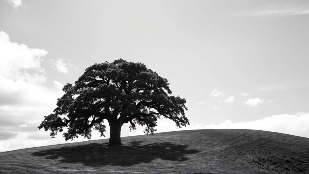
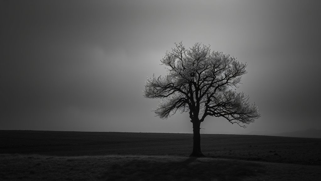
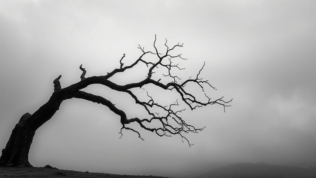
Building on your understanding of gradation and contrast, experimenting with light to dark shifts can add striking depth to your monochrome images. By carefully controlling tonal variations, you create strong monochrome contrast that guides the viewer’s eye and emphasizes key elements. Smooth progressions from light to dark enhance tonal harmony, making your composition feel cohesive and balanced. Use subtle shifts to suggest form and texture or bold contrasts to create drama. Focus on how different shades interact, ensuring each tone complements the overall harmony of your piece. Mastering light to dark shifts allows you to sculpt your image with depth and dimension, transforming a simple hue into a compelling visual story. This technique is essential for elevating monochrome photography beyond flatness into a dynamic, engaging experience.
Utilizing Contrast to Enhance Visual Interest

Contrast is a powerful tool in monochrome photography that can transform a simple image into a compelling visual story. By leveraging contrast, you create striking differences that draw the viewer’s eye and emphasize key elements. To effectively utilize contrast:
- Vary your color saturation to highlight focal points and create depth.
- Use sharp light-to-dark shifts to guide the viewer’s eye through the composition.
- Enhance visual rhythm by repeating contrasting tones, adding movement and harmony.
- Experiment with subtle tonal differences for nuanced, layered images.
These techniques make your photos more engaging, transforming flat scenes into dynamic narratives. Mastering contrast allows you to craft images with depth, richness, and visual interest—all within the constraints of a single hue.
Playing With Texture and Pattern

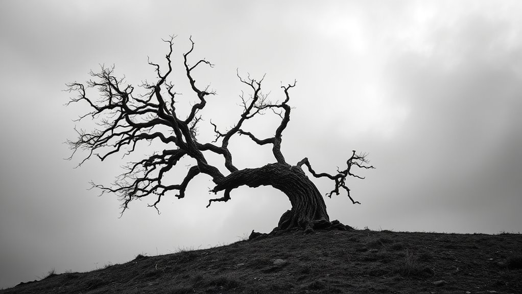
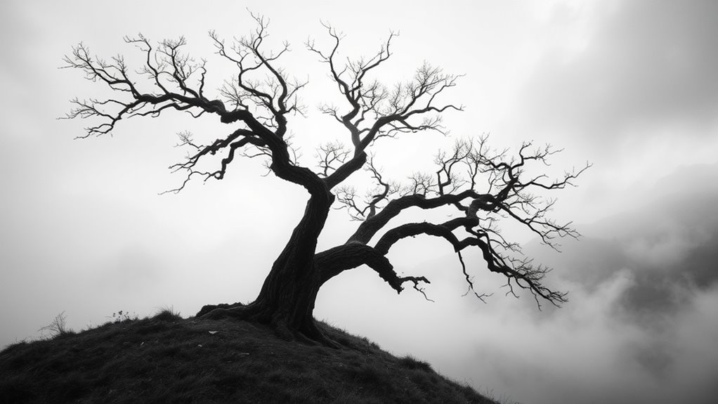
Textures and patterns add depth and visual interest to monochrome images by engaging your viewer’s sense of touch and sight. Using textural contrast allows you to highlight different surfaces—rough versus smooth, matte versus glossy—creating a tactile experience that draws the eye. Pattern layering involves combining various motifs at different scales, adding complexity without relying on color. When you mix textures and patterns thoughtfully, you create a dynamic composition that guides the viewer’s eye through the image. Experiment with juxtaposing bold, geometric patterns against softer, organic textures to develop visual intrigue. This approach emphasizes depth within a single hue, making your monochrome work more immersive and compelling. Playing with texture and pattern transforms a simple tone into a rich, layered visual story.
Mastering Light and Shadow Techniques
Mastering light and shadow techniques can turn a monochrome image from flat to mesmerizing by emphasizing form and mood. By carefully controlling contrast, you enhance the depth within your monochrome palettes. Consider these key approaches:
- Use high contrast to create bold differentiation, making objects stand out.
- Soften shadows for subtle progressions that add gentle depth.
- Adjust light placement to highlight textures and shapes.
- Balance color saturation by limiting it, focusing on tonal variation instead.
These techniques help you manipulate the perception of depth without relying on multiple hues. Properly executed, they deepen the visual impact and evoke emotion, even in a simple monochrome palette. Mastering light and shadow is your most powerful tool for transforming flat images into compelling artwork.
Incorporating Depth Through Composition and Perspective

To create a sense of depth in your monochrome images, you need to carefully compose your scene and choose your perspective wisely. Your goal is to enhance depth perception by organizing elements in a way that guides the viewer’s eye through the image. Use foreground, middle ground, and background to establish spatial arrangement, creating layers that add dimension. Play with angles and vantage points—shooting from a low or high perspective can dramatically alter the sense of depth. Pay attention to how objects overlap and diminish in size, reinforcing spatial relationships. Thoughtful composition combined with perspective choices helps your monochrome photos feel more immersive, drawing viewers into the scene and emphasizing the depth only achievable through strategic spatial arrangement.
Balancing Elements for a Harmonious Design
Achieving visual harmony in your monochrome images hinges on effectively balancing the various elements within the frame. To create a sense of balance harmony and visual equilibrium, consider these key points:
Balance light, shapes, and focal points to create harmonious monochrome images.
- Distribute light and dark areas evenly to prevent cluttered or lopsided images.
- Use leading lines to guide the viewer’s eye smoothly across the composition.
- Vary textures and shapes to add interest without overwhelming the scene.
- Place focal points strategically to anchor the viewer’s attention and maintain harmony.
Tips for Fine-Tuning Your Monochrome Artwork

Fine-tuning your monochrome artwork involves paying close attention to subtle adjustments that enhance overall harmony and impact. Start by refining your monochrome symbolism—consider how each shade and tone communicates your intended message. Use hue harmonies to create seamless progressions and depth, ensuring no area feels disconnected. Adjust contrast carefully to emphasize focal points and add visual interest without overwhelming the piece. Experiment with subtle variations in brightness and saturation to evoke specific emotions or moods, enhancing the artwork’s depth. Keep in mind that small tweaks can considerably improve balance and cohesion. Regularly step back to view your work objectively, making mindful adjustments to achieve a polished, unified result that resonates through thoughtful use of hue harmonies and symbolic nuances.
Frequently Asked Questions
How Can I Effectively Evoke Emotion Using a Single Hue?
To evoke emotion using a single hue, understand color psychology and how it influences feelings. You can enhance your visual storytelling by choosing a hue that aligns with the mood you want to convey—blue for calm, red for passion, or yellow for happiness. Use variations in saturation and brightness to add depth, guiding viewers emotionally and making your message more powerful through thoughtful color choices.
What Are Common Mistakes to Avoid in Monochrome Art?
Did you know that 65% of viewers feel more connected to artwork with strong tonal contrast? When creating monochrome art, avoid common mistakes like ignoring color harmony or overusing tonal contrast, which can make your piece look chaotic. Instead, focus on balancing shades and values to create depth. You’ll evoke emotion and keep viewers engaged if you master subtle progressions and maintain harmony within your monochrome palette.
How Does Cultural Context Influence Monochrome Color Choices?
You should consider how cultural symbolism influences your monochrome color choices, as different cultures assign unique meanings to colors. Regional palettes can guide your selections, ensuring your artwork resonates locally or conveys the intended message. Ignoring these cultural nuances might lead to misinterpretation or unintended offense. By understanding these influences, you can choose hues that deepen your work’s emotional impact and cultural relevance, making your monochrome art more meaningful.
Can Monochrome Palettes Be Used for Branding or Commercial Design?
Imagine you’re designing a logo using a monochrome palette, like a sleek black and white scheme. Monochrome branding works well for commercial color schemes because it creates a strong, cohesive identity. You can evoke sophistication or minimalism, making your brand memorable. Using different shades adds depth and interest without overwhelming. So, yes, monochrome palettes are effective tools in commercial and branding design, offering versatility and a timeless appeal.
What Tools or Software Are Best for Creating Monochrome Artwork?
When creating monochrome artwork, you’ll find tools like digital brushes and photo editing software invaluable. Digital brushes help you craft smooth gradients and textured effects within a single hue, adding depth. Photo editing programs like Adobe Photoshop or Lightroom allow you to adjust tones and contrast easily, giving your monochrome pieces richness and dimension. These tools make it simple to experiment and refine your artwork, ensuring vibrant, compelling monochrome designs.
Conclusion
Think of your monochrome artwork as a lighthouse guiding ships through fog—you use subtle variations in tone and texture to create depth and interest. When I first tried this, I was amazed how a single hue could feel so vibrant and layered, just like a well-orchestrated symphony. With practice, you’ll master the balance of contrast, light, and pattern, transforming simple color choices into a mesmerizing visual journey that draws viewers in and keeps them exploring.