
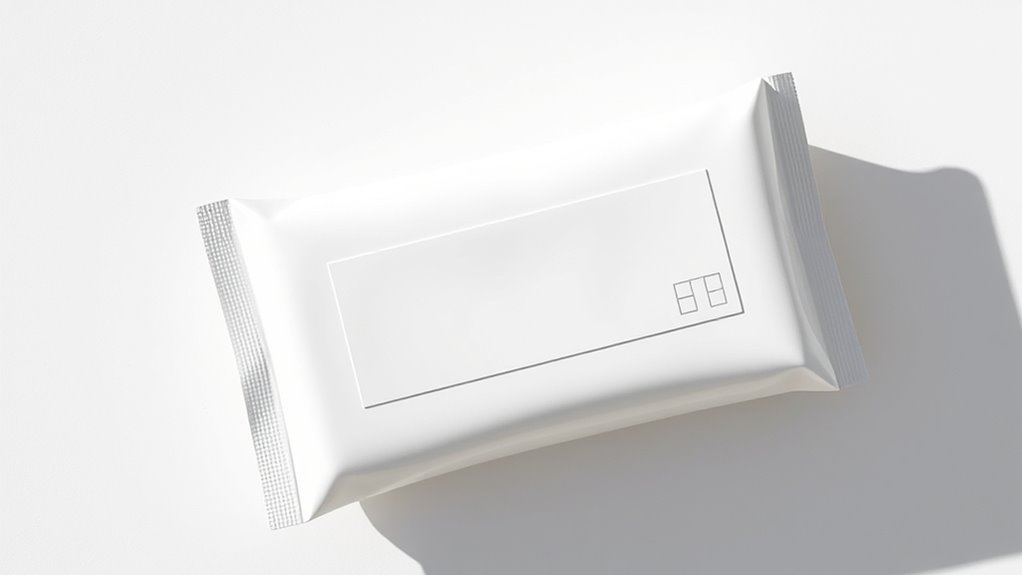
Minimalist packaging design focuses on clean, simple aesthetics, eco-friendly materials, and strategic use of color and space. You’ll notice monochrome schemes, negative space, and tactile finishes that create a sophisticated feel while reducing waste. Brands highlight transparency with clear components and refined labeling. This trend emphasizes sustainability, luxury, and clarity — making your products stand out effortlessly. If you want to explore how these elements work together, there’s plenty more to discover.
Key Takeaways
- Trend toward eco-friendly, biodegradable, and sustainable materials like plant-based inks and recycled components.
- Emphasis on monochrome color schemes and strategic negative space for a clean, sophisticated aesthetic.
- Use of tactile finishes such as embossing and matte textures to add visual depth without clutter.
- Clear typography with minimal text, focusing on readability and visual hierarchy for consumer clarity.
- Luxury brands incorporate high-quality textures and subtle branding to evoke elegance and exclusivity.
The Rise of Eco-Friendly Materials in Minimalist Packaging
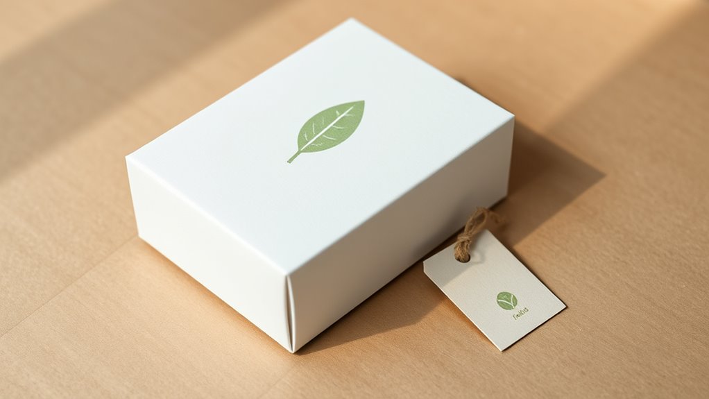
As environmental concerns grow, more brands are turning to eco-friendly materials to create minimalist packaging. You’ll notice a shift toward biodegradable packaging that breaks down naturally, reducing landfill waste.
Plant-based materials, such as cornstarch or bamboo fibers, are increasingly popular choices because they’re renewable and sustainable. These materials not only align with eco-conscious values but also complement minimalist aesthetics through their simple, natural textures. Additionally, biodegradable packaging is gaining traction as a viable alternative to traditional plastics, helping to mitigate environmental impact.
Plant-based materials like cornstarch and bamboo fibers are sustainable, natural, and perfect for minimalist packaging.
By opting for biodegradable packaging, you can lessen your environmental impact while maintaining a sleek, modern look. Many companies now prioritize these eco-friendly options to appeal to conscious consumers. Incorporating sustainable materials into your packaging design can reinforce your brand’s commitment to environmental responsibility.
Embracing plant-based materials in minimalist packaging demonstrates a commitment to sustainability and innovation, making your brand stand out as responsible and forward-thinking. Additionally, using renewable resources like bamboo or cornstarch supports sustainable forestry and reduces reliance on fossil fuels. Moreover, selecting eco-friendly packaging options can enhance your brand’s reputation and appeal to environmentally conscious customers.
Implementing creative practice in choosing eco-friendly packaging solutions can also encourage innovative approaches to sustainable design, aligning with the growing importance of environmental consciousness in branding.
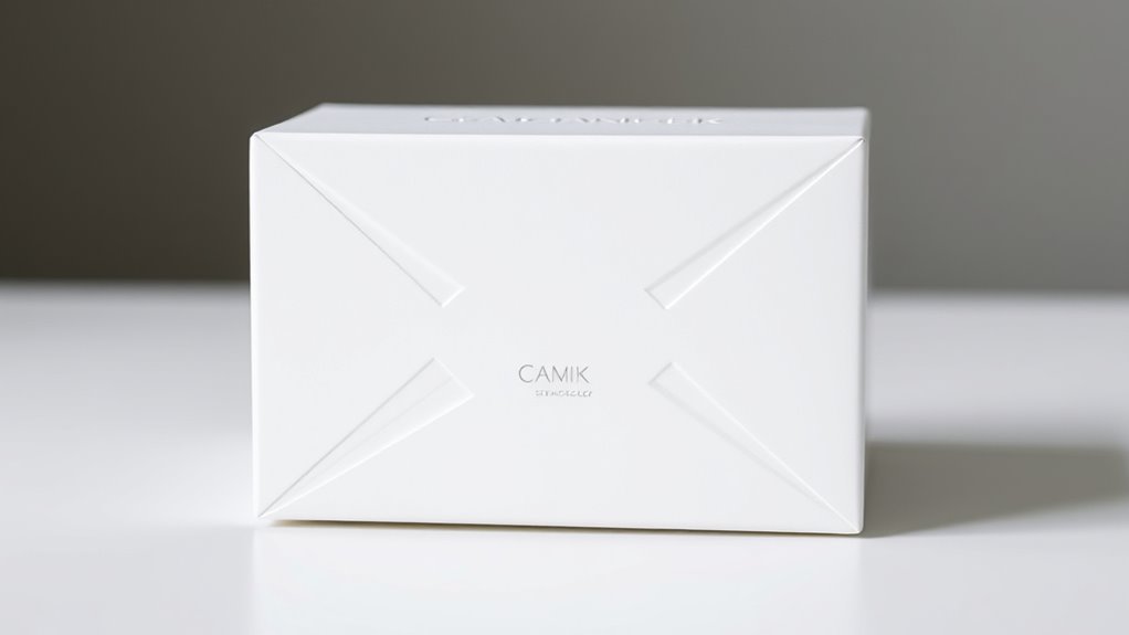
Monochrome Color Schemes and Their Impact
Monochrome color schemes can considerably influence the perception of minimalist packaging by creating a cohesive and sophisticated look. They emphasize color simplicity, allowing your products to stand out without unnecessary distraction. Monochrome contrast enhances visual interest while maintaining elegance, making the design feel intentional and refined. When choosing a color palette, consider shades that complement each other to evoke different emotions—calmness, luxury, or freshness. Here’s a quick overview:
| Shade Level | Description |
|---|---|
| Light | Soft, subtle, and clean |
| Medium | Balanced, versatile color |
| Dark | Bold, striking, and memorable |
Using monochrome schemes strategically can elevate your packaging, making it memorable and impactful with minimal effort. For example, selecting a black coat for a product can evoke luxury and sophistication, especially when paired with minimalist design principles. Incorporating color psychology into your choices can further enhance the emotional response your packaging elicits from consumers. Additionally, understanding how visual contrast affects perception can help in creating designs that are both eye-catching and harmonious. Recognizing the importance of color harmony can also ensure that your monochrome palette feels balanced and pleasing to the eye. Moreover, paying attention to color contrast can optimize the visibility and readability of your packaging details.
Use of Negative Space to Enhance Visual Appeal
Using bold negative space can make your packaging stand out and draw attention to key elements. Incorporating minimalist design principles ensures that the overall aesthetic remains clean and uncluttered. You should balance empty areas with design details so everything feels intentional and harmonious. When done right, negative space enhances the overall visual appeal without clutter. Additionally, understanding self watering plant pots can inspire innovative packaging ideas that emphasize simplicity and functionality. For instance, employing ergonomic design can improve user experience by making packaging easier to handle and open. For example, considering support hours like those for PlayStation or theme parks can remind designers to create clear, user-friendly labeling and instructions that reflect operational schedules. Recognizing the importance of outdoor survival gear can also guide packaging designs to prioritize durability and practicality for adventurous users.
Bold Negative Space Use
Bold negative space can dramatically elevate your packaging design by creating striking contrasts and guiding the viewer’s eye. When used intentionally, it emphasizes negative space symbolism, allowing your key message or brand icon to stand out. This technique simplifies the visual message, making it more memorable and impactful. Incorporate visual balance techniques by positioning elements thoughtfully around the negative space, ensuring harmony and focus. A bold approach to negative space doesn’t just add elegance—it communicates confidence and clarity. It invites curiosity and encourages viewers to interpret the design, enhancing engagement. Understanding Self-Understanding – Personality Test concepts can also inspire minimalist arrangements that maximize impact with fewer elements. Additionally, considering the importance of Fin and Forage can help in designing packaging that aligns with sustainable and resource-efficient principles. Being aware of Personal Finance Management strategies can also influence packaging choices that convey value and trustworthiness to consumers. Recognizing the significance of Resources and Tools available can further optimize your design process for better results.
Balancing Elements Effectively
Effectively balancing elements in minimalist packaging design hinges on how well you utilize negative space to create harmony and focus. Negative space accentuates the contrast of elements, making key features stand out. Incorporating visual hierarchy can further guide the viewer’s attention and improve overall clarity. Achieving asymmetrical balance ensures your design feels dynamic without feeling chaotic. To do this successfully, consider these points:
- Use negative space strategically to guide the viewer’s eye.
- Balance larger empty areas with smaller, bold elements.
- Play with contrast of elements to highlight important details.
- Avoid overcrowding by leaving sufficient negative space for clarity.
Typography Trends in Minimalist Design
In minimalist packaging design, typography plays a crucial role in conveying clarity and elegance with simplicity. You’ll notice a shift toward clean, sans-serif fonts that emphasize readability.
However, calligraphic fonts are making a comeback, adding a touch of sophistication and personality without cluttering the design. Vintage typography also influences current trends, lending a nostalgic feel that pairs well with minimalist aesthetics.
Calligraphic and vintage fonts bring personality and nostalgia to minimalist packaging.
When used thoughtfully, these styles create contrast and visual interest, guiding the consumer’s eye effortlessly. The key is restraint; even when incorporating ornate or retro fonts, they remain subtle and balanced within the overall design.
This trend highlights how typography can elevate minimalism, making your packaging look refined, timeless, and instantly recognizable.
Incorporating Sustainable and Recyclable Components

To align with environmentally conscious consumer preferences, incorporating sustainable and recyclable components into packaging design is essential. Using biodegradable plastics reduces plastic waste, ensuring packaging breaks down naturally over time.
Plant-based inks offer eco-friendly printing options that minimize harmful emissions and toxins. To maximize sustainability, consider these approaches:
- Choose biodegradable plastics for packaging materials
- Use plant-based inks for printing and branding
- Opt for minimal packaging to reduce waste
- Incorporate recycled or recyclable materials whenever possible
These strategies not only support eco-friendly practices but also appeal to consumers seeking responsible brands.
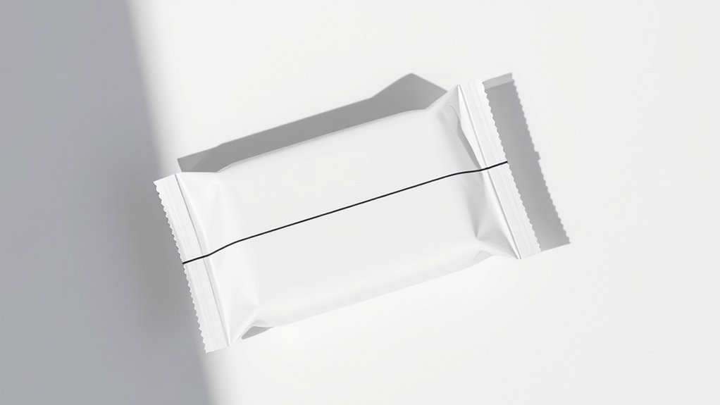
The Role of Transparent Packaging in Minimalist Aesthetics
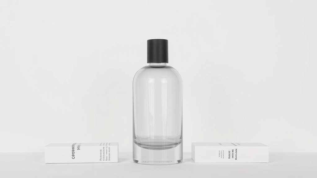
Incorporating sustainable materials like biodegradable plastics and recycled components already emphasizes environmental responsibility, but choosing transparent packaging elevates minimalist design by showcasing the product itself.
Clear glass is a popular choice because it provides a sleek, unobtrusive look that highlights the product’s natural qualities. See-through labels complement this approach by maintaining simplicity while offering essential information without clutter.
Transparent packaging creates a sense of honesty and purity, allowing consumers to see exactly what they’re getting. It also emphasizes clean lines and minimalism, reducing visual noise.
Minimalist Packaging for Luxury and Premium Brands
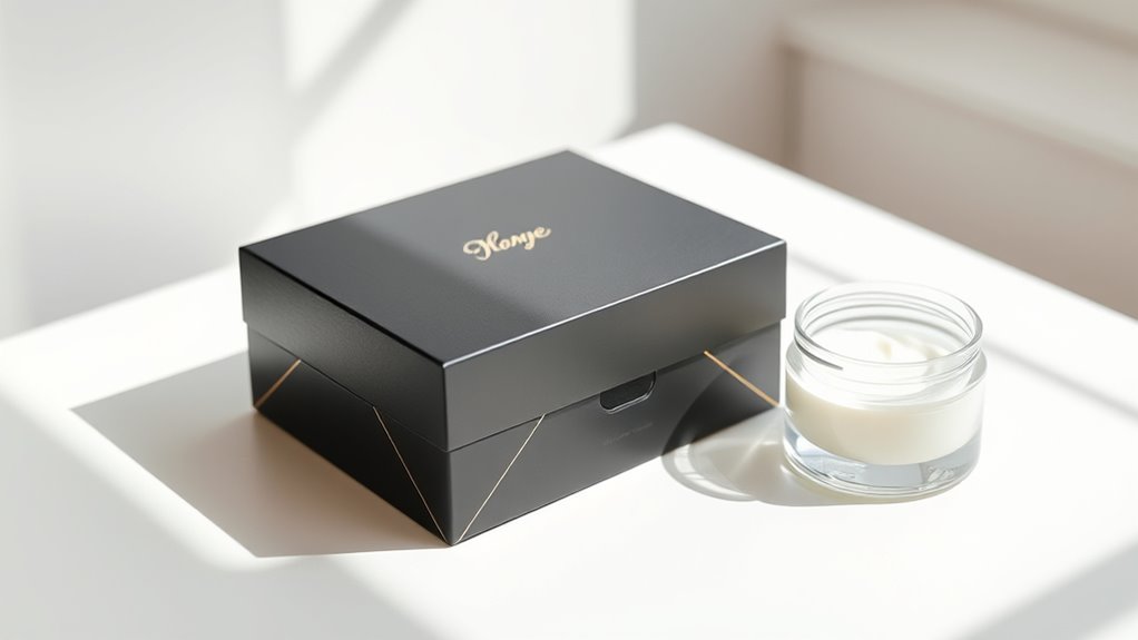
When designing minimalist packaging for luxury brands, you focus on selecting elegant materials that convey quality effortlessly.
Subtle branding elements and sophisticated color palettes help create a refined, understated look.
These choices work together to enhance the brand’s premium feel without overwhelming the design.
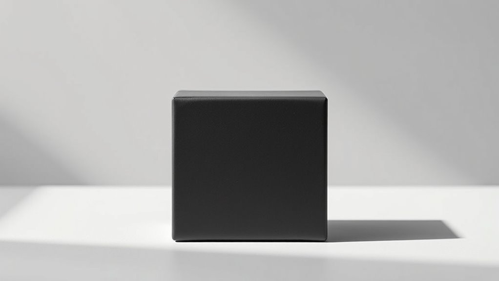
Elegant Material Choices
Choosing the right materials is essential for achieving a minimalist packaging design that exudes luxury and sophistication. High-quality, tactile materials elevate the unboxing experience and reinforce the product’s premium nature.
Using luxury textures such as soft matte finishes, smooth embossed surfaces, or subtle metallic accents creates visual interest without clutter. Tactile materials like thick cardstock, engraved wood, or genuine leather add a tangible sense of exclusivity.
To enhance the minimalist aesthetic, focus on materials that communicate refinement through simplicity. Consider these points:
- Opt for natural, sustainable textures that convey elegance
- Use muted, monochrome color palettes for understated luxury
- Incorporate subtle surface details like embossing or debossing
- Select materials that feel substantial and durable in hand
These choices help craft a refined, minimalist package that speaks to your brand’s luxury positioning.
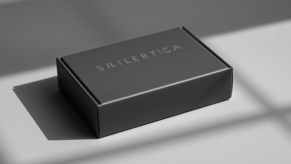
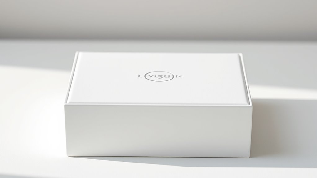
Subtle Branding Elements
Subtle branding elements play an essential role in maintaining the clean, uncluttered look of minimalist packaging while still conveying your brand’s identity.
By incorporating understated logos, embossed details, or delicate typography, you create a refined aesthetic that emphasizes quality without overwhelming the design. These subtle cues enhance brand recognition by allowing consumers to identify your product through minimal visual cues, strengthening your visual identity in a sophisticated way.
Using minimalist branding techniques ensures that your packaging remains elegant and timeless, aligning perfectly with luxury and premium brands. Keep the focus on simplicity, but don’t sacrifice the distinctiveness that sets your brand apart.
Thoughtfully executed subtle branding elements help you communicate exclusivity while maintaining a sleek, minimalist appeal.
Sophisticated Color Palettes
A sophisticated color palette is essential for creating minimalist packaging that exudes luxury and elegance. It sets the tone and communicates premium quality with simplicity.
Using muted tones like charcoal, soft beige, or deep navy creates a refined backdrop, while bold accents add visual interest.
Incorporate matte finishes to enhance the tactile experience, making the packaging feel more luxurious and understated.
To achieve this balance, consider:
- Pairing neutral shades with bold accents for contrast
- Using monochromatic schemes to maintain cohesion
- Applying matte finishes to reduce glare and increase sophistication
- Keeping color choices minimal to avoid clutter and focus on elegance
This approach ensures your packaging feels both modern and timeless, appealing to high-end consumers who appreciate subtlety and craftsmanship.
Creative Use of Texture and Material Finishes
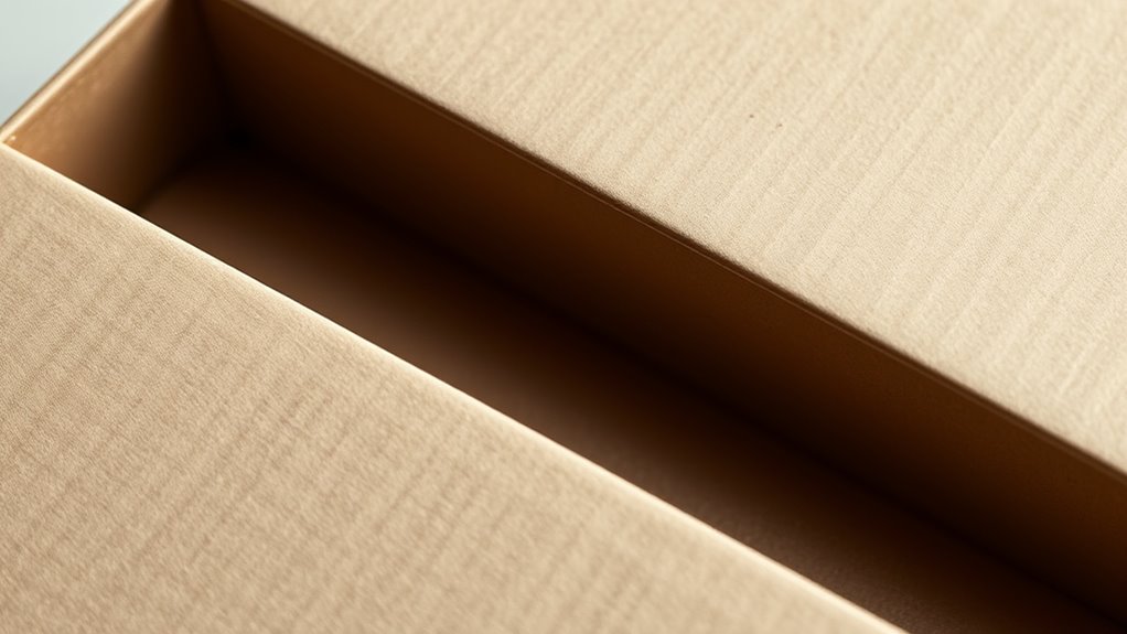
Creative use of texture and material finishes can elevate minimalist packaging from simple to striking by adding tactile interest and visual depth. Textured finishes, like embossed patterns or matte surfaces, engage the senses and create memorable experiences. They also support tactile branding, helping your product stand out on shelves without cluttering the design.
Using different materials—such as soft-touch coatings or uncoated kraft paper—can convey specific brand qualities, like luxury or eco-friendliness. These finishes subtly communicate your message while maintaining minimalism’s clean aesthetic.
When thoughtfully applied, texture enhances visual appeal and invites consumers to touch and explore your packaging, strengthening brand connection. In minimalist design, texture is a powerful tool to add complexity and sophistication without overwhelming simplicity.
Simplified Labeling and Information Presentation
When designing labels, you prioritize clear, minimal typography to make information easy to read at a glance.
Using a limited color palette helps keep the focus on essential details without visual clutter.
Concentrate on presenting only the most important information to create a clean and effective packaging look.
Clear, Minimal Typography
Clear, minimal typography plays a crucial role in minimalist packaging by ensuring that labels communicate essential information quickly and effortlessly. Using bold headlines helps draw attention to key details, making the information easy to scan.
Effective font pairing balances readability with aesthetic appeal, enhancing overall design harmony. To maximize clarity, consider these tips:
- Choose simple, clean fonts for a modern look
- Use bold headlines to highlight important info
- Maintain consistent font sizes for hierarchy
- Minimize decorative elements that clutter the label
Limited Color Palette
A limited color palette simplifies packaging by reducing visual clutter and focusing attention on essential information. Using fewer colors enhances color contrast, making key details stand out clearly. This approach establishes a strong visual hierarchy, guiding the viewer’s eye naturally from the most important to less critical info. By restricting colors, you create a clean, cohesive look that emphasizes clarity over decoration. Here’s a quick overview:
| Feature | Benefit |
|---|---|
| Fewer colors | Enhances color contrast for readability |
| Focused attention | Draws eyes to key information |
| Consistent branding | Maintains a unified, minimalist aesthetic |
| Clear visual hierarchy | Guides consumers effortlessly through the info |
| Simplified design | Reduces distractions, improves comprehension |
Essential Information Focus
Have you ever struggled to find important information on a cluttered package? Minimalist packaging emphasizes clarity by prioritizing essential details. You’ll notice the avoidance of decorative embellishments and complex graphic elements that distract from key info.
Instead, labels are simple, clean, and easy to read, guiding your focus directly to what matters. To achieve this, consider:
- Using large, legible fonts for product names and instructions
- Limiting text to only necessary details
- Employing ample white space to enhance readability
- Highlighting critical information with subtle contrasts
This approach ensures consumers quickly grasp important info without confusion. Simplified labeling not only improves user experience but also aligns with modern minimalist aesthetics, making your product stand out for its clarity and purpose.
Case Studies of Successful Minimalist Packaging Campaigns
Many brands have successfully embraced minimalist packaging to create a strong visual impact while reducing clutter. Take Apple’s product designs, for example, which highlight clean lines and subtle branding, allowing their brand storytelling to shine through simplicity.
Another case is Muji, whose understated packaging emphasizes cultural symbolism, reflecting Japanese minimalism and mindfulness. These campaigns show that less can be more; they focus on conveying the essence of the product without distraction.
Frequently Asked Questions
How Does Minimalist Packaging Influence Consumer Purchasing Decisions?
Minimalist packaging influences your purchasing decisions by highlighting visual appeal, making products stand out on shelves with clean, simple designs. It also appeals to your environmental awareness, as minimalist packaging often uses fewer materials and reduces waste.
When you see sleek, eco-friendly packaging, you’re more likely to trust the brand, feel good about your purchase, and choose it over more cluttered or elaborate options, ultimately guiding your buying choices.
What Are the Cost Implications of Adopting Minimalist Packaging Designs?
Your wallet might feel like it’s being hit by a hurricane when adopting minimalist packaging, but it’s worth it. By streamlining designs, you improve supply chain efficiency and cut packaging material costs.
Fewer materials mean lower expenses and faster production. While initial redesigns may require investment, long-term savings and sustainability benefits outweigh the costs.
Ultimately, minimalist packaging can transform your costs into a lean, efficient, and eco-friendly process.
How Can Minimalist Packaging Be Adapted for Different Product Categories?
You can adapt minimalist packaging for various product categories by choosing sustainable materials that suit each item’s needs. For example, use eco-friendly paper for cosmetics, or sleek glass for luxury products.
Incorporate cultural adaptation by respecting local design preferences and symbols, ensuring your minimalist approach resonates globally. Focus on clean lines and simple visuals, making your packaging versatile across different markets while maintaining sustainability and cultural relevance.
What Challenges Do Brands Face When Transitioning to Minimalist Packaging?
When shifting to minimalist packaging, you face challenges like supply chain complexities, which can complicate sourcing and logistics.
You also need to balance environmental sustainability with maintaining product protection and branding.
Simplifying designs might reduce costs but requires careful planning to avoid compromising quality or customer appeal.
How Does Minimalist Packaging Impact Brand Recognition and Loyalty?
Think of your brand’s visual identity as a lighthouse guiding customers through a sea of options. Minimalist packaging sharpens your packaging aesthetics, making your product stand out with clarity and elegance.
This simplicity can boost brand recognition by creating memorable, consistent visuals. Loyalty grows when consumers connect emotionally with sleek, honest packaging that reflects quality.
Ultimately, minimalist design helps your brand become a trusted beacon in a crowded marketplace.
Conclusion
As you embrace minimalist packaging, remember it’s like the calm at the eye of a storm—simple yet powerful. Your design choices echo a silent promise of sustainability and elegance, guiding consumers through a visual journey that’s both meaningful and memorable. By aligning with these trends, you craft more than packaging—you craft a legacy that whispers, “Less is more,” inspiring trust and loyalty that stand the test of time, much like a well-loved classic.