
The rule of thirds isn’t just for photos—it’s a powerful tool across all visual arts and design. You can use it to create balanced paintings, engaging web layouts, compelling video shots, and stylish interiors. By placing key elements along grid lines or intersections, you guide viewers’ attention naturally and add depth to your work. If you want to explore how this versatile rule can transform your projects, keep exploring to reveal its full potential.
Key Takeaways
- The rule of thirds applies to various visual arts, including painting, illustration, and interior design, enhancing composition and balance.
- It guides storytelling and spatial arrangements, helping to focus viewer attention in films, video games, and stage design.
- Artists use the rule to create dynamic perspectives, depth, and visual interest beyond photography.
- Design fields like web and graphic design utilize the rule for layout balance, guiding viewer flow and emphasizing key elements.
- Learning and applying the rule improves visual literacy and aesthetic judgment across many artistic disciplines.
Understanding the Basics of the Rule of Thirds

The Rule of Thirds is a simple yet powerful guideline that helps you create balanced and engaging compositions. It divides your canvas into nine equal parts with two horizontal and two vertical lines, guiding where to place key elements. When applying this rule, you naturally develop better color harmony, as your focal points draw attention and create visual interest. It also enhances perspective depth, making your artwork feel more dynamic and three-dimensional. By aligning important features along these lines or at their intersections, you control the viewer’s eye movement and emphasize your main subjects. This technique encourages you to think critically about composition, ensuring your work feels natural and well-structured. Additionally, understanding contrast ratio can help you improve the overall visual impact of your images by emphasizing differences in light and dark areas. Recognizing visual balance helps artists create more harmonious and pleasing images. Incorporating body awareness into your artistic process can further improve your ability to recognize and utilize visual balance. Mastering the Rule of Thirds gives you a solid foundation for creating compelling, professional-looking art, and applying space organization principles from home improvement can enhance your spatial awareness and overall design sensibility.
Applying the Rule of Thirds in Painting and Illustration

When applying the Rule of Thirds in painting and illustration, you direct the viewer’s eye by strategically placing key elements along the grid lines or at their intersections. This technique creates balance and focus, guiding attention naturally. Use color theory to emphasize focal points; warm colors or contrasting hues placed at these intersections make objects stand out. Perspective techniques, like vanishing points and depth cues, complement the grid, helping you position foreground and background elements harmoniously. By aligning important features with the rule, you craft a composition that feels dynamic yet cohesive. This approach _guarantees_ that your artwork not only captures interest but also leads the viewer smoothly through the scene, making your visual storytelling more compelling and engaging. Incorporating automated tools can assist artists in achieving precise compositions efficiently.
Enhancing Web and Graphic Design With the Rule of Thirds

You can use the rule of thirds to create a balanced visual layout that naturally guides viewers’ eyes. Placing key elements along the grid lines helps focus attention where you want it most. This technique makes your web and graphic designs more engaging and easier to navigate. Incorporating visual focal points aligned with the grid can further enhance the impact of your design. Additionally, understanding relationship dynamics can inform design choices that evoke specific emotional responses.
Balancing Visual Composition
Balancing visual composition is essential for creating engaging web and graphic designs that capture viewers’ attention. When applying the rule of thirds, positioning key elements along the grid lines or intersections helps achieve harmony. Understanding color theory enhances this balance by evoking specific emotional impacts—warm colors can energize, while cool tones create calmness. By thoughtfully combining color choices and element placement, you guide the viewer’s eye naturally across the design. Incorporating cohesive color palettes and balancing visual weight further ensures no single area feels overcrowded or empty, making your visuals more appealing and effective. Properly balancing elements with the rule of thirds enhances overall cohesion, making your design feel intentional and professional. Additionally, recognizing the importance of visual weight allows you to prioritize certain elements, guiding the viewer’s focus intentionally. Employing visual hierarchy techniques can further improve the clarity and impact of your layout. Ultimately, this approach strengthens emotional resonance and keeps your audience engaged.
Guiding Viewer Focus
Strategically placing key elements along the rule of thirds grid directs viewers’ attention exactly where you want it. Use color theory to highlight focal points—bright, contrasting colors draw eyes naturally. Incorporate perspective techniques to create depth, guiding viewers’ gaze toward important areas. For example, positioning a subject at a grid intersection emphasizes its importance, while background elements can lead the eye toward the main focus. Combining these methods ensures your design directs attention intuitively, without overwhelming the viewer. The rule of thirds helps balance visual weight, making your message clearer and more engaging. Additionally, understanding how to enhance visual harmony can further improve viewer engagement and overall aesthetic appeal. Mastering these compositional techniques also aligns with the principles of visual storytelling, ensuring your message resonates effectively.
Using the Rule of Thirds to Improve Composition in Video and Film

The rule of thirds is a powerful tool for enhancing composition in video and film, guiding you to place key elements along imaginary lines that divide the frame into thirds horizontally and vertically. This technique helps you achieve balanced cinematic framing and improves shot composition by drawing viewers’ eyes naturally to important subjects. Use the table below to determine where to position your focal points:
| Top Left | Top Center | Top Right |
|---|---|---|
| Middle Left | Center | Middle Right |
| Bottom Left | Bottom Center | Bottom Right |
Aligning characters or objects along these lines or at their intersections creates visual interest and depth. Incorporating the rule of thirds elevates your storytelling, making scenes more engaging and dynamic.
The Role of the Rule of Thirds in Advertising and Marketing Materials

In advertising and marketing materials, applying the rule of thirds helps you create visually compelling images that grab attention and communicate your message effectively. When you use this technique, your visuals become more balanced and engaging, making it easier for viewers to focus on key elements. This improves brand recognition because memorable, well-composed images stick in consumers’ minds. Additionally, the rule of thirds guides viewers’ eyes naturally across your content, boosting consumer engagement. Whether you’re designing a billboard, social media post, or product packaging, strategically placing your brand logo or product along the grid lines enhances visual impact. Overall, mastering the rule of thirds in your marketing visuals can help you stand out, foster stronger connections, and leave a lasting impression on your audience.
Incorporating the Rule of Thirds in Storytelling and Visual Narratives

You can use the rule of thirds to balance visual elements, guiding the viewer’s eye naturally across your story. When you position key subjects along the gridlines, your narrative becomes more focused and engaging. This technique helps highlight important details and creates a cohesive visual flow that supports your storytelling. Incorporating visual composition techniques like the rule of thirds can enhance the overall impact of your message. Additionally, understanding the top camping gear options can help you select the right tools to complement your visual storytelling outdoors. Using essential oils with specific therapeutic properties can also subtly enhance the mood or atmosphere of your visual narrative, making it more memorable. Recognizing the influence of narcissistic behaviors on perception can further refine your storytelling approach, ensuring your message resonates authentically.
Balancing Visual Elements
By aligning key visual elements along the lines and intersections of the rule of thirds, you can create a balanced and engaging composition that guides viewers’ eyes naturally through the story you’re telling. To achieve this balance, consider color harmony—using complementary or analogous colors to unify different parts of your scene. Texture contrast also plays an essential role; pairing smooth surfaces with rough textures adds visual interest and prevents the composition from feeling flat. Distributing these elements thoughtfully across the grid ensures no single part dominates, maintaining harmony and flow. This balanced approach keeps viewers engaged, encouraging them to explore every detail of your narrative while creating a cohesive visual experience. Mastering this technique enhances storytelling by making your visuals more compelling and deliberate.
Enhancing Narrative Focus
Have you ever noticed how the placement of key elements can dramatically influence a story’s impact? Using the rule of thirds helps you guide viewers’ focus intentionally. By applying color theory, you can evoke emotions and highlight important narrative moments, making scenes more compelling. Perspective techniques, like varying angles and depth, reinforce the story’s message and direct attention naturally. Positioning main characters or objects along grid lines emphasizes their significance without overwhelming the viewer. This strategic placement creates a visual hierarchy, reinforcing the story’s flow. When combined with thoughtful color choices and perspective, the rule of thirds becomes a powerful tool to deepen narrative focus, ensuring your audience engages with your story on a more emotional and visual level.
Creative Ways to Use the Rule of Thirds in Interior and Spatial Design
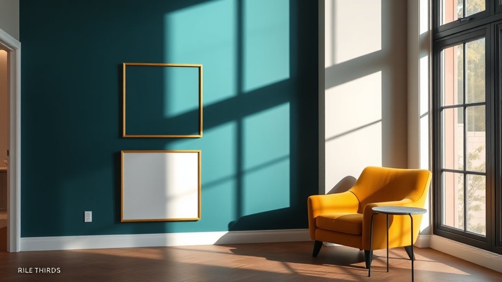
In interior and spatial design, the rule of thirds can be a powerful tool for creating balanced and visually engaging layouts. You can use it to position key elements like furniture, artwork, or lighting, ensuring they draw attention naturally. For example, aligning a statement piece along one of the grid lines enhances visual flow. Experiment with color harmony and material textures within these zones to add depth and interest, making spaces feel cohesive yet dynamic. Incorporate the following ideas:
| Placement | Element | Tip |
|---|---|---|
| Left vertical | Artwork or mirror | Use contrasting textures for depth |
| Right vertical | Seating or focal point | Choose harmonious colors for balance |
| Center | Accent lighting | Highlight textures with warm light |
This approach elevates your design by guiding the eye thoughtfully around the space. Additionally, understanding the importance of visual balance can help you create more harmonious environments that are both functional and aesthetically pleasing.
Common Mistakes and Misconceptions About the Rule of Thirds

Many people assume that applying the rule of thirds guarantees a perfectly balanced and aesthetically pleasing design, but this isn’t always the case. Misconceptions often lead to rigid use, where you place every element exactly on grid lines, ignoring context or harmony. A common error is overusing the rule, thinking it’s a strict formula rather than a guideline. Sometimes, trying to align everything to the thirds can make a composition feel forced or unbalanced. Remember, the rule is meant to enhance your work, not restrict creativity. Additionally, many believe that the rule applies only to photos, but it’s just as relevant in interior and spatial design. Understanding these misconceptions helps you use the rule more effectively and avoid common errors that can detract from your overall aesthetic.
Digital Tools and Apps That Help Implement the Rule of Thirds

Many digital tools and apps can make applying the rule of thirds easier and more intuitive. You’ll find both free options and paid programs, each offering different features to suit your needs. Exploring these tools helps you choose the best fit for your workflow and creative goals. For example, TikTok’s built-in editing features often include grid overlays to help align your content more effectively, making it easier to follow the rule of thirds during creation.
Popular Composition Apps
Numerous digital tools and apps make applying the rule of thirds straightforward, whether you’re shooting photos or editing them afterward. These apps often incorporate grids that overlay your workspace, guiding composition and alignment. Popular options include Adobe Lightroom, Snapseed, and VSCO, which provide adjustable grids for precise placement. Some apps also integrate features like color theory suggestions and typography techniques to enhance visual appeal. For example, you can align key elements along grid lines, ensuring balanced compositions. A table below highlights key features:
| App | Features | Special Tools |
|---|---|---|
| Lightroom | Custom grids, color adjustments | Color theory enhancements |
| Snapseed | Overlay grids, fine-tuning | Typography overlays |
| VSCO | Composition guides, filters | Creative editing tools |
These apps streamline applying the rule of thirds, elevating your visual storytelling.
Free vs. Paid Tools
Are free and paid tools equally effective in helping you implement the rule of thirds? Both options can enhance your compositions, but paid tools often offer advanced features like more precise grid overlays and integrated perspective techniques. Free apps usually include basic grids and simple guides, making them accessible for beginners. Incorporating color theory into your compositions becomes easier with paid tools that provide detailed overlays and adjustments, helping you create balanced visuals. Understanding perspective techniques is also vital, and some paid apps offer perspective grids that assist in aligning elements according to the rule of thirds. Ultimately, both free and paid tools can improve your skills, but investing in paid options might give you more control and nuanced features to refine your creative process.
Developing Your Eye: Practicing the Rule of Thirds Beyond Photography

Have you ever wondered how the principles of the rule of thirds can enhance your perception beyond photography? You can develop your eye by applying it to art and everyday scenes, sharpening your sense of composition. Practice incorporating color theory to create balanced, engaging visuals that draw viewers’ attention naturally. When sketching or doing perspective drawing, use the rule to place focal points at intersections, adding depth and interest. To improve, try these activities:
- Analyze paintings or illustrations, noting how the rule guides the composition
- Experiment with different color schemes to see how they influence balance
- Practice perspective drawing by positioning objects along the grid lines
- Take daily photos or sketches, focusing on rule of thirds placement
- Study natural scenes, recognizing how the rule appears in nature
These exercises strengthen your intuition and visual literacy beyond photography.
Frequently Asked Questions
Can the Rule of Thirds Be Applied to 3D Modeling and Animation?
Yes, you can definitely apply the rule of thirds to 3D modeling and animation. By using grid alignment, you can position your model’s focal points where the grid lines intersect, creating a more balanced and engaging composition. This technique helps you guide viewers’ eyes naturally, whether you’re placing a character or an object within a scene. It’s a simple yet effective way to improve visual appeal in your 3D projects.
How Does the Rule of Thirds Influence User Interface Design?
Imagine your interface as a well-balanced painting; the grid alignment guides you, placing focal points where users’ eyes naturally rest. You influence user flow by positioning key elements along these lines or intersections, making your design more intuitive. The rule of thirds helps you create harmony and focus, ensuring important buttons and messages stand out, leading to a seamless experience that feels both natural and engaging to users.
Is the Rule of Thirds Effective in Abstract or Non-Representational Art?
You might wonder if the rule of thirds works in abstract or non-representational art. It can be effective by guiding you toward creating abstract harmony and non-representational balance. When you apply the rule, you intentionally position elements to evoke visual interest and emotional impact, even without recognizable subjects. This technique helps you craft compositions that feel balanced and dynamic, proving its versatility beyond traditional photography or realistic art.
Can the Rule of Thirds Be Adapted for Use in Virtual Reality Environments?
Think of virtual reality composition as an uncharted ocean, where immersive design principles guide your voyage. You can adapt the rule of thirds in VR to create balanced, engaging scenes that draw users into the experience. By aligning key elements along imaginary gridlines, you enhance spatial harmony and user focus. This approach transforms virtual environments into artful landscapes where every element feels purposeful, making your immersive design truly mesmerizing.
How Does Cultural Perception Affect the Application of the Rule of Thirds?
You should consider how cultural aesthetics and perception biases influence how the rule of thirds is applied. Different cultures value balance, symmetry, or asymmetry differently, which can shift your perception of what feels visually appealing. Your cultural background shapes how you interpret visual cues, so you might adapt or ignore the rule based on local artistic norms. Being aware of these influences helps you create more culturally resonant and effective compositions.
Conclusion
So, next time you’re tempted to ignore the rule of thirds, remember it’s not just for photographers. Whether you’re designing a website, crafting a painting, or arranging your living room, this timeless principle secretly keeps your creations from looking like a chaotic mess. Embrace it, break it, or pretend you’re breaking it—just don’t forget it’s the unsung hero behind most good-looking things. After all, who knew perfect composition could be so sneaky?