
Colors shape your emotions and experiences, so using minimalist palettes can truly set the mood. Soft neutrals like whites and grays create a calming atmosphere, promoting tranquility and focus. You can add bold accents for an energizing spark that enhances the overall vibe. Balancing textures and lighting also plays a key role in maintaining that serene aesthetic. Discovering how these elements come together can transform your space remarkably.
Key Takeaways
- Minimalist color palettes promote serenity and clarity, reducing cognitive load and fostering a calming atmosphere for relaxation and focus.
- Soft neutral tones evoke tranquility, enhancing emotional well-being by symbolizing purity and simplicity in design spaces.
- Bold accent colors create focal points, invigorating spaces without overwhelming the senses, maintaining the minimalist philosophy of "less is more."
- Texture and natural light play vital roles in enhancing minimalist designs, adding depth while promoting a soothing and inviting environment.
- Experimenting with light and dark elements in color schemes can balance visual interest and maintain a serene aesthetic throughout various spaces.

AUREUO Morandi Acrylic Paint Set – 8 Muted Colors x 0.71 Fl Oz/21ml Tubes, Vintage Neutral Earthy Tones for Canvas Painting, DIY Crafts, Home Decor, Wall Art Non-Toxic Matte Finish
MORANDI COLOR PALETTE: This Acrylic Paint Set features 8 soft, muted shades inspired by the tranquil and sophisticated…
As an affiliate, we earn on qualifying purchases.
As an affiliate, we earn on qualifying purchases.
Understanding Minimalist Color Palettes

When you embrace a minimalist color palette, you're choosing a design approach that promotes serenity and simplicity.
Minimalist color schemes primarily feature neutral base colors like white, gray, and beige, creating a calming atmosphere. By using limited accent colors sparingly, you add visual interest without overwhelming the space.
Minimalist color schemes embrace neutral tones, fostering tranquility while limited accents enhance visual interest without cluttering the space.
This philosophy, rooted in the idea that "less is more," fosters clarity and tranquility, stripping away excess. Soft, muted tones evoke harmony and relaxation, enhancing your emotional experience.
Additionally, integrating subtle textures and patterns allows you to achieve depth while maintaining a clean aesthetic. Understanding color psychology in this framework helps you create spaces that resonate emotionally, making minimalist palettes an effective choice for anyone seeking a peaceful environment. Furthermore, utilizing effective wall organization can enhance the minimalist approach by promoting order and reducing visual clutter.

Foindtower Pack of 2 Decorative Jacquard Boucle Lumbar Throw Pillow Covers Accent Textured Striped Pillowcases Cozy Boho Cushion for Couch Sofa Bedroom Living Room Home Decor 12×20 Inch Natural Beige
【Premium Fabrics】Foindtower Pillowcase Crafted from premium polyester fiber, this fabric boasts exceptional durability and wrinkle resistance. It maintains…
As an affiliate, we earn on qualifying purchases.
As an affiliate, we earn on qualifying purchases.
The Emotional Impact of Color in Design

Colors play an essential role in shaping your emotional experience in design, influencing how you feel and interact with a space.
Understanding the psychological effects of colors can enhance your minimalist design approach. Here are four key points to contemplate:
- Warm colors like red and yellow evoke energy and excitement, boosting your emotional response.
- Cool colors such as blue and green promote calmness and tranquility, creating a serene atmosphere.
- Monochromatic schemes can enhance focus and relaxation, fostering mental clarity.
- Neutral colors, like white and gray, promote a sense of cleanliness and order, calming your mind in living spaces.
uniro Neutral Sketch Art Prints, Vintage Abstract Figure Canvas Art, Minimalist Line Drawing for Gallery Wall Decor (8" x 10" – Unframed)
Neutral Sketch Wall Art: The neutral wall art prints decor are ideal for rustic home decor/farmhouse wall decor…
As an affiliate, we earn on qualifying purchases.
As an affiliate, we earn on qualifying purchases.
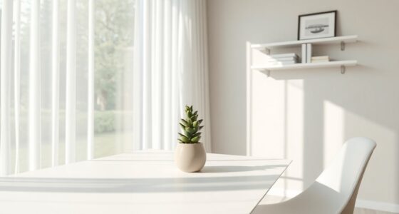
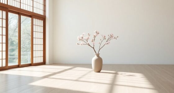
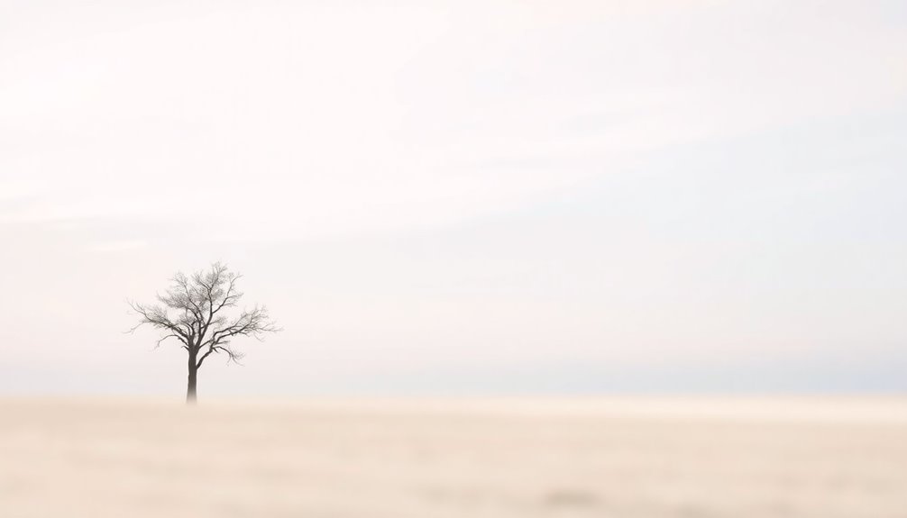
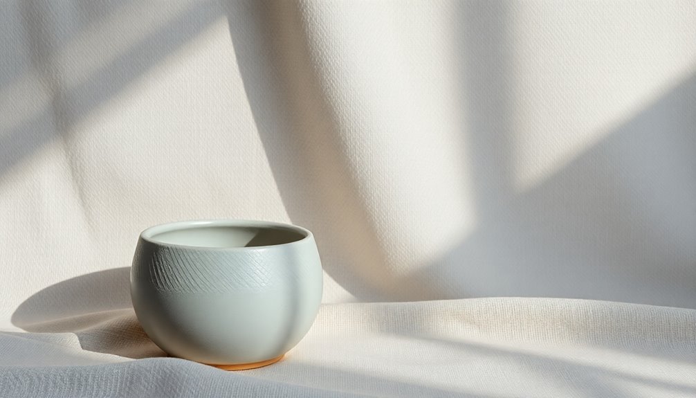
Soft Neutrals: Creating Calm and Serenity
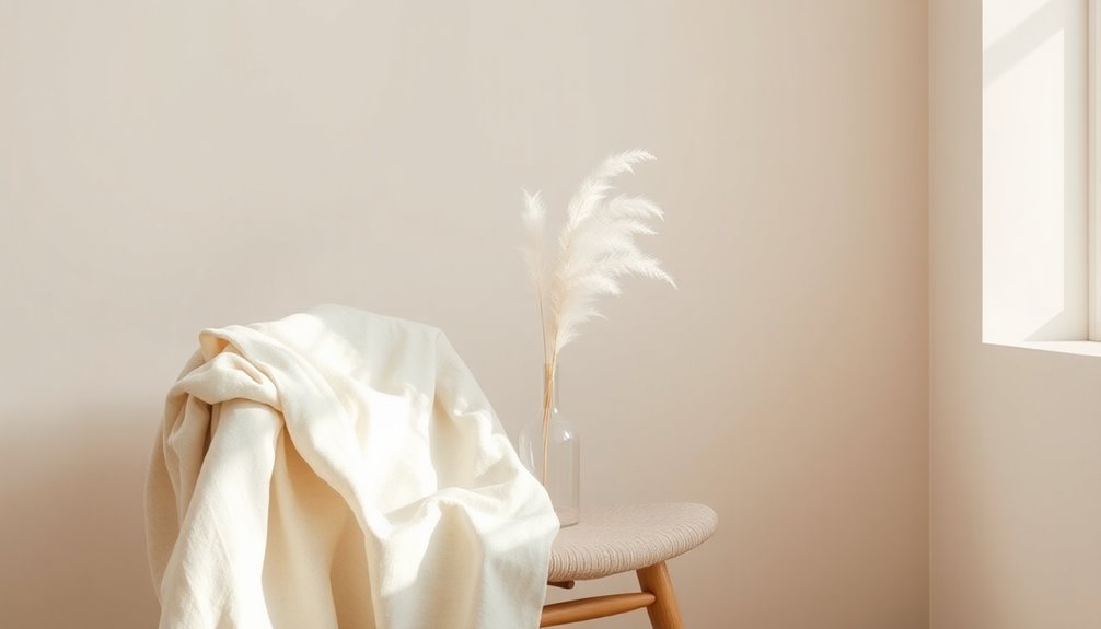
Soft neutrals, like beige and light gray, create a serene atmosphere that invites relaxation and reduces stress in your living spaces.
These colors not only reflect light effectively, enhancing brightness and openness, but also align perfectly with minimalist color palettes that emphasize simplicity.
Soft neutrals beautifully enhance light and space, embodying the essence of minimalist design through simplicity and elegance.
A calming environment can be achieved by incorporating soft neutrals in areas meant for rest, such as your bedroom or meditation space. They evoke feelings of warmth and comfort, making you feel at ease.
By adding subtle variations in these tones, you can introduce depth and interest to your design without overwhelming the senses.
This tranquil visual experience helps you unwind and fosters a peaceful retreat from the chaos of everyday life. Additionally, creating a soothing ambiance can be enhanced by using scented candles that contribute to the overall atmosphere.

MIULEE Natural White Linen Curtains 84 Inch Long for Bedroom Living Room, Soft Thick Linen Textured Window Drapes Semi Sheer Light Filtering Rod Pocket Back Tab Neutral Farmhouse Cream Ivory 2 Panels
WELL MADE: Sold as 2 panels, each panel is W52" x L84", and W104" x L84" in total….
As an affiliate, we earn on qualifying purchases.
As an affiliate, we earn on qualifying purchases.
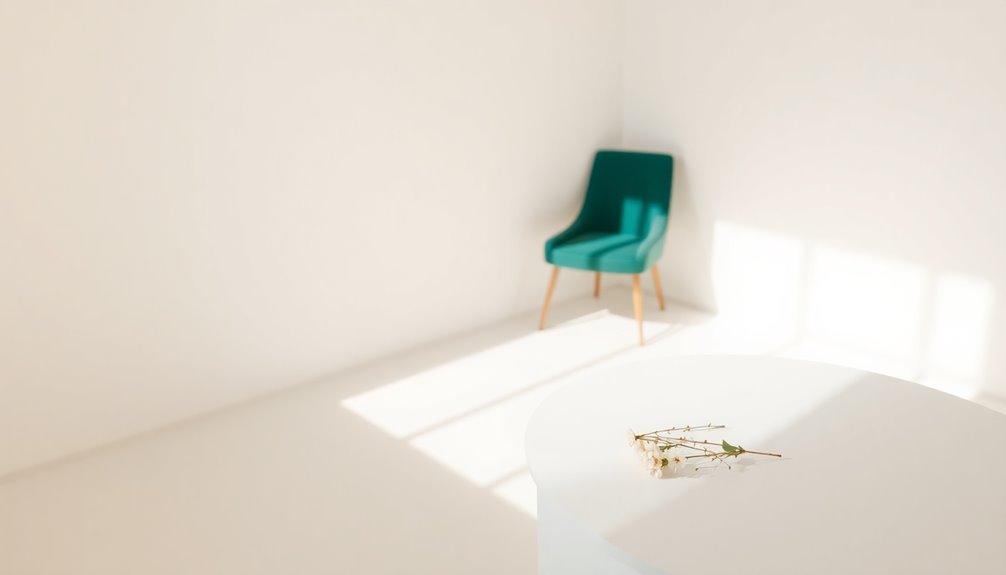
Bold Accents: Energizing and Inspiring Spaces
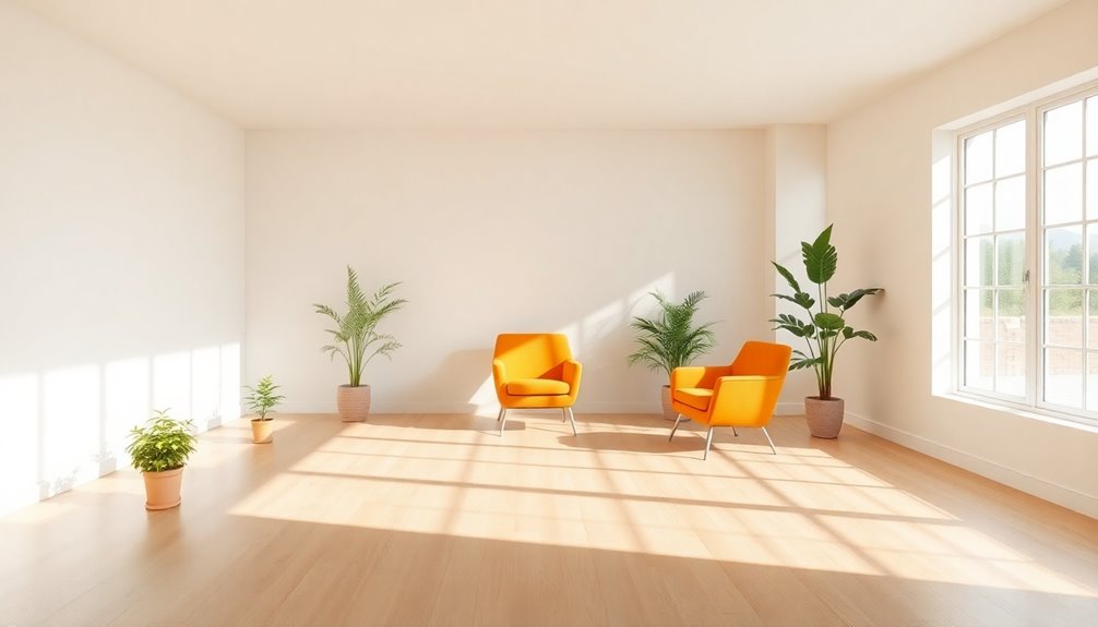
Incorporating bold accents into your minimalist spaces can transform the atmosphere, adding an invigorating spark that stimulates creativity and enthusiasm. These vibrant hues break the monotony of neutral tones and evoke specific emotions, making your environment more dynamic.
Here are some effective ways to use bold accents:
- Accent walls: Paint one wall a striking color like red or yellow to create focal points.
- Furniture pieces: Select chairs or tables in bright colors to draw attention.
- Artwork: Hang eye-catching art that incorporates bold hues for visual interest.
- Accessories: Use cushions, vases, or rugs in vibrant colors to complement your minimalist color palettes.
Incorporating these elements can also align with the trend of sustainable fashion, emphasizing a commitment to eco-friendly choices in your decor.
The Role of Texture in Minimalist Color Schemes
While vibrant colors can energize a minimalist space, texture plays an equally essential role in enhancing its aesthetic. By incorporating various textures, you can add depth and visual interest without compromising the simplicity of your color schemes.
Natural materials like wood and stone introduce warmth and tactile appeal, perfectly complementing the neutral palette typical in minimalist design. Subtle textures in fabrics, such as linen or cotton, provide a softness that enriches the environment while maintaining serenity.
You might also consider simple geometric or abstract patterns to enhance visual interest, but keep them understated to avoid distraction. Tone-on-tone textures or watercolor-inspired prints can elevate the experience, creating a sense of elegance while adhering to the philosophy of simplicity.
Color Psychology: How Different Hues Influence Mood
When you think about color, consider how warm hues like red and yellow can energize and excite you.
In contrast, cool colors such as blue and green create a serene atmosphere that promotes calmness.
Neutrals can also play a key role by providing balance, helping you feel centered amidst vibrant colors. Additionally, incorporating high-fiber ingredients like chia seeds into your diet can enhance your overall well-being and support a positive mood.
Warm Colors Impact Mood
Warm colors like red, orange, and yellow can greatly influence your mood, creating feelings of energy and excitement.
These colors create a sense of enthusiasm, which can enhance social interactions and boost creativity.
Here's how warm colors impact your mood:
- Red: Increases heart rate and can lead to impulsive behavior, effective for stimulating immediate action.
- Yellow: Associated with happiness, but too much can trigger frustration; balance is key.
- Orange: Blends warmth and cheer, promoting creativity and social connection in collaborative spaces.
- Brightness: The psychological impact of saturation matters; highly saturated hues generate excitement, while softer tones create an inviting atmosphere.
Embrace the power of warm colors to uplift your environment and mood! Additionally, incorporating natural elements into your decor can further enhance the overall ambiance and tranquility of your space.
Cool Colors Promote Calm
Cool colors, like blue and green, create a soothing atmosphere that can help you unwind and focus. These hues promote calm, making them perfect for minimalist design. Blue evokes stability and trust, while green symbolizes balance and nature, enhancing your well-being. The psychological impact of cool colors considerably reduces anxiety, fostering comfort in spaces like bedrooms and offices. Regular skin treatments can also boost skin health and amplify the soothing effects these colors provide.
| Color | Psychological Effect | Ideal Spaces |
|---|---|---|
| Blue | Stability and Trust | Offices, Bedrooms |
| Green | Balance and Nature | Wellness Centers |
| Aqua | Serenity and Peace | Relaxation Areas |
| Teal | Invigorating Calm | Creative Spaces |
Incorporating these colors into your environment can transform your mood and encourage mindfulness.
Neutrals Provide Balance
Neutrals serve as a foundation for balance in any space, effortlessly creating a calming environment that enhances relaxation and mental clarity. By incorporating neutral colors like white, gray, and beige, you can achieve a harmonious visual experience that soothes the senses.
Here are four benefits of using neutral palettes:
- Promotes tranquility: Neutral shades symbolize purity and simplicity, fostering a sense of orderliness.
- Reduces cognitive load: A balanced design minimizes distractions, allowing for better focus.
- Adds depth: Subtle variations in neutral tones create interest without overwhelming.
- Enhances accent colors: Neutral backgrounds provide the perfect canvas for vibrant accent colors, elevating visual appeal while maintaining calm.
Incorporating mindfulness techniques can further enhance the calming effects of neutral color schemes.
Embrace neutrals for a serene and balanced atmosphere.
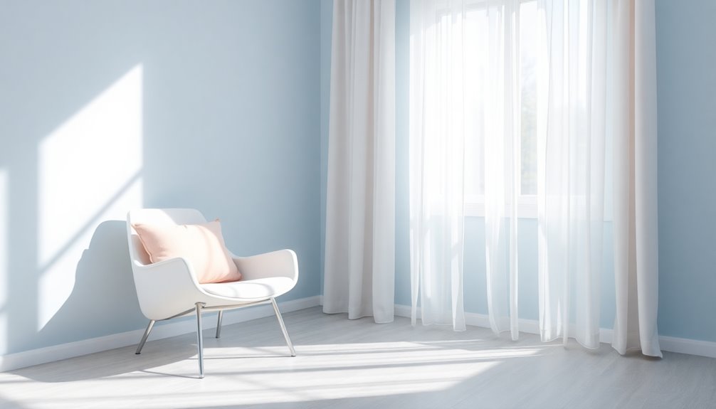
Balancing Light and Color for Optimal Atmosphere
While the right balance of light and color can transform a space, understanding their interplay is crucial for creating the ideal atmosphere.
Natural light enhances the brightness of minimalist color palettes, while artificial lighting can be adjusted to promote a calming mood. By using dimmable fixtures and soft light sources, you can align with the serene qualities of neutral base colors like white, gray, and beige.
These colors reduce visual clutter and enhance focus, contributing to a cohesive environment. Remember, the saturation and brightness of your chosen colors will impact the overall mood; softer tones can induce tranquility, while vibrant hues energize. Additionally, improving indoor air quality through allergen reduction can complement the calming effects of your color choices.
Consistent lighting throughout the day guarantees that your space maintains its intended atmosphere.
Applying Minimalist Color in Different Environments

- Living Rooms: Use soft neutrals like white and light gray to foster relaxation and social interaction.
- Bedrooms: Incorporate soothing colors such as pale blues and gentle greens to create a calming sanctuary for restful sleep.
- Kitchens and Bathrooms: Opt for clean, fresh palettes with white and muted tones to evoke a sense of cleanliness and order.
- Accent Colors: Add subtle muted pastels or earthy tones to enhance visual interest without disrupting the tranquil atmosphere. Additionally, consider using warm color palettes to create a more inviting and cozy atmosphere, especially in a farmhouse bedroom setting.
Experimenting With Minimalist Color Schemes

When you're experimenting with minimalist color schemes, start by choosing neutral base colors to create a calm foundation.
You can then incorporate accent hues to add pops of interest while balancing light and dark elements for depth.
This approach helps you maintain a serene aesthetic while enhancing the overall visual experience.
Choosing Neutral Base Colors
Choosing neutral base colors can transform your space into a serene sanctuary, where relaxation and focus thrive. By incorporating neutral base colors like white, gray, and beige into your minimalist design, you create an environment that minimizes distractions and enhances concentration.
Here are four key benefits of using neutral tones:
- Calming Effect: Neutral colors foster tranquility, promoting a peaceful atmosphere.
- Visual Cohesion: A consistent palette creates a sophisticated and inviting space.
- Depth Without Overwhelm: Soft variations in muted colors add interest without overwhelming the senses.
- Enhanced Focus: The psychological impact of a minimalist design allows for clearer mental processing. Additionally, a clean environment can reduce allergens and pollutants, further contributing to a sense of well-being.
Embrace neutral base colors to cultivate a calming and focused environment that embodies the essence of minimalist living.
Incorporating Accent Hues
Incorporating accent hues into your minimalist color scheme can elevate your space while maintaining its serene essence. Thoughtful color choices are key; select one or two accent colors that complement your neutral base.
Consider muted pastels or earthy tones for subtlety. Contrasting shades like deep greens or soft blues can provide balance and depth. Remember, these accent colors can evoke specific emotions—like a touch of yellow for optimism or a hint of red for energy.
Limiting your accent colors guarantees clarity and focus, adhering to minimalist principles. When used effectively, accent hues not only add character but also guide attention, creating a harmonious atmosphere that supports the mood and purpose of your space.
Balancing Light and Dark
Accent hues play an important role in achieving balance within your minimalist color scheme, but it's the interplay of light and dark that truly elevates the space.
When you're balancing light and dark, consider these key points:
- Incorporate Lighter Shades: Use whites and soft pastels to enhance natural light and create a sense of openness.
- Add Darker Hues: Integrate colors like charcoal or navy for sophistication and grounding.
- Utilize Monochromatic Colors: Experiment with varying shades for harmony—lighter tones promote calmness, while darker tones offer stability.
- Emphasize Architectural Features: Play with contrasts to guide the eye and enhance aesthetics without overwhelming.
Understanding the psychological impact of your color schemes will help create a balanced and inviting atmosphere.
Frequently Asked Questions
What Is the Psychology of Color Palettes?
The psychology of color palettes explores how colors influence your emotions and behaviors.
Warm colors like red and orange can energize you, while cool colors such as blue and green promote calmness.
You might find that certain colors enhance your focus or creativity, impacting your decision-making.
How Do Colors Affect Your Mood in Psychology?
Colors directly influence your mood by triggering emotional responses.
Warm colors like red and yellow can energize you, making you feel happy and excited. In contrast, cool colors such as blue and green often bring a sense of calmness and tranquility.
The brightness of colors also matters; brighter hues can uplift your spirits, while darker shades can evoke sadness.
Understanding these effects can help you choose colors that enhance your emotional well-being.
What Are the 4 Psychological Colors?
Ever wonder how colors can influence your feelings? The four psychological colors you should know are red, blue, yellow, and green.
Red grabs your attention and ignites passion, while blue calms your mind and boosts focus.
Yellow sparks happiness and creativity, though too much can frustrate you.
Green represents balance and health, promoting freshness and tranquility.
Understanding these colors can help you create spaces that resonate with your emotions and enhance your daily life.
What Is the Color Palette of the Minimalist Art Movement?
The color palette of the minimalist art movement mainly features neutral tones like white, gray, and beige.
These colors create a calm and clear atmosphere in the artwork. You'll often see monochromatic schemes, where various shades of a single color emphasize simplicity without overwhelming you.
When accent colors are used, they're usually muted, enhancing the composition while maintaining a sense of tranquility and focus, reflecting the minimalist ethos of "less is more."
Conclusion
Incorporating minimalist color palettes can transform your space and mood considerably. Did you know that 90% of snap judgments made about products are based on color alone? By carefully selecting hues that evoke calm or energy, you can create an environment that resonates with your intentions. Whether you choose soft neutrals or bold accents, the right colors can elevate your surroundings, making your space not just visually appealing but also a true reflection of your emotions.