

The 90‑9‑1 rule helps you balance bold colors with neutrals, making your space look harmonious. About 90% of your room should be neutral, like whites or grays, to keep it calm. Around 9% can support the look with secondary colors, and just 1% is perfect for eye-catching accents that draw attention without overwhelming. Mastering this ratio keeps your decor stylish and cozy—keep exploring to see how this rule can transform your space.
Key Takeaways
- The 90‑9‑1 rule balances neutral, secondary, and bold colors to create harmony in interior design.
- Approximately 90% of a space should be neutral to serve as a calming backdrop.
- About 9% is dedicated to secondary colors that support the overall color scheme.
- Only around 1% should feature bold accents to draw attention without overwhelming.
- Proper application of this rule ensures visual hierarchy, focus, and a cohesive aesthetic.
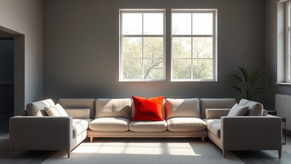
Have you ever noticed how a splash of bold color can transform a room? It’s incredible how just a single accent wall or a few vibrant accessories can change the entire feel of a space. When you understand the principles behind color as an accent, especially the 90‑9‑1 rule, you start to see how strategic pops of color can craft a balanced and engaging environment. At the core of this is the concept of color psychology, which explains how different hues evoke specific emotions and influence perceptions. Using color thoughtfully as an accent allows you to tap into these psychological effects without overwhelming the space. For example, a splash of red can energize a room, while soft blues induce calmness. It’s about selecting the right hue to evoke the mood you want to cultivate, creating an emotional connection that enhances your experience of the space.
The idea of visual hierarchy plays a key role in how you apply color accents. Visual hierarchy guides the viewer’s eye, helping emphasize the most important elements in a room. When you use color as an accent, you’re intentionally creating focal points that draw attention and organize visual flow. For instance, a brightly colored piece of artwork or a vibrant cushion instantly becomes the room’s center of interest. This technique helps prevent visual clutter and directs focus, making your space feel intentional and well-designed. The 90‑9‑1 rule supports this approach by suggesting that your space should be mostly neutral (about 90%), with a small percentage of bold, attention-grabbing accents (around 1%), and a slightly larger portion of secondary, supporting colors (roughly 9%). This balance ensures that the space feels harmonious rather than chaotic, with accents serving as eye-catching highlights that don’t overpower. Incorporating rustic textiles and natural materials can further enhance the warmth and charm typical of farmhouse decor, creating a cozy yet stylish environment.

LANANAS Neutral Couch Throw Pillow Covers 18×18 Inch Set of 4 Decorative Farmhouse Boho Throw Pillows for Living Room, Couch, Bed, Sofa Soft Corduroy Accent Home Decor (Neutral Brown, 18×18 Inch)
COVERS ONLY.
As an affiliate, we earn on qualifying purchases.
As an affiliate, we earn on qualifying purchases.
Frequently Asked Questions
How Do I Choose the Right Accent Colors for My Space?
To choose the right accent colors, consider color psychology to evoke the mood you want, like calm or energy. Use contrasting palettes to create visual interest, pairing bold or complementary hues with neutral base colors. Think about how the accent colors interact with your space’s lighting and furniture. Test small swatches first, and trust your instincts, ensuring the accents enhance your overall design without overwhelming the room.
Can the 90‑9‑1 Rule Work in Small or Cluttered Rooms?
You might think the 90‑9‑1 rule is too strict for small or cluttered rooms, but it actually helps with small space decorating and cluttered space solutions. By sticking to a dominant color, a few accents, and subtle details, you create harmony without overwhelming. Ironically, less is more here, making your space feel larger and organized. So yes, this rule can work wonders, even when space is tight or cluttered.
What Are Common Mistakes When Applying the 90‑9‑1 Rule?
You often overuse accents, making the space chaotic rather than balanced, or neglect harmony by choosing colors that clash. This disrupts the intended subtlety of the 90‑9‑1 rule. To avoid mistakes, guarantee accents complement the main color palette and don’t overpower the room. Focus on creating a cohesive look, with accents enhancing, not dominating, the space’s overall harmony and visual appeal.
How Does Lighting Affect Color Accents and Their Impact?
Lighting effects can dramatically alter how your color accents are perceived, creating surprises you didn’t expect. Bright or dim lighting shifts color perception, making accents more vibrant or subdued. Shadows and highlights add depth, emphasizing or hiding details. You must carefully consider lighting because it influences the impact of your accents, ensuring they enhance your space rather than diminish it. A well-planned lighting scheme transforms subtle accents into enchanting focal points.
Are There Any Cultural Considerations When Selecting Accent Colors?
When selecting accent colors, consider cultural symbolism and regional preferences to avoid misunderstandings or offense. You might find that certain hues carry specific meanings or evoke strong emotions in different cultures. For example, red symbolizes luck in China but can signify danger elsewhere. Being aware of these cultural nuances guarantees your color choices resonate positively and respect local traditions, making your space more welcoming and meaningful.

KILZ TRIBUTE Paint & Primer, Interior, Color Sample, Vintage Indigo, 8 Ounces
PAINT + PRIMER: KILZ TRIBUTE is a low VOC, 100% acrylic advanced technology paint and primer in one…
As an affiliate, we earn on qualifying purchases.
As an affiliate, we earn on qualifying purchases.
Conclusion
By sprinkling color like a dash of spice, you turn a plain canvas into a vibrant masterpiece. The 90-9-1 rule guides your hand, ensuring your design sings with harmony and balance. Embrace color as your accent, a subtle whisper that sparks excitement and depth. When you master this dance, your space transforms into a symphony of visual delight—where every hue plays its part, creating a melody that captures the eye and stirs the soul.

Primitives by Kathy Cowgirls Keep Together Kitchen Towel
COTTON TOWEL: Kitchen towel is made with soft absorbent cotton
As an affiliate, we earn on qualifying purchases.
As an affiliate, we earn on qualifying purchases.

Der Rose Set of 2 Succulents Plants Artificial Mini Fake Succulents Plants for Office Desk Accessories for Women Pink Home Vanity Decor
Cute Pink Accessories: This set of 2 packs office desk decorations for women comes with the 2.2" (about…
As an affiliate, we earn on qualifying purchases.
As an affiliate, we earn on qualifying purchases.