

To create minimalist infographics, focus on simplicity and clarity. Choose a limited color palette of 3-5 harmonious colors to enhance understanding. Utilize white space effectively to boost readability and focus attention on key elements. Select legible sans-serif fonts, keeping sizes appropriate. Incorporate simple icons that visually represent data, and distill key messages for impact. Finally, guarantee logical information flow to guide your audience smoothly. You'll discover even more tips to refine your designs and make them shine!
Key Takeaways
- Focus on simplicity by reducing clutter and emphasizing essential elements for clear communication.
- Choose a limited color palette of 2-4 harmonious colors to enhance visual appeal and consistency.
- Utilize ample white space to improve readability and guide the viewer's attention effectively.
- Select legible sans-serif fonts and maintain a consistent font size to ensure easy comprehension.
- Organize information logically with clear headings and visual cues to guide the viewer's eye through the content.
Understanding Minimalist Design Principles

When you embrace minimalist design principles, you focus on simplicity and clarity. By reducing clutter, you highlight essential elements that enhance readability and comprehension.
Effective use of whitespace is key; it creates visual hierarchy and guides your viewer's eye to important information. You'll notice that a strong contrast between text and illustrations is vital, ensuring clarity and preventing visual confusion.
When designing infographics, choose custom icons and illustrations that convey specific information succinctly. This way, you enhance your overall message without adding unnecessary complexity. Additionally, maintaining high-quality content is crucial as it establishes credibility and keeps your audience engaged.
Choosing a Limited Color Palette

When you're choosing a limited color palette, consider how colors can affect emotions and perceptions. Aim for a harmonious combination that not only looks good but also reinforces your message. Consistency is key; sticking to your selected colors throughout the design will guide the viewer's eye and enhance understanding. Additionally, using customer sentiment analysis can help you determine which colors resonate best with your target audience.
Psychological Impact of Color
A carefully chosen color palette can greatly influence how your audience perceives and engages with your infographic. The psychological impact of color is significant; for instance, blue often evokes calmness and trust, while red can create urgency or excitement.
By utilizing a limited color palette, you enhance visual clarity and focus, making it easier for your viewers to process information. Research shows that infographics with three to five colors are more aesthetically pleasing and effective than those with complex color schemes.
High contrast between text and background boosts readability, improving comprehension by up to 80%. Consistent color use across your infographic helps reinforce brand identity, making your message more memorable and engaging for your audience. Additionally, incorporating traditional tea ceremonies can provide a unique cultural context that enhances the story your infographic tells.
Harmonizing Color Combinations
Choosing a limited color palette not only enhances the visual appeal of your infographic but also makes it easier for your audience to process information. Aim for 2-4 colors to achieve visual harmony and reduce cognitive load.
Consider using analogous colors for a serene look or complementary colors for striking contrast that highlights key elements. Remember, color psychology plays an essential role; blue conveys trust, while red evokes urgency.
Consistency is key, so use the same shades for similar data points to reinforce connections and improve clarity. Tools like Adobe Color or Coolors can help you create aesthetically pleasing and functional color schemes that guarantee your infographic is both visually appealing and effective in communication. Additionally, incorporating a cohesive color palette can enhance the overall design and ensure a seamless flow of information.
Consistency Across Design Elements
To create a visually appealing infographic, consistency across design elements is essential, as it helps your audience quickly grasp the information.
A limited color palette of 3 to 5 colors enhances visual cohesion while reducing clutter. When you maintain color consistency throughout charts, icons, and backgrounds, you make it easier for viewers to interpret the data.
Use a color wheel to select complementary or analogous colors that work well together. Incorporating neutral shades like whites, grays, or blacks can balance brighter colors, ensuring key data points stand out. Additionally, consider lighting design to enhance the overall ambiance of your infographic, making it more inviting and engaging for the audience.
Utilizing White Space Effectively

White space is essential in your infographics, as it helps enhance readability and keeps your audience focused. By balancing visual elements with empty space, you can create a clean design that guides attention to key information. Incorporating bold colors for accent walls can also draw attention to important areas within your infographic, making it visually appealing.
Importance of White Space
Effective use of white space is vital in creating impactful infographics. This negative space enhances readability, giving your audience visual breathing room that can boost comprehension by up to 20%.
By strategically placing white space, you guide the viewer's eye to important information, making it easier for them to identify key messages and statistics. Infographics with adequate white space are perceived as more professional and engaging, resulting in a 30% increase in viewer retention.
Consistent white space around text and elements helps create a balanced layout, reducing visual clutter and enhancing aesthetic appeal. In fact, research shows that ideal white space can improve user interaction rates by up to 50% on digital platforms, making it a vital aspect of effective graphic design. Additionally, understanding nutritional composition can help convey health-related information more effectively in your designs.
Balancing Visual Elements
While designing minimalist infographics, balancing visual elements is essential for delivering a clear message.
Utilizing white space effectively enhances readability, allowing your viewer's eyes to rest and focus on key points. This not only improves comprehension but also strengthens the visual hierarchy by emphasizing important information.
Aim for a ratio of at least 30% white space to overall content to create a harmonious layout. By eliminating clutter, you guide the viewer's attention to focal points, increasing engagement by up to 20%.
A well-organized presentation of data leads to a clearer understanding, making your infographic more memorable. Additionally, incorporating full sustained attention during the design process can further enhance your creativity and the overall impact of your infographic.
Enhancing Readability and Focus
When designing your infographic, utilizing white space strategically can greatly enhance readability and focus.
By placing adequate white space around text and images, you prevent visual clutter, allowing viewers to concentrate on your key messages. Research shows that infographics with sufficient white space can boost viewer engagement by up to 20%, thanks to improved clarity and aesthetic appeal.
This negative space creates a visual hierarchy, directing the viewer's eye to the most critical information and simplifying complex data. By highlighting important statistics through effective white space, you make them stand out prominently.
A balanced approach not only supports comprehension but also conveys professionalism and thoughtfulness in your infographic design, ensuring your audience stays engaged and informed. Additionally, embracing the transformative power of curiosity can inspire innovative design choices and enhance your overall infographic effectiveness.
Selecting Readable Fonts

Choosing the right fonts can make or break your infographic's readability. When selecting readable fonts, opt for sans-serif options like Arial or Helvetica for the body text, as they're easier to read on screens, particularly at smaller sizes.
Stick to a minimum font size of 12 points for body text, using larger sizes (16-24 points) for headings to establish a clear hierarchy. Limit your choices to two or three fonts to maintain consistency and avoid visual clutter in your infographic templates.
Use bold or italic styles sparingly to highlight key information without overwhelming your design. Finally, verify there's enough contrast between your font color and background, like dark text on a light background, to enhance readability considerably. Additionally, ensure your design aligns with budget planning principles to effectively communicate financial information.
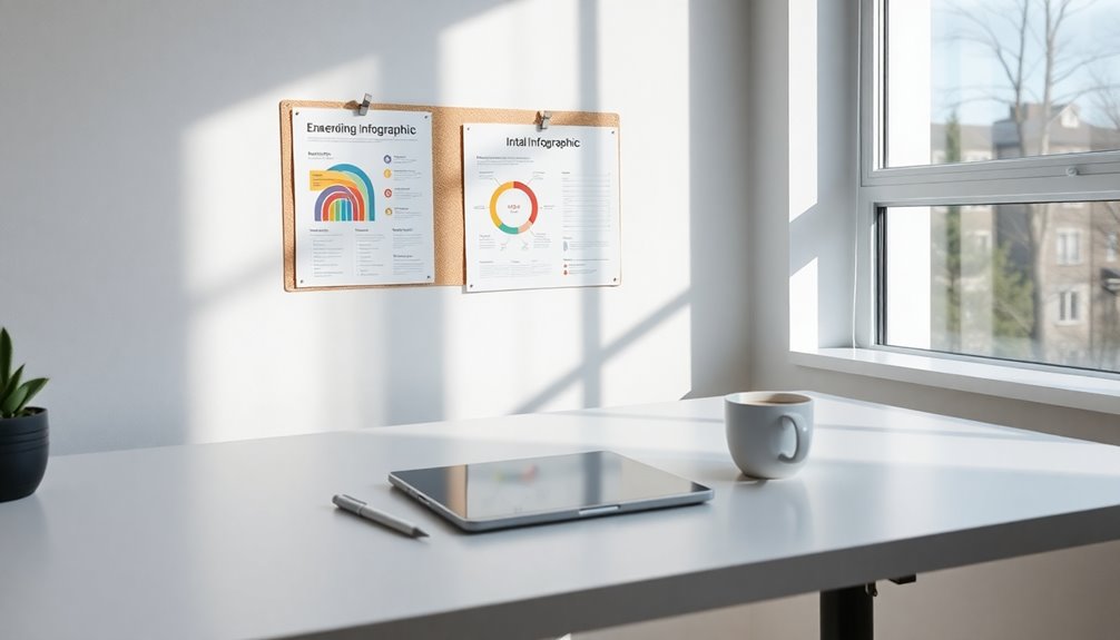
Incorporating Simple Icons and Illustrations
Incorporating simple icons and illustrations can elevate the effectiveness of your minimalist infographic by providing clear visual cues that enhance understanding.
When you design your infographic, choose icons that visually represent specific data points; for instance, use transportation symbols in a transport statistics infographic. This approach helps convey complex information without overwhelming your audience.
Stick to a limited color palette for your icons to create a cohesive look that maintains visual appeal. Consistency in design—like stroke width, style, and size—ensures a professional feel, aiding viewer comprehension.
Focusing on Key Messages
To effectively communicate your message in a minimalist infographic, distilling information down to its essence is essential. Focus on key messages that convey the most important information while avoiding overwhelming your audience.
Use bold typography and high-contrast colors to make these messages stand out. Organize your content hierarchically, guiding the viewer's eye towards what matters most.
- Employ visual elements like icons or simple charts to reinforce key messages.
- Regularly revisit and refine your key messages during the design process.
- Make certain that your final infographic communicates your intended message clearly.
Ensuring Logical Information Flow

While crafting a minimalist infographic, guaranteeing a logical flow of information is essential for effective communication.
Start by organizing information in a logical sequence, grouping related data together so each section naturally leads to the next. Use headings and subheadings to create a clear hierarchy, allowing viewers to navigate the content with ease.
Organize your infographic logically, grouping related data and using headings for easy navigation.
Incorporate visual cues like arrows or lines to guide the viewer's eye, making the flow intuitive and engaging. Keep text concise, focusing on key points and statistics that support your main message without overwhelming the viewer.
Finally, test the flow by gathering feedback from peers or your target audience, adjusting the layout as necessary to guarantee a smooth and logical progression throughout your infographic.
Reviewing and Refining Your Design

As you finalize your minimalist infographic, reviewing and refining your design is essential to guaranteeing it effectively communicates your message.
Start by checking for spelling and grammatical errors, and guarantee clarity in your information presentation. Seek feedback from peers or your target audience to identify areas for improvement.
Consider these key aspects during your review:
- Make necessary adjustments based on constructive criticism, focusing on readability and visual impact.
- Test your infographic with a sample audience to gauge reactions and comprehension.
- Finalize design elements to guarantee consistency in colors, fonts, and spacing.
Frequently Asked Questions
What Are the 7 Steps in Creating an Infographic?
To create an infographic, start by defining your purpose and audience.
Next, gather relevant data from credible sources.
After that, sketch a wireframe to plan your layout.
Then, design visually appealing elements, choosing colors, typography, and icons that enhance readability.
Once you've created the infographic, review and revise it for clarity and impact.
Finally, seek feedback from peers before finalizing it for publication and promotion.
What Are the 5 Elements of an Infographic?
When you're designing an infographic, focus on five key elements.
First, gather credible data that supports your message.
Next, use visual elements like charts and icons to enhance understanding.
Make certain your message is clear and targeted, guiding viewers through the information.
Organize your layout logically to create a smooth flow.
Finally, include a call to action to encourage engagement, whether that's sharing or exploring more about the topic.
Can Chatgpt Create Infographics?
Think of ChatGPT as your brainstorming buddy, but it can't whip up infographics directly.
It helps you spark ideas, structure your content, and refine key messages. You can gather best practices for minimalist design and data presentation, but the actual graphic creation? That's up to your hands and design software.
Use tools like Canva or Illustrator to bring your vision to life, while ChatGPT guides you every step of the way!
What Are the 5 Easy Steps to Make an Infographic?
To create an infographic, start by choosing your topic and gathering reliable data.
Next, sketch a wireframe layout to organize your text and visuals.
Once that's set, pick a design style and color scheme that enhances readability.
Incorporate clear and concise text with engaging visuals to simplify complex information.
Finally, review your work, revise for clarity, and seek feedback to guarantee it connects with your audience before sharing it.
Conclusion
As you commence your journey to create minimalist infographics, remember that less truly is more. By stripping away the clutter, you reveal the essence of your message, like a sculptor revealing a masterpiece from a block of marble. Embrace simplicity, harness color wisely, and let white space breathe life into your design. With each choice, you'll craft visuals that not only inform but also resonate. So go ahead—let your creativity flow and watch your ideas take flight!