To create a calm dashboard that helps you focus, prioritize simplicity and clarity. Use soft color palettes, minimalistic visuals, and only display the most relevant data. Avoid clutter by reducing unnecessary information, which keeps your attention on what truly matters. Well-designed visuals make data intuitive and less overwhelming, boosting confidence and decision-making. Keep exploring these design principles to craft dashboards that foster calmness and enhance productivity every step of the way.
Key Takeaways
- Use minimalist layouts with limited color palettes to reduce visual clutter and enhance focus.
- Highlight only essential metrics to prevent information overload and streamline decision-making.
- Incorporate gentle visuals, soft colors, and subtle animations to create a calming user experience.
- Organize data intuitively, emphasizing clarity and ease of navigation for better engagement.
- Prioritize simplicity and intentional design to foster confidence and maintain user attention.

Have you ever felt overwhelmed by the constant influx of information and distractions that pull your attention away from what truly matters? It’s a common experience in today’s fast-paced digital world. That’s where calm dashboards come in. They’re designed to help you focus by presenting data visualization in a way that’s clean, simple, and free of unnecessary clutter. Instead of bombarding you with endless charts and metrics, calm dashboards streamline information, highlighting only what’s essential. This approach reduces cognitive overload, allowing you to process data more efficiently and make better decisions. When your dashboard emphasizes clarity over complexity, user engagement naturally increases. You’re more likely to stay attentive and motivated because the visuals invite interaction rather than discourage it.
Calm dashboards reduce overload and boost focus by highlighting only what truly matters.
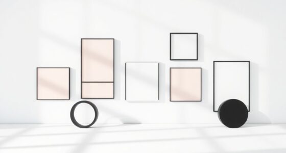
Data visualization plays a vital role in creating these calming interfaces. Instead of overwhelming you with a jumble of colors and shapes, calm dashboards employ thoughtfully chosen visuals that are easy on the eyes. Soft color palettes, minimalistic graphs, and subtle animations help guide your focus without startling you. The goal isn’t just to display data but to do so in a way that encourages continuous engagement without fatigue. Clear and vibrationally aligned visuals also help foster a sense of harmony and focus. When the visuals are intuitive and well-organized, you spend less time deciphering information and more time understanding trends or uncovering insights. This seamless user experience keeps you engaged and fosters a sense of control over your data environment.
Moreover, calm dashboards prioritize simplicity in layout and design. They avoid busy dashboards filled with numerous metrics and instead present only the most relevant information at a glance. This intentional minimalism prevents distraction and helps you stay aligned with your goals. When you see only what’s necessary, your brain doesn’t have to work overtime filtering out noise. As a result, your focus sharpens, and your ability to interpret data improves. This clarity boosts user engagement because you feel more confident navigating your dashboard, which encourages you to explore further without feeling overwhelmed.
In essence, calm dashboards serve as a quiet, steadying force in your digital workspace. They leverage effective data visualization techniques to foster clarity, reduce stress, and promote continuous focus. When designed well, they transform an overload of information into an accessible, engaging experience. Instead of throwing everything at you all at once, they gently guide your attention to what matters most. That’s how you stay calm, focused, and in control of your data, making your work more productive and less stressful.

QMYOP Computer Monitor Decor Figurines, Computer Monitor Decor, Car Dashboard Decorations 6 PCS Cute Critters (YY)
【MATERIAL】: The computer monitor decor figurines is made of high quality resin material, durable, wear-resistant and environmentally friendly,…
As an affiliate, we earn on qualifying purchases.
As an affiliate, we earn on qualifying purchases.
Frequently Asked Questions
How Can I Customize Dashboards for Individual Team Members?
You can customize dashboards for individual team members by exploring the platform’s personalization options, allowing you to tailor views to each person’s needs. Adjust widgets, filters, and layouts based on their roles and preferences, ensuring user accessibility is optimized. Regularly gather feedback to refine these settings, making each dashboard more intuitive and focused. This personalized approach boosts productivity and keeps team members engaged with relevant, accessible information.
What Are the Best Tools for Creating Calm Dashboards?
You can create calm dashboards using tools like Tableau, Power BI, or Google Data Studio, which emphasize clean visual design and easy customization. These tools help reduce clutter, enhance user engagement, and foster focus by offering intuitive interfaces and visual clarity. By choosing the right tool, you guarantee your dashboards remain serene and user-friendly, minimizing distractions and improving overall data comprehension for your team.
How Do I Measure the Effectiveness of a Focus-Oriented Dashboard?
You measure the effectiveness of a focus-oriented dashboard by tracking user engagement and evaluating visual clarity. Observe how often users interact with key metrics and whether they complete tasks efficiently. Conduct user feedback sessions to gauge their understanding and comfort. Clear visuals help users interpret data quickly, so monitor if users spend less time deciphering information and more time making informed decisions, indicating the dashboard’s success.
Can Calm Dashboards Be Integrated With Existing Project Management Tools?
You can definitely integrate calm dashboards with existing project management tools; it’s all about dashboard integration and tool compatibility. While some platforms offer seamless connections, others may require custom solutions or APIs. You’ll want to check if your project management software supports third-party integrations or has compatible plugins. By doing this, you guarantee your focus-oriented dashboard complements your workflow without disrupting your productivity.
What Are Common Mistakes to Avoid When Designing Focus-Driven Dashboards?
You should avoid visual clutter by keeping your dashboard simple and focused, using only essential data. An inconsistent layout can confuse users, so maintain a uniform structure throughout. Don’t overload your dashboard with too many colors or fonts, as it distracts from the main purpose. Instead, prioritize clarity and consistency to create a calm, focused environment that helps users concentrate on what’s important.
calm color palette desktop background
As an affiliate, we earn on qualifying purchases.
As an affiliate, we earn on qualifying purchases.
Conclusion
By designing dashboards that prioritize simplicity and reduce distractions, you create a focused environment that enhances decision-making. For example, a startup streamlined its sales dashboard, removing clutter and highlighting key metrics. As a result, their team quickly identified trends and responded faster. When you apply these principles, you’ll foster clarity and concentration, empowering users to stay engaged and make smarter choices. Focused dashboards aren’t just aesthetic—they’re essential for effective, mindful data-driven work.

WALI Computer Monitor Stand for Desk, Adjustable Laptop Riser, Desk Monitor Stand Underneath Storage for Office, Home, School Supplies (STT003), 1 Pack, Black
Design: The monitor stand for the desk has a large 14.6 x 9.3 inches metal shelf that fits…
As an affiliate, we earn on qualifying purchases.
As an affiliate, we earn on qualifying purchases.
subtle animated UI elements
As an affiliate, we earn on qualifying purchases.
As an affiliate, we earn on qualifying purchases.