
To make your design more impactful, limit yourself to just a few well-chosen fonts. Using too many fonts can overwhelm your audience and create confusion, while a curated selection improves clarity and visual hierarchy. Pair serif with sans-serif fonts to highlight important sections and guarantee readability across sizes and mediums. By embracing restraint and choosing fonts strategically, you boost professionalism and make your message stand out—discover more tips to refine your typography approach as you continue.
Key Takeaways
- Using fewer fonts reduces clutter, enhances clarity, and directs focus on key messages.
- Pairing 2-3 complementary fonts creates a balanced hierarchy and improves content comprehension.
- Contrasting serif and sans-serif fonts adds visual interest while maintaining readability.
- Consistent font choices streamline editing and foster a cohesive, professional brand identity.
- Prioritizing legible, well-chosen fonts ensures effective communication with maximum impact.
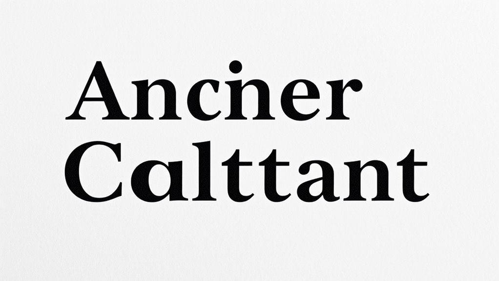
When it comes to creating effective designs, using too many fonts can dilute your message and overwhelm your audience. Many designers fall into the trap of selecting a variety of typefaces, thinking it will make their work more dynamic. However, this approach often leads to clutter and confusion. Instead, focusing on font pairing—the art of combining two to three complementary fonts—can streamline your design and enhance readability improvements. By choosing fonts that harmonize well, you create a clean visual hierarchy that guides viewers effortlessly through your content.
A key to successful font pairing is understanding contrast. Pair a serif font with a sans-serif for a balanced look that emphasizes important sections without sacrificing clarity. For example, use a sturdy serif for headings to grab attention, while opting for a simple, easy-to-read sans-serif for body text. This contrast not only makes your design more visually appealing but also improves readability, ensuring your message comes across clearly. Keep in mind that the goal is to create a cohesive visual flow, not to showcase every font you like. When you limit your font choices, each one has space to shine, making your design more impactful.
Readability improvements happen when you select fonts that are legible across different sizes and mediums. Avoid overly decorative or thin fonts that strain the eyes, especially in smaller text. Instead, choose fonts with enough weight and clarity, so that your audience can easily consume your content without effort. Additionally, choosing fonts that align with the dog breed’s characteristics can help reinforce your message and create a more tailored visual identity. Consistency is essential. Use the same font styles for similar content, and reserve bold or italics for emphasis. This consistency reinforces your message and keeps the design unified, avoiding the chaos that multiple, mismatched fonts can bring.
Furthermore, sticking to fewer fonts simplifies the editing process. When you’re not juggling numerous typefaces, making adjustments becomes quicker and less complicated. It also helps maintain brand cohesion, as your visual identity remains clear and recognizable. Remember, simplicity doesn’t mean boring. Thoughtful font pairing and deliberate font choices can create a sophisticated and professional look that commands attention. The fewer fonts you use, the more space you create for your content to breathe, allowing your message to resonate more powerfully.
In the end, restraint is your best tool. By focusing on font pairing and prioritizing readability improvements, you craft designs that are clear, elegant, and memorable. Less truly is more when it comes to typography—your audience will thank you for it.

LG 34WR55QK-B 34-inch UltraWide WQHD (3440 x 1440) Curved Computer Monitor, 100Hz, 5ms, HDR10, Reader Mode, HDMI, DisplayPort, USB Type-C, Tilt/Height Adjustable Stand, Black
21:9 UltraWide - The 21:9 UltraWide WQHD (3440 x 1440) monitor is great for work. The widescreen allows...
As an affiliate, we earn on qualifying purchases.
Frequently Asked Questions
How Do I Choose the Right Fonts for My Brand Identity?
To choose the right fonts for your brand identity, start by considering your brand’s personality and target audience. Use font pairing strategies to combine contrasting yet complementary fonts that enhance readability and visual appeal. Keep branding consistency in mind by limiting your font choices to maintain a cohesive look across all platforms. Test your selections in different contexts, ensuring they reflect your brand’s tone and resonate with your audience effectively.
What Are Common Mistakes to Avoid When Limiting Fonts?
Avoid font overload by sticking to just a few typefaces, which keeps your design clean and focused. Be mindful of inconsistent hierarchy; use size, weight, and style consistently to guide your audience smoothly through your content. Don’t mix too many fonts or styles, as it confuses readers and weakens your message. Keep it simple, intentional, and cohesive, ensuring your typography enhances rather than distracts from your brand.
How Can Typography Influence User Experience and Readability?
They say “a picture is worth a thousand words,” and the same applies to typography. Your font choices directly impact user experience and readability by influencing font psychology and guiding attention. By following readability best practices—like choosing clear fonts and appropriate sizes—you make content easier to scan and understand. Good typography creates an intuitive flow, making your message more compelling and ensuring users stay engaged.
Are There Specific Font Combinations That Always Work Well Together?
Yes, certain font combinations follow pairing principles that guarantee font harmony. You should pair a serif with a sans-serif for contrast and clarity, like Georgia with Helvetica. Stick to two or three fonts to maintain consistency and avoid clutter. Pay attention to weight, style, and size differences to create visual balance. When you follow these pairing principles, your typography will look cohesive and professional, enhancing user experience and readability.
How Do I Ensure My Typography Remains Accessible Across Devices?
Think of your typography as a bridge connecting users to your content. To keep it accessible across devices, you need to focus on responsive scaling, ensuring fonts adjust smoothly to different screens. Use accessibility testing tools to identify issues, like small text or poor contrast, and fix them promptly. This approach guarantees your message remains clear and inclusive, no matter what device your audience uses.

LG 34" Curved UltraWide WQHD(3440x1440) Smart Monitor with HDR10 99% sRGB, 100Hz, Magic Remote, AirPlay 2 & Adjustable Stand, webOS
Work Smart, Play Smart on a 21:9 Smart Screen - LG Smart Monitor is designed for multitasking while...
As an affiliate, we earn on qualifying purchases.
Conclusion
By choosing fewer fonts, you create a visual harmony that guides your audience effortlessly, like a well-tuned orchestra. When your typography speaks with clarity and purpose, every word resonates, making your message unforgettable. It’s no coincidence that simple, impactful design often feels natural and compelling. So, embrace restraint and watch your message bloom, like a quiet garden suddenly bursting with color—powerful, deliberate, and impossible to ignore.

SAMSUNG 34" ViewFinity S50GC Series Ultra-WQHD Monitor, 100Hz, 5ms, HDR10, AMD FreeSync, Eye Care, Borderless Design, PIP, PBP, LS34C502GANXZA, 2023, Black
DO MORE ON ONE SCREEN: See every detail on the wider display featuring a 21:9 aspect ratio; Ultra...
As an affiliate, we earn on qualifying purchases.

LEVOIT OasisMist 1000S (10L) Smart Humidifier for Home Large Room Bedroom, Last 100 Hours Suitable for Indoor Plant, Cover up to 600ft², Easy Top Fill, Remoter & Voice Control, Auto Mode, Quiet, White
𝙎𝙪𝙥𝙚𝙧-𝙡𝙤𝙣𝙜 100 𝙃𝙤𝙪𝙧𝙨, 𝙀𝙣𝙘𝙤𝙪𝙣𝙩𝙚𝙧 𝙔𝙤𝙪𝙧 𝙊𝙖𝙨𝙞𝙨: Maximize your time and minimize refills with the humidifier's extended 100-hour runtime,...
As an affiliate, we earn on qualifying purchases.