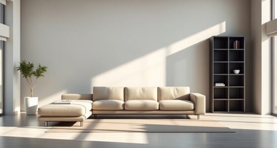

To create calm layouts, use a well-structured grid system that guides your viewers’ eyes smoothly across the content. Focus on balanced placement of elements, incorporating white space to prevent clutter and foster a sense of harmony. Responsive grids ensure your design feels peaceful on any device. Mastering these principles helps you craft layouts that are both visually balanced and easy to navigate. Keep exploring to learn how to implement these techniques effortlessly.
Key Takeaways
- Use consistent, evenly spaced grid structures to promote visual harmony and calmness.
- Incorporate ample white space within grids to reduce clutter and enhance readability.
- Prioritize balanced element placement to distribute visual weight evenly across the layout.
- Employ responsive grid frameworks to maintain stability and cohesiveness across devices.
- Design with intentional, deliberate positioning to create a serene, uncluttered user experience.

Have you ever wondered how designers create balanced and organized layouts? The secret often lies in the strategic use of grid systems. These systems serve as invisible frameworks that guide the placement of elements, ensuring your design feels harmonious and easy to navigate. When you understand how to leverage grids effectively, you can produce layouts that are both visually balanced and adaptable across various devices. This is where the concepts of visual balance and responsive design come into play, working together to craft calm, polished pages.
Visual balance is the cornerstone of a well-structured layout. It’s about distributing visual weight evenly across your design so that no single element feels out of place or overwhelming. Grid systems help achieve this by providing a structured arrangement of columns and rows, which act as guides for positioning content. When elements align to a grid, your design naturally feels more stable and cohesive. Whether you’re working with images, text blocks, or buttons, placing them within the grid’s framework ensures they complement each other rather than compete for attention. This balance makes your layout feel calm and inviting, encouraging users to focus without distraction.
Responsive design adds another layer of sophistication. As more people access websites on a variety of devices — from desktops to smartphones — your layout must adapt seamlessly. Grid systems excel here because they’re inherently flexible. Modern CSS grids and frameworks like Bootstrap allow you to set up a single grid that adjusts itself based on screen size. This means your design maintains its visual balance regardless of the device, without needing separate layouts for each. You might set up a grid with multiple columns for desktop views, then let those columns stack into single columns for smaller screens. This fluidity ensures your content remains organized and visually pleasing, fostering a sense of calm even as the viewing environment changes.
In practice, using grid systems for calm layouts involves more than just dividing the space. It’s about intentional placement. You choose your grid’s structure thoughtfully, considering how much white space you want around elements and how to guide users’ eyes naturally across the page. By aligning content to the grid, you create a visual rhythm that’s easy to follow. This consistency reduces visual clutter and makes your site feel serene and professional.
Additionally, understanding the visual balance and how to achieve it through grids allows you to craft layouts that are not only aesthetically pleasing but also functional. Ultimately, mastering grid systems means you’re designing with intention. You’re ensuring that your layout is balanced visually and adaptable for any device, creating a calm and user-friendly experience. When you harness the power of grids, you craft designs that are not only beautiful but also functional and easy to maintain. This approach results in layouts that evoke calmness, clarity, and confidence—exactly what every good design should do.

Big Berkey Gravity-Fed Stainless Steel Countertop Water Filter System 2.25 Gallon with 2 Authentic Black Berkey Elements BB9-2 Filters
ENJOY GREAT-TASTING TAP WATER EVERY DAY AT HOME- The 2.25-gallon Big Berkey System can be used on a...
As an affiliate, we earn on qualifying purchases.
Frequently Asked Questions
How Do Grid Systems Enhance User Experience in Calming Layouts?
Grid systems enhance your user experience in calming layouts by creating visual harmony, making content easier to process. They organize elements systematically, reducing clutter and guiding the eye smoothly across the design. This structure promotes cognitive ease, helping users feel more relaxed and focused. As a result, your audience can navigate your site effortlessly, fostering trust and comfort while engaging with your content.
What Are Common Mistakes to Avoid When Designing With Grid Systems?
Did you know that 60% of users leave websites due to poor layout? When designing with grid systems, avoid common mistakes like alignment issues and overcomplication. Focus on consistent spacing and simple structures, as cluttered designs create confusion. Be mindful of breaking grid rules unnecessarily, which can disrupt flow. Keep your layout clean and aligned to guarantee a calming, user-friendly experience that retains visitors.
Which Grid System Is Best for Mobile Versus Desktop Layouts?
For mobile layouts, you should use a flexible, single-column grid to guarantee responsive design and maintain a clear visual hierarchy. On desktops, a multi-column grid works best, providing structure and balance. You actively adapt your grid system based on screen size, ensuring content remains accessible and visually appealing. This approach helps you create calm, organized layouts that enhance user experience across all devices.
How Do Grid Systems Influence Website Accessibility and Readability?
Grid systems galvanize grid-guided greatness, giving your site structure and style. They enhance accessibility by ensuring typography clarity, making text easy to read, and improve readability through consistent spacing. Plus, they help maintain ideal color contrast, so users with visual impairments can navigate comfortably. By providing predictable patterns, grid systems promote inclusive experiences, ensuring everyone can access and enjoy your website with ease and enjoyment.
Can Grid Systems Be Customized for Unique Branding Requirements?
Yes, you can customize grid systems to fit your branding requirements, enhancing your visual identity and offering branding flexibility. By adjusting grid parameters like column widths, spacing, and alignment, you guarantee your layout reflects your unique style while maintaining structure. This customization helps create a cohesive look that resonates with your audience, making your website stand out and reinforcing your brand’s personality through tailored design elements.

8-Stage Gravity Water Filtration System 3.0 Gallon-304 Stainless Steel Countertop System with 4 Filters and StandReduce 99.9% Chlorine, NSF/ANS 42 Certifcation
Powerful 8-Stage Purification System — IceJoy water purifier boasts a powerful 8-stage filtration system designed to reduce 99.9%...
As an affiliate, we earn on qualifying purchases.
Conclusion
Think of grid systems as the steady heartbeat of your calm layouts, guiding your design like a trusted compass through a sea of chaos. They anchor your ideas, creating harmony and balance that soothe the eye and mind. With grids as your foundation, your designs flow effortlessly, like a gentle river carving its path. Embrace these frameworks, and watch your layouts become tranquil landscapes where every element finds its perfect place.
Membrane Solutions UV Countertop Water Filtration System, Stainless Steel 2.25G Gravity Water Filter with 3 Pack 0.1-Micron UF Filters, for Home, Camping, and RVing (U3P)
Experience a Water Filtration Revolution: Our exclusive stainless steel countertop water filter with built-in UV Smart System. The...
As an affiliate, we earn on qualifying purchases.

Purewell 3-Stage 0.01μm Ultra-Filtration Gravity Water Filter System, 304 Stainless Steel Countertop System with 2 Filters, Metal Water Level Spigot and Stand, Reduce 99% Chlorine, 2.25G, PW-OB-K
3-Stage Filtration - The Purewell gravity water filter system adopts a composite filter technology, can reduce most contaminants....
As an affiliate, we earn on qualifying purchases.