
Think about a simple apple. Its clean lines and bold color draw you in, much like the minimalist logos that define some of the world's most powerful brands. Each logo tells a story, revealing deeper meanings behind their straightforward designs. But what makes these symbols so impactful? As we explore the narratives behind iconic logos, you might find surprising connections that elevate your understanding of branding and identity.
Key Takeaways
- Apple's logo evolved from a complex design to a sleek silhouette, symbolizing innovation and creativity with its distinctive bite.
- Nike's Swoosh represents speed and athleticism, allowing diverse applications and becoming synonymous with the brand's identity.
- MasterCard's interlocking circles emphasize unity in financial transactions, with a redesigned color scheme enhancing visibility and brand recognition.
- Target's minimalist bullseye logo captures attention and symbolizes focus, using effective white space for clarity and legibility.
- Uber's monochrome logo reflects efficiency and professionalism, with a clean sans serif font establishing a strong brand identity.

The History of Graphic Design: 45th Ed. (45th Edition) (Multilingual Edition)
As an affiliate, we earn on qualifying purchases.
As an affiliate, we earn on qualifying purchases.
The Essence of Minimalist Design
When you think about minimalist design, simplicity often stands out as its core principle. This approach emphasizes clear functionality, utilizing flat colors and basic shapes to create iconic logos that resonate with consumers.
A simple logo isn't just aesthetically pleasing; it's also highly recognizable. Today's visual branding trends reflect consumer preferences for straightforward visuals, reducing distractions and enhancing clarity.
Minimalist logos adapt seamlessly across various platforms, making them versatile for modern needs. They evoke strong emotional connections, reinforcing brand identity through their simplicity.
Effective minimalist designs often require consumers to encounter a logo multiple times for it to stick, proving that less can indeed be more in creating memorable and impactful brand experiences. Additionally, the principles of color accuracy are essential in ensuring that minimalist logos maintain their visual integrity across different media.
The History of Graphic Design: 45th Ed. (45th Edition) (Multilingual Edition)
As an affiliate, we earn on qualifying purchases.
As an affiliate, we earn on qualifying purchases.
Apple: The Bite That Defines
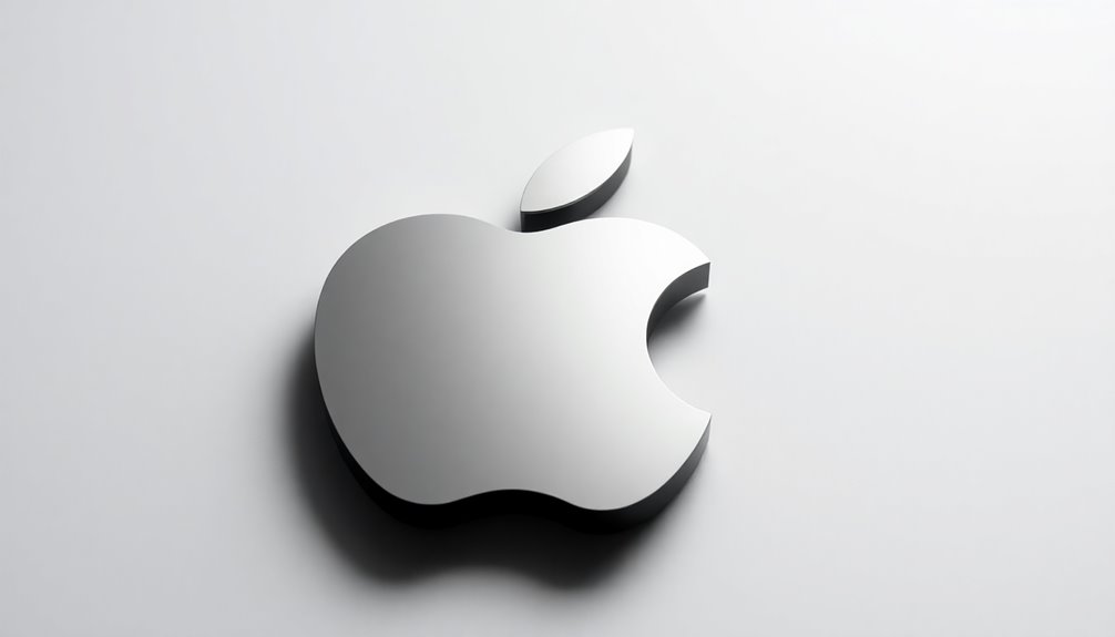
When you look at the Apple logo, you can see a clear evolution from its intricate beginnings to the sleek design we recognize today.
That bite taken out of the apple not only sets it apart from other fruits but also sparks various cultural interpretations and misconceptions.
As we explore this iconic logo, you'll discover how its design choices reflect deeper meanings and the brand's innovative spirit. Additionally, understanding the importance of branding can provide insights into why such simple designs can create lasting impressions.
Design Evolution Over Time
As the world of design continually evolves, the Apple logo stands out as a prime example of how minimalism can reshape brand identity.
Originally created by Rob Janoff in 1977, the logo transformed from a complex design into a simplified silhouette of a bitten apple. This evolution not only enhanced its recognizability but also aligned perfectly with Apple's minimalist philosophy.
The intentional bite prevents confusion with other round fruits, ensuring distinctiveness. Over the years, the logo shifted from a vibrant rainbow palette to a sleek monochrome, reflecting modern design trends.
Its iconic status is a reflection of how simplicity can effectively strengthen brand identity and foster deeper consumer connections, making the Apple logo truly unforgettable. Additionally, the concept of diversification strategy demonstrates how brands can enhance their identity by simplifying their visual elements.
Cultural Interpretations and Misconceptions
Although the Apple logo's simplicity may seem straightforward, it carries a wealth of cultural interpretations and misconceptions that add layers to its meaning. The bite taken from the apple was designed to distinguish it from a cherry and give scale, not as a tribute to Alan Turing, despite that popular misconception.
This iconic logo represents more than just a brand; it symbolizes creativity and technological advancement. Its minimalist design reflects Apple's brand philosophy of simplicity, allowing it to evolve while retaining its powerful identity. Additionally, the logo's evolution is a testament to the importance of strong brand identity in cultivating customer loyalty.
As a cultural icon, the Apple logo transcends mere logos, embodying knowledge and innovation, influenced by Steve Jobs' personal affinity for the fruit during his diet.

Terwex Custom Electric Branding Iron for Wood, Black Temperature-Controlled Wood Branding Iron Personalized Metal Stamp, Logo Branding Irons Letter Stamp for Leather Food, Woodworking Tools(1.5")
Custom Wood Branding Iron: Design your personalized branding iron by selecting your preferred size, uploading your logo, or…
As an affiliate, we earn on qualifying purchases.
As an affiliate, we earn on qualifying purchases.
Nike: The Swoosh of Speed
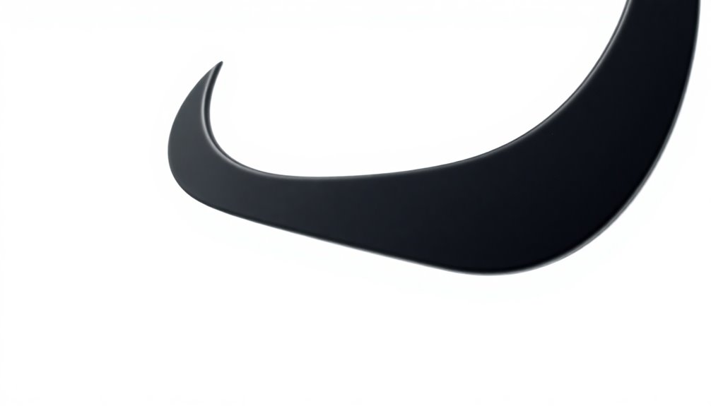
The Nike Swoosh embodies speed and movement, capturing the essence of athleticism in a single, powerful design. Created by Carolyn Davidson in 1971, this minimalist logo has become one of the most recognizable logos globally. Its simplicity and versatility enhance Nike's brand identity, fostering an emotional connection with consumers.
Here are four key aspects of the Swoosh:
- Value: Initially purchased for just $35, it's now part of a brand valued over $30 billion.
- Simplicity: The Swoosh's minimalist design allows for diverse applications.
- Recognition: In 1995, Nike removed the brand name, relying solely on the Swoosh.
- Performance: The logo symbolizes athletic performance, reinforcing Nike's branding strategy. Additionally, its design mirrors the speed and movement associated with top-tier athletes in various sports.

CustomBrandWare Build Your Own Stickers – Any Design Or Logo – Personalize Business – 50+ Roll – Multi Shapes, Sizes, Backgrounds, Text – Gloss/Matte Labels (2 inch Circle)
Personalize Your Stickers: Upload your own design, photo, or text, and choose from a range of 50 to…
As an affiliate, we earn on qualifying purchases.
As an affiliate, we earn on qualifying purchases.
MasterCard: Unity Through Circles

MasterCard's logo, with its two interlocking circles, embodies the essence of unity in financial interactions. This minimalist logo design symbolizes the connection between consumers and financial services, representing seamless transactions.
The iconic logo's color scheme, featuring vibrant red and yellow, was redesigned in 2018 to enhance visibility and modernize the brand's identity. By removing the accompanying text, MasterCard allowed the visual elements to stand alone, focusing on brand recognition.
The circular design resembles a Venn diagram, emphasizing collaboration within the financial ecosystem. This evolution showcases MasterCard's commitment to adapting to digital contexts, ensuring that their logo remains relevant and impactful in an increasingly interconnected world. Additionally, just as the logo symbolizes vibrational alignment in financial transactions, it also reflects the importance of harmony in consumer experiences.
Target: The Power of Simplicity
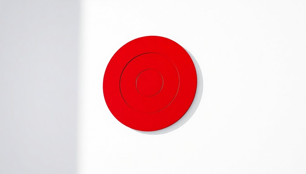
How does a simple design convey such strength in branding? Target's minimalist logo, with its bold red and white circles, creates an instantly recognizable visual identity. This simplicity eliminates the need for text, making it memorable across various platforms.
Here are four key elements that highlight its power:
- Effective Use of White Space: Enhances legibility and reinforces clarity.
- Circular Shape: Embodies harmony and unity, reflecting Target's brand identity as a one-stop shopping destination.
- Precision Symbolism: The bullseye represents focus and accuracy.
- Bold Colors: The striking red and white combination captures attention effortlessly.
Target's commitment to a simple yet impactful logo has solidified its presence in a competitive retail landscape, showcasing the power of simplicity in branding. Additionally, the importance of brand identity in creating a lasting impression can be seen in various successful companies.
Facebook: Clean Lines and Clarity
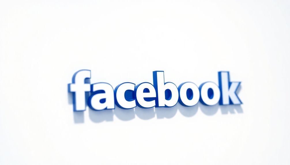
When you look at Facebook's logo, you see a perfect example of how typography and color choice can create a user-friendly interface.
Its clean lines and distinctive blue hue not only enhance brand recognition but also make the platform approachable for its billions of users.
This minimalist design strategy plays a significant role in maintaining a unified brand presence across all digital spaces. Additionally, the design exemplifies how digital creativity can significantly impact user engagement and brand perception.
Typography and Color Choice
Many people appreciate the clean lines and clarity of Facebook's logo, which effectively embodies minimalist design principles. Its typography and color choice greatly contribute to its modern appeal and user-friendly nature.
Here are some key aspects:
- Readability: The bold sans serif font enhances clarity.
- Simplicity: A straightforward design minimizes distractions, focusing attention on content.
- Approachable: Lowercase letters create a friendly brand image, fostering connection.
- Consistency: Uniformity in typography and color strengthens brand recognition across platforms.
Additionally, the rise in demand for smart home technology has influenced many brands to adopt minimalist logos that reflect modernity and innovation.
User-Friendly Interface Design
A user-friendly interface design is essential for keeping users engaged, and Facebook excels in this area with its clean lines and clarity.
The logo design, featuring straightforward blue and white lettering, enhances visibility and aligns with the brand's commitment to simplicity. By using lowercase typography, Facebook promotes a modern image that feels approachable.
The minimal visual distractions in their design allow you to recognize and engage with the brand effortlessly across various digital interfaces. This consistency reinforces brand identity and contributes to a coherent user experience.
Ultimately, the simplicity and clarity of Facebook's logo reflect its focus on ease of use, making it easier for you to navigate and connect. Content quality plays a crucial role in ensuring that users remain engaged with the platform.
Brand Recognition Strategies
User-friendly interface design naturally complements effective brand recognition strategies, and Facebook exemplifies this through its logo. The logo's simplicity and clean lines enhance consumer recognition across various digital platforms.
Here are some key elements of Facebook's brand recognition strategies:
- Lowercase Typography: Creates an approachable image, aligning with tech branding norms.
- Consistent Branding: Reinforces the visibility of the brand logo, aiding familiarization.
- Minimal Distractions: Maximizes legibility, ensuring easy identification.
- Strategic Brand Colors: The blue and white palette fosters trust and familiarity.
Uber: Modernity in Monochrome
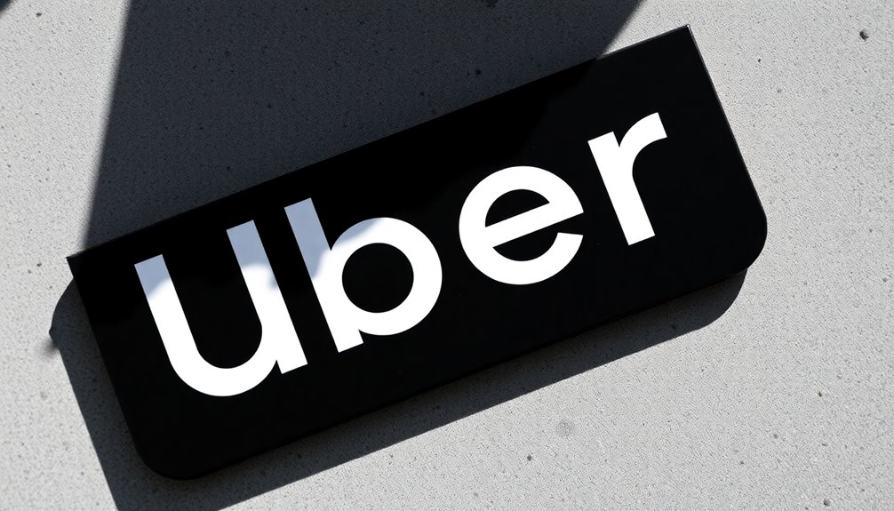
While steering through the bustling world of urban transportation, you might have noticed Uber's logo, which perfectly embodies modernity in its minimalist design. Introduced in 2010, the logo showcases a clean sans serif font that emphasizes efficiency and professionalism. Its monochrome color scheme enhances versatility across digital platforms, while proper capitalization contributes to a polished look. By focusing solely on the brand name, Uber's branding strategies have established a strong identity, allowing for easy recognition and recall.
| Feature | Description |
|---|---|
| Design Style | Minimalist |
| Color Scheme | Monochrome |
| Font Type | Clean Sans Serif |
| Brand Focus | Brand Name |
| Goal | Recognition and Efficiency |
NASA: Icons of Innovation
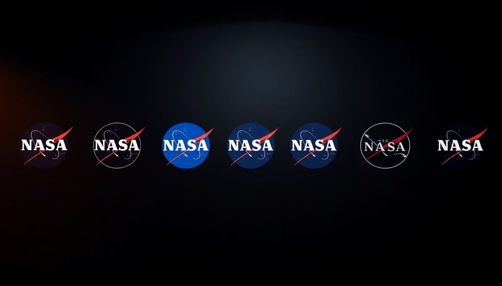
NASA's logos stand as icons of innovation, showcasing the agency's commitment to pushing boundaries in aeronautics and space exploration.
The two primary logos—the Meatball and the Worm—illustrate this evolution in branding and design.
- Meatball: Introduced in 1959, it symbolizes NASA's dedication to aerospace.
- Worm: Launched in 1975, its sleek, minimalist design emphasizes speed and modernity.
- Brand Visibility: Both logos enhance recognition, essential in a complex field like aerospace.
- Reintroduction: The Meatball was revived in 1992, demonstrating NASA's ability to innovate while maintaining its core identity.
These logos reflect NASA's journey in branding, merging tradition with innovation to inspire future generations in space exploration.
Frequently Asked Questions
What Is a Famous Minimalistic Logo?
A famous minimalistic logo you might recognize is the Apple logo. Its simple bitten apple design captures the essence of the brand's philosophy, making it instantly identifiable.
You see it everywhere, and it represents innovation and sleekness.
Another iconic example is the Nike swoosh, which conveys movement and energy with its clean lines.
These logos show how effective minimalism can be in creating memorable brand identities that resonate with consumers.
What Are the Top 10 Most Recognizable Logos?
When you think about the top 10 most recognizable logos, you're likely picturing brands like Apple, Nike, and McDonald's. Their logos have become cultural icons, instantly identifiable across the globe.
Other notable mentions include Coca-Cola, with its classic script, and MasterCard, known for its interlocking circles.
Brands like Starbucks, Adidas, Google, Amazon, and Mercedes-Benz also rank high for their distinctive designs that resonate with millions.
Each logo carries a unique story and powerful brand identity.
What Is the Most Iconic Logo of All Time?
Choosing the most iconic logo of all time is like picking a favorite star in the night sky; there are so many shining brightly.
However, many would argue that the Apple logo stands out the most. It's simple yet profound, instantly recognizable around the globe.
The bitten apple symbolizes knowledge and innovation, capturing what the brand represents. Its design transcends time, making it a true emblem of modern creativity and technology.
Why Are Minimalist Logos Popular?
Minimalist logos are popular because they cut through clutter, making it easier for you to recognize and remember brands.
Their simplicity guarantees they look great on various platforms, from mobile screens to billboards.
You appreciate how they convey a brand's essence without unnecessary details.
Plus, their clean design aligns with modern tastes, creating a timeless appeal.
As trends shift, you find minimalist logos maintain relevance, making them a smart choice for brands today.
Conclusion
So, next time you admire a sleek logo, remember it's not just a pretty picture. It's a minimalist masterpiece whispering deep corporate secrets—like how many hours of brainstorming went into deciding between a circle and a square! These logos, with their simple lines and clever twists, make you feel something profound, like "I really need that new gadget" or "I should totally order a ride." Who knew simplicity could be so complex? Cheers to the art of less!