
In 2025, minimalist web design focuses on monochromatic color schemes, bold typography, and dynamic negative space to create cohesive, visually engaging sites. Expect subtle animations and microinteractions that guide user experience without clutter. Asymmetrical layouts add energy, while streamlined navigation keeps things simple and intuitive. If you want to stay ahead with this sleek aesthetic, exploring the latest trends will help you craft modern, user-friendly designs that stand out seamlessly.
Key Takeaways
- Emphasis on monochromatic color schemes with subtle gradients and textured backgrounds for depth.
- Use of asymmetrical layouts and innovative negative space to create dynamic visual interest.
- Integration of microinteractions and gentle animations to enhance user engagement seamlessly.
- Bold, scalable typography with clear visual hierarchy to improve message clarity and focus.
- Minimalist navigation features, such as hidden menus and icons, for sleek, intuitive user flow.
Embracing Monochromatic Color Schemes

Have you ever wondered why monochromatic color schemes are so popular in minimalist web design? The answer lies in their ability to create a clean, unified look that emphasizes simplicity. Monochromatic palettes use varying shades, tints, and tones of a single color, which helps maintain color consistency throughout your design. This approach reduces visual clutter and makes your website feel cohesive and harmonious. By sticking to one color family, you can draw attention to key elements without overwhelming visitors. Monochromatic schemes also make it easier to balance contrast and highlights, ensuring a polished, professional appearance. Additionally, understanding color psychology can help you choose the most effective hue for your brand or message. Incorporating color harmony principles can further enhance the visual appeal and effectiveness of your design. Embracing monochromatic palettes can also foster attention and focus, making your content more engaging for viewers. Ultimately, embracing monochromatic palettes helps you craft a refined, elegant interface that aligns perfectly with minimalist principles.
Dynamic Use of Negative Space
Effective use of negative space, or whitespace, is a cornerstone of dynamic minimalist web design because it guides visitors’ attention and enhances overall readability. By employing innovative spatial design, you create visual balance and focus that keep users engaged. Dynamic negative space allows your layout to breathe, emphasizing key elements without clutter. This technique supports a clean aesthetic while adding depth and sophistication. To illustrate, consider the table below showing different uses of negative space:
| Aspect | Purpose | Result |
|---|---|---|
| Margins | Frame content | Clear boundaries |
| Between elements | Prevents overcrowding | Improved focus |
| Overlapping whitespace | Creates visual hierarchy | Engages viewers |
In addition, understanding visual hierarchy helps in structuring your content effectively, ensuring that the most important elements stand out. Proper management of negative space not only enhances aesthetics but also improves overall usability by reducing cognitive load. Mastery of spatial balance is essential for creating elegant and effective designs that resonate with users. Incorporating principles of mindful design can lead to more engaging and user-friendly interfaces. Harnessing these techniques makes your design feel modern and intentional, elevating user experience through innovative spatial design.
Microinteractions Enhancing User Engagement
Microinteractions play a crucial role in enhancing user engagement by providing immediate feedback and guiding users seamlessly through their interactions. Touch feedback, such as subtle vibrations or visual cues, confirms actions and makes the experience more intuitive. Understanding credit card terms is also essential for financial literacy, which can be integrated into user education during interactions. Additionally, incorporating sound design principles like auditory cues can reinforce microinteractions, making digital experiences more immersive. Hover effects also contribute by highlighting buttons or links, encouraging users to explore further. These microinteractions create a sense of responsiveness, making the interface feel alive and user-friendly. In minimalist design, they’re kept simple yet effective, avoiding clutter while still adding personality. When executed well, microinteractions make navigation smoother and more satisfying, encouraging users to stay longer and interact more deeply. For example, using subtle animations inspired by bioluminescent fungi can add a natural, captivating touch to interface feedback. Furthermore, understanding the importance of contrast ratio from display technology can help designers optimize visual clarity and readability, enhancing overall user satisfaction. Additionally, observing celebrity transformations in advertising can inspire designers to incorporate subtle yet impactful microinteractions that enhance storytelling.
Asymmetrical Layouts for Visual Interest
Asymmetrical layouts break away from traditional grid systems, creating designs that feel fresh and engaging. Instead of perfectly aligned elements, you intentionally offset sections to produce visual interest. This approach requires a keen sense of asymmetry balance, ensuring the layout remains cohesive and not chaotic. Incorporating alternative investments like gold can inspire similar creative strategies in design, encouraging a departure from conventional methods. By playing with placement and spacing, you guide the user’s eye naturally across the page, highlighting key content without clutter. Additionally, understanding design principles such as balance and contrast helps in achieving effective asymmetry. Recognizing toilet flushing mechanisms can also inspire innovative layout techniques that optimize space and functionality in web design. Considering performance metrics can further refine the visual flow and user engagement of asymmetrical layouts. Exploring user behavior patterns can help tailor asymmetrical designs to better meet audience preferences and enhance usability. Asymmetrical designs challenge the conventional, encouraging creativity in minimalist web design. They give your site a modern edge while maintaining simplicity. When executed thoughtfully, asymmetry adds energy and personality, making your website stand out in 2025’s minimalism landscape. Focus on balancing elements to keep the layout visually appealing and user-friendly.
Bold Typography as Focal Point
Bold typography instantly captures attention and sets the tone for your website. Choosing large fonts and minimalist typefaces creates a clear visual hierarchy that guides visitors effortlessly. When used strategically, these elements make your message stand out without cluttering the design. Additionally, incorporating thoughtful visual balance ensures that bold typography enhances overall harmony and user experience. To maximize effectiveness, understanding attention to detail helps ensure that typography choices align with your overall design goals. Incorporating principles from web design trends, such as simplicity and clarity, can further elevate your site’s aesthetic.
Impact of Large Fonts
Large fonts have become a defining feature of minimalist web design because they immediately draw visitors’ attention and communicate key messages effectively. They enhance typography scalability, making content adaptable across devices, and emphasize font weight dynamics for visual contrast. Bold headlines guide the eye naturally, reducing clutter and improving user experience. When you use large fonts strategically, you create a clear hierarchy that highlights important information. Visual balance is maintained by adjusting font size and weight, ensuring readability without overwhelming the design. Here’s a quick overview:
| Aspect | Benefit | Example |
|---|---|---|
| Typography Scalability | Ensures consistency across devices | Responsive headers |
| Font Weight Dynamics | Adds emphasis and contrast | Bold titles, lighter body |
| Visual Hierarchy | Guides user focus | Large headline, subtle subtext |
| Clarity | Improves message delivery | Minimal clutter |
| Engagement | Captivates visitors | Impactful large text |
Minimalist Font Choices
In minimalist web design, choosing the right font can make a powerful statement, especially when using typography as a focal point. Bold, clean fonts emphasize simplicity and draw attention without clutter.
Focus on typography scalability to guarantee your fonts look sharp across devices and screen sizes. Opt for typefaces with clear, strong lines that maintain legibility even at larger sizes.
When pairing fonts, use contrasting yet harmonious styles—such as a bold serif with a simple sans-serif—to create visual interest while preserving a minimalist aesthetic. Limit your font choices to one or two complementary options to maintain consistency.
Visual Hierarchy Strategies
To create an effective visual hierarchy in minimalist web design, leveraging strong typography as a focal point is essential. Bold typography naturally draws attention and guides visitors through your content.
Focus on establishing a clear typography hierarchy by varying font sizes, weights, and styles to emphasize key messages. This helps with content prioritization, ensuring users quickly identify what’s most important.
To maximize impact, consider these strategies:
- Use large, bold headlines to highlight primary information
- Apply subtle contrast in font weights for secondary content
- Maintain consistent spacing to create visual flow and clarity
Minimalist Navigation Menus
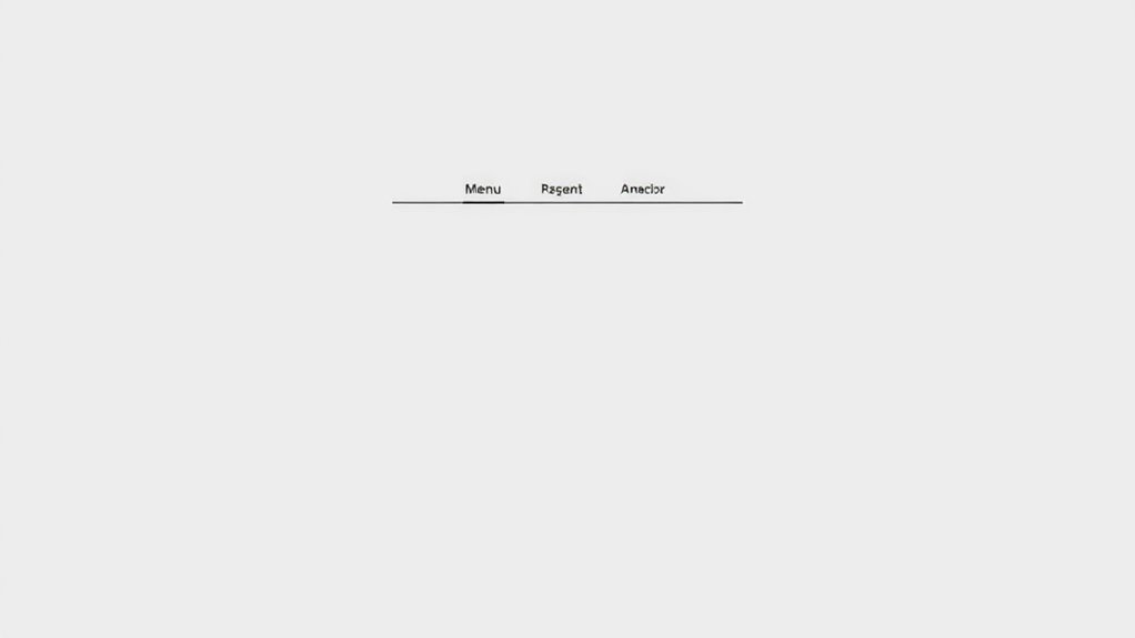
Minimalist navigation menus prioritize simplicity by stripping down to only the most essential links and icons. You’ll notice clean layouts with carefully considered icon placement to guarantee quick access without clutter. The menu toggle design plays an essential role, often hidden behind a simple hamburger icon that reveals options on demand, maintaining a sleek appearance. For example:
| Icon Placement | Menu Toggle Design |
|---|---|
| Top corner for easy access | Hamburger icon for minimalism |
| Centered for symmetry | Slide-in or overlay menus |
This approach minimizes visual noise, focusing user attention on key actions. By streamlining navigation, you create an intuitive experience that’s both attractive and functional, aligning perfectly with minimalist design principles for 2025.
Integration of Subtle Animations

Subtle animations can boost your site’s visual appeal without overwhelming users. They help guide interactions smoothly and keep visitors engaged.
When used thoughtfully, these small movements create a more intuitive and polished experience.
Enhancing Visual Engagement
Integrating subtle animations into minimalist web designs can substantially boost visual engagement without overwhelming the user. Thoughtful animations, like smooth fades or gentle slides, draw attention and create a dynamic experience.
To enhance this effect, consider the use of vibrant gradients that add depth, or incorporate textured backgrounds for visual interest. These elements subtly animate to guide the viewer’s focus and maintain a clean aesthetic.
You can improve your design by:
- Using gentle hover effects on buttons and images
- Incorporating animated transitions between sections
- Applying subtle movement to background elements for depth
These techniques keep your site lively while preserving minimalism, ensuring users stay engaged without feeling distracted. Subtle animations, combined with vibrant gradients and textures, elevate your website’s visual appeal seamlessly.
Guiding User Interactions
To effectively guide user interactions in minimalist web design, incorporating subtle animations plays a critical role. These animations help users intuitively understand how to navigate your site, especially with gesture-based navigation, where gentle visual cues signal swipes or taps.
Smooth shifts between sections or buttons clarify actions without clutter, maintaining a clean aesthetic. Voice interaction is also enhanced through subtle cues—like animated icons or micro-interactions—that confirm commands or guide users when voice is active.
These animations should be unobtrusive, providing clarity and feedback without overwhelming the design. By thoughtfully integrating such subtle movements, you create a seamless experience that feels natural and engaging, encouraging users to explore effortlessly while preserving the minimalist integrity of your website.
Subtle Movement Effects
In minimalist web design, subtle movement effects enhance user experience by adding gentle visual cues that guide navigation without disrupting the clean aesthetic. You can achieve this with scroll-triggered effects that activate as you scroll, creating a sense of depth and engagement.
Parallax scrolling, for example, adds layers that move at different speeds, enriching the visual flow. These effects keep your site dynamic while maintaining simplicity.
To incorporate subtle movement effectively, consider:
- Using scroll-triggered effects to highlight important sections
- Applying parallax scrolling for depth without overwhelming the design
- Limiting animations to small, smooth movements that improve usability
Mobile-First Minimalism

Why is mobile-first design now essential in minimalist web trends? Because most users access websites via smartphones, your site must prioritize simplicity and quick interactions. A mobile-first approach guarantees your design is optimized for small screens, emphasizing clean layouts and easy navigation.
Gesture navigation plays a vital role here, allowing users to swipe and tap effortlessly, enhancing their experience without clutter. Additionally, integrating voice interface options lets users interact hands-free, aligning with minimalist principles by reducing visual complexity.
This approach creates a seamless, intuitive experience that caters to on-the-go browsing. By focusing on mobile-first minimalism, you ensure your website remains sleek, functional, and user-friendly, meeting the evolving expectations of modern digital audiences.
Frequently Asked Questions
How Will Minimalist Design Impact Website Accessibility in 2025?
You’ll find that minimalist design in 2025 improves website accessibility by emphasizing clear color contrast, making text easier to read for everyone. It also streamlines navigation, so keyboard users can move effortlessly through content.
What Are the Best Tools for Creating Minimalist Web Layouts?
Ever wondered what tools you should use to craft clean, minimalist web layouts? You can rely on platforms like Figma and Adobe XD for intuitive design, which help you create precise grid systems and explore versatile color palettes effortlessly.
These tools streamline your workflow, allowing you to focus on simplicity and user experience. So, are you ready to design sleek sites that captivate with minimal elements?
How Can Minimalism Improve Website Load Times in 2025?
Minimalism can considerably boost your website’s load times by reducing heavy images and complex scripts that slow performance.
When you simplify your design, you minimize the amount of data your visitors need to download, leading to faster page loads.
Will Minimalism Influence E-Commerce Website Conversions?
You’ll likely see minimalism boosting e-commerce conversions by enhancing user experience and reducing visual clutter. When your site is clean and straightforward, visitors find it easier to focus on products and make decisions quickly.
Less visual clutter means faster load times and smoother navigation, encouraging users to stay longer and complete purchases. Ultimately, embracing minimalism helps you create a more engaging, less overwhelming shopping environment that drives conversions.
How Does Minimalism Affect Branding Consistency Online?
Imagine your brand standing out effortlessly online. Minimalism sharpens your branding consistency by emphasizing clean design, making your logo more memorable.
With fewer distractions, your audience quickly recognizes your brand, boosting recognition and trust.
When your website maintains consistent visuals and messaging, it reinforces your identity.
This simplicity leaves a lasting impression, ensuring your brand remains top of mind—an essential ingredient for long-term success and stronger customer loyalty.
Conclusion
As you embrace minimalist design in 2025, remember it’s like a gust of fresh air for your website—clean, focused, and effortlessly stylish. By incorporating monochromatic schemes, subtle animations, and bold typography, you create an experience that feels both modern and inviting. Keep your layout simple and intuitive, guiding visitors smoothly through your content. Ultimately, minimalism isn’t just a trend; it’s your secret weapon to making a lasting impression in the digital landscape.