If you're on the hunt for stunning minimalist website designs, you've got great options to inspire your next project. Check out McChill, which uses clean layouts and ample white space to make your content shine. La La Land Kind Cafe merges monochromatic color schemes with high-quality imagery for visual harmony. Zero offers user-friendly navigation, keeping everything organized and accessible. For more inspiration on designs that prioritize simplicity and clarity, there's plenty more to discover.
Key Takeaways
- Minimalist designs, like McChill and Wendy Ju, enhance portfolio visibility and emphasize work through clean layouts and ample white space.
- Engaging visuals and high-quality imagery, as seen in La La Land Kind Cafe and TrueHarvest Farms, create a cohesive and visually appealing aesthetic.
- User-friendly navigation, exemplified by Zero and Couple, simplifies access to content, enhancing the overall browsing experience for visitors.
- Clear information hierarchy and varied typography guide user attention, making essential messages stand out and improving content readability.
- Strategic use of white space across designs fosters a distraction-free environment, encouraging user exploration and focus on key elements.
McChill
When you visit McChill, you'll immediately notice how its clean design enhances the visibility of its portfolio, making it easy for you to navigate through the showcased work.
The minimalist website design effectively uses a solid background paired with animated text, providing essential information about services while keeping you engaged.
The clean, minimalist design combines a solid background and animated text to engage visitors while conveying essential service information.
You'll appreciate the large navigation links, which guarantee you can find what you need quickly and efficiently.
Ample white space throughout the site improves content readability, allowing you to focus on key information without distractions.
McChill highlights its services and past achievements in a professional manner, appealing to potential clients with a straightforward presentation that emphasizes clarity and purpose. Additionally, this design approach aligns with the concept of creating cozy spaces that cater to both families and seniors, promoting a sense of comfort and accessibility.
La La Land Kind Cafe
Moving from McChill's clean aesthetic, La La Land Kind Cafe captivates visitors with its monochromatic color palette that creates visual harmony. This minimalist design draws you in, making the experience both soothing and engaging.
High-quality images align seamlessly with the color scheme, presenting a cohesive look that enhances the cafe's offerings. Ample white space promotes easy reading and navigation, ensuring a positive user experience.
Clever typography establishes a strong visual hierarchy, emphasizing key messages without overwhelming you. Each element showcases the cafe's mission beautifully, inviting you to explore further. Additionally, the use of high-quality ingredients reflects a commitment to health, much like how chia seeds support digestive health.
Zero
When you land on Zero's site, an enthralling screen-sized animation grabs your attention right away.
You'll find a centralized link that lets you easily access detailed project information, making navigation a breeze.
This minimalist design strips away distractions, allowing you to focus on what truly matters: the brand's mission and achievements. Additionally, the well-structured content improves user experience, ensuring visitors can easily engage with the site's offerings.
Screen-Sized Animation Showcase
How does an enchanting screen-sized animation transform a website's initial impact? When you land on the Zero website, you're greeted by a mesmerizing screen-sized animation that succinctly introduces its services.
This stunning visual not only grabs your attention but also creates an engaging first impression. The minimalist designs emphasize simplicity, allowing you to focus on the core information without distractions.
A prominent mantra displayed on the homepage reinforces the brand's mission and values, effectively communicating the essence of the business. As you navigate, user-friendly features enhance usability, making it easy to explore and find relevant content quickly.
This seamless blend of animation and minimalist design guarantees that visitors aren't just informed, but also inspired. Additionally, smart home technology is increasingly becoming a focal point in modern web design, reflecting the trends of integrating digital solutions into everyday life.
Centralized Project Access
The enchanting screen-sized animation on Zero's homepage seamlessly leads you to a centralized hub for project access. This feature offers an efficient way to view all completed projects, streamlining your navigation experience.
With a minimalist design approach, the website emphasizes simplicity, which enhances your user experience. The centralized project access isn't just practical; it also embodies the brand's identity and mission through a clear mantra, making it memorable.
Instead of searching through cluttered menus, you can effortlessly explore the content, ensuring you find what you need without distractions.
Zero prioritizes user-friendly design, allowing you to focus on the projects that matter most, all while enjoying a clean, visually appealing interface. Additionally, the design reflects the importance of creating a functional layout that maximizes space for optimal usability.
User-Friendly Navigation Design
User-friendly navigation design is at the heart of Zero's website, ensuring you can quickly find what you need without unnecessary hassle.
The streamlined layout features a central link, giving you easy access to all completed projects, which greatly enhances your browsing experience.
With minimalist design elements, like simplified navigation and clear call-to-action buttons, you can navigate the site without distractions.
The screen-sized animations succinctly introduce services, keeping you engaged right from the start.
This effective balance between visual appeal and functionality guides you through content intuitively, allowing you to locate pertinent information with minimal clicks. Regular cleaning is essential for optimal performance of air purifiers, which can serve as a reminder of the importance of maintenance in any design project.
Mogutable
Mogutable stands out with its clean grid layout, designed to showcase a diverse range of products effortlessly. This minimal website design utilizes a white background that enhances the overall aesthetic, giving it a luxurious and residential feel.
You'll appreciate the strategic placement of simple icons, making it easy to access your account and cart functionalities. High-quality images are prominently featured, ensuring that each product shines and captures attention.
The ample white space not only contributes to a minimalist aesthetic but also improves content readability, making your browsing experience enjoyable. Overall, Mogutable combines elegance with functionality, creating an inviting online space that resonates with its target audience.
Additionally, the use of high-quality images can evoke emotions similar to how butter enhances the flavor of dishes in cooking, further elevating the user experience.
You'll find inspiration here for your next project.
Wendy Ju

Wendy Ju's online portfolio is a masterclass in minimalism, showcasing her career highlights with clarity and intent.
The thoughtfully crafted layout emphasizes minimal web design, allowing you to focus on her work without distractions. You'll appreciate the curated selection of fonts and colors that enhance the overall visual appeal while maintaining a professional look.
The intentional layout highlights minimalism, directing your attention to her work and elevating the visual experience with carefully chosen fonts and colors.
A tiny navigation bar simplifies your journey, providing direct access to key pages. This streamlined design reduces unnecessary elements, promoting an efficient user experience.
Each project shines through, inviting you to engage deeply with her creativity and expertise.
Wendy Ju's portfolio not only exemplifies effective minimalism but also inspires you to create your own stunning, clean designs. Additionally, her use of sustainable practices in her design process reflects the growing trend toward eco-friendly materials in the fashion industry.
Wingmen

When you visit Wingmen, you'll immediately notice its professional design aesthetic, which creates a classy vibe perfect for business professionals. The user-friendly navigation, with its simple grid layout, invites you to interact with the content effortlessly. This minimalist approach guarantees you stay focused on what truly matters without unnecessary distractions. Additionally, proper disposal methods can enhance user experience by ensuring a clean and organized environment.
Professional Design Aesthetic
Simplicity and elegance define the professional design aesthetic of the Wingmen website. This minimalistic web approach uses a straightforward grid layout that reveals sections upon clicking, keeping the presentation clean and organized.
Ample white space enhances the clarity of information, allowing you to focus easily on what matters. By showcasing essential details succinctly, the design speaks directly to business professionals, aligning seamlessly with a professional design aesthetic that elevates the brand image.
This classy appeal not only attracts potential clients but also fosters trust among partners. The minimalist strategy emphasizes functionality while maintaining visual charm, ensuring you have an engaging user experience that resonates with your audience. Additionally, the rise of e-commerce sales for beauty is reflected in the clean online presence, making it easier for users to navigate and engage with the content.
User-Friendly Navigation
The professional design aesthetic of the Wingmen website extends into its user-friendly navigation. By employing a simple grid layout, you can effortlessly open sections with a click, enhancing your navigation experience.
The website presents succinct information, making it easy to grasp key details without unnecessary scrolling. Ample white space throughout the design aids in digesting information and prevents you from feeling overwhelmed.
This streamlined navigation process appeals to business professionals, focusing on clarity and easy access to important sections. By adhering to essential design principles, Wingmen not only reinforces its classy brand image but also provides you with an intuitive user interface.
You'll appreciate how easy it's to find what you need.
Velvethammer
Velvethammer stands out as a go-to resource for musicians seeking management services, thanks to its clean and straightforward website design.
Velvethammer is a top choice for musicians in need of management services, featuring a clean and user-friendly website design.
The minimalist design effectively highlights essential information, guaranteeing users can easily navigate and engage with the content.
Here are three standout features that make it one of the best website examples:
- Solid Colors: The use of solid colors creates a professional atmosphere while keeping the focus on the content.
- Elegant Fonts: Simple yet sophisticated fonts enhance readability, making information digestible.
- Strategic Text Blocks: Thoughtfully placed text blocks ensure that key details are accessible, reinforcing the service's credibility.
Oishii
When you explore Oishii's website, you'll notice how the engaging visual selection of berries draws you in immediately.
The clear information hierarchy, with varied font styles, guides your focus to what matters most.
Plus, the user-friendly navigation makes it a breeze to find and purchase your favorite products.
Engaging Visual Selection
To create an engaging online experience, Oishii's website captivates visitors with its striking visuals of specially selected berries. The use of engaging visuals paired with ample negative space enhances the overall aesthetic, drawing your attention effectively.
Here are three key elements that elevate the visual appeal:
- Stunning Berry Imagery: Each berry is showcased with high-quality images that make them irresistible.
- Strategic Font Styles: Varied typography guides you to essential messages, guaranteeing important information doesn't get lost.
- User-Friendly Design: The simplicity of the store locator page allows for easy navigation, making it a breeze to find product details.
This thoughtful design approach guarantees a seamless browsing experience, inspiring you to explore further.
Clear Information Hierarchy
Building on the enchanting visuals, Oishii's website excels in presenting information through a clear hierarchy.
The site utilizes varied font styles that effectively guide your attention to vital text and details. By strategically employing white space, it enhances the readability of the content, making it easier for you to absorb information without feeling overwhelmed.
Oishii highlights special selections of berries with engaging visuals, organizing content to emphasize the significance of each product. This thoughtful layout creates a logical flow that directs you seamlessly through the site, ensuring essential details are always accessible.
Ultimately, the clear information hierarchy not only enhances your experience but also allows you to quickly grasp key messages related to their offerings.
User-Friendly Navigation
Steering through Oishii's website feels effortless due to its clear and straightforward structure. The user-friendly navigation allows you to access various sections with minimal effort.
Here's what makes it stand out:
- Centralized Menu: This simplifies your experience, letting you find information in just a few clicks.
- Visual Hierarchy: Important links are prominently displayed, guiding you through the site easily.
- Intuitive Icons and Labels: These enhance your understanding, making navigation seamless.
With ample white space surrounding the navigation elements, readability improves and cognitive load decreases. You can focus on what truly matters without feeling overwhelmed.
Oishii's design truly exemplifies how user-friendly navigation can elevate your browsing experience.
Zimik Studio
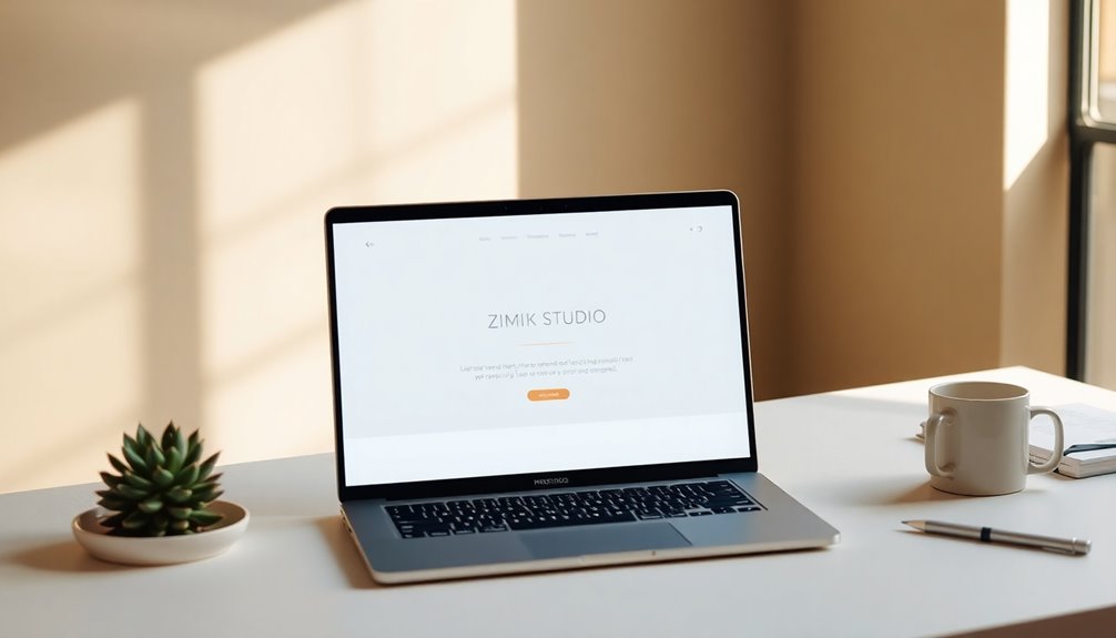
Zimik Studio stands out with its beautifully crafted handcrafted soaps and candles, all showcased on a thoughtfully designed minimalist website.
The warm color palette adds a touch of personality, enhancing the aesthetic appeal while keeping the focus on the products. You'll appreciate the discreetly placed clickable menu button, which allows for easy navigation without cluttering the interface.
The monochromatic color scheme guarantees a clean look, further emphasizing the products you want to explore. With minimal distractions throughout the site, you can easily browse and concentrate on what truly matters—Zimik Studio's exquisite offerings.
This combination of thoughtful design elements makes their website a perfect example of how minimalism can elevate an online shopping experience.
TrueHarvest Farms

When you visit TrueHarvest Farms, you'll notice their simple functional design that makes navigation a breeze.
The dark color contrast not only enhances the site's aesthetics but also makes the vibrant images of their produce pop.
This engaging visual content invites you to explore and discover more about their offerings.
Simple Functional Design
TrueHarvest Farms captures attention with its simple functional design, ensuring you can easily navigate and explore their offerings.
This simple website prioritizes user experience, making it effortless to find what you need. Here are three standout features:
- User-Friendly Layout: The intuitive design encourages you to discover products without feeling overwhelmed.
- Expandable Menu: A clean menu button reveals links in a straightforward manner, simplifying navigation.
- High-Quality Images: Stunning visuals of fresh produce not only enhance the site's appeal but also emphasize the quality of the farm's offerings.
Dark Color Contrast
By utilizing a dark color scheme, TrueHarvest Farms creates a stunning backdrop that makes their vibrant product images pop.
This minimalist approach not only emphasizes the beauty of the farm's offerings but also enhances the overall user experience. The website's clean aesthetic allows you to focus on essential elements without distraction.
When you navigate the site, the menu button expands smoothly to reveal multiple links, ensuring easy access to various sections while maintaining a streamlined look. High-quality images take center stage, drawing your attention and inviting exploration.
The user-friendly layout reflects a commitment to functional minimalism, making it effortless for you to engage with the content. This combination of dark color contrast and minimalist design truly elevates the website's visual impact.
Engaging Visual Content
The minimalist design of TrueHarvest Farms beautifully sets the stage for engaging visual content that captivates visitors. The website showcases vibrant, high-quality images against a dark color scheme, ensuring the products stand out.
This thoughtful approach creates a visually appealing experience, drawing users in to explore. Here are three key design elements that enhance engagement:
- User-Friendly Layout: Easy navigation encourages exploration of offerings.
- Centralized Menu: Expands to reveal multiple links, simplifying access to information.
- Ample White Space: Enhances readability and supports the minimalist aesthetic.
Together, these elements foster an interactive environment, allowing you to immerse yourself in the rich visual content while enjoying seamless usability.
Ramotion
Ramotion stands out with its striking minimalist design that prioritizes clarity and user engagement. The large font on a white background enhances message clarity, drawing your attention to key content effortlessly.
You'll appreciate the selective navigation bar, which minimizes clutter and allows you to find essential links quickly. Various font weights guide your reading priorities, creating a clear visual hierarchy that's easy to follow.
This simple design promotes understanding and navigation, greatly improving the overall user experience. Focused on essential information, Ramotion exemplifies effective minimalist web design principles that not only attract visitors but also keep them engaged.
If you're looking for inspiration, Ramotion's design approach can certainly elevate your next project.
PhonicBloom
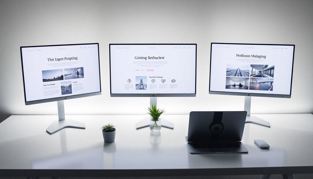
PhonicBloom showcases a stunning minimalist design that highlights its innovative synthesizers.
You'll appreciate the clean layout that enhances your browsing experience through simplicity and clarity. The website employs a well-structured grid layout, making navigation a breeze.
Here are three standout features you'll love:
- High-Quality Images: Each synthesizer is presented with clear visuals, aiding product identification.
- Minimal Design Elements: The website eliminates distractions, allowing you to focus solely on the products.
- Thoughtful Content Arrangement: The layout encourages exploration and engagement with PhonicBloom's offerings.
With these elements combined, PhonicBloom guarantees you enjoy a seamless experience while discovering their unique synthesizers.
PhonicBloom ensures a smooth journey as you explore their distinctive synthesizers.
You'll find that the minimalist approach truly enhances the overall user experience.
Couple
When you explore Couple, you'll immediately notice how the delicate color palette enhances the presentation of their exquisite jewelry. This thoughtful design minimizes distractions, allowing you to focus entirely on the stunning pieces offered.
You'll appreciate how the strategically placed images highlight the elegance and craftsmanship of the jewelry, drawing your eye to each detail. The clever visual hierarchy guides your attention effectively, making navigation a breeze.
Simple navigation further enhances your interaction, ensuring a seamless shopping experience. Couple serves as a prime example of minimalist web design, showcasing how less truly can be more.
Lulu and Isabelle

Lulu and Isabelle captivates visitors with a stunning photography and graphic design portfolio that puts the artist's work front and center.
The website's minimal design enhances user experience, allowing you to focus on the visuals without distractions. You'll find easy navigation that makes exploring the portfolio effortless.
Here are three standout features:
- High-Quality Images: Every piece showcases the artist's skills and creative vision.
- Intuitive Layout: Main categories are clearly presented, reducing excessive text.
- User-Friendly Navigation: Potential clients can easily browse through the work.
With its minimalist website designs, Lulu and Isabelle effectively communicates artistic style while making a strong impression on visitors.
You're sure to feel inspired by this elegant approach to showcasing creativity.
ET Studio
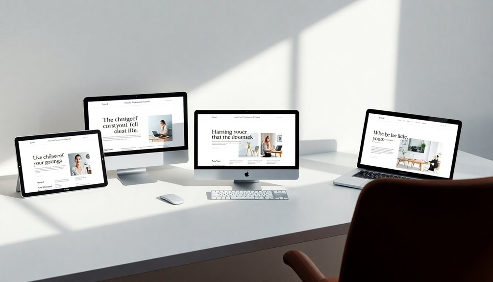
ET Studio captures attention with its bold use of large letters against a pristine white background, delivering a striking visual impact.
This website embodies a minimalist design style that prioritizes simplicity and clarity. You'll appreciate the limited navigation bar, which offers only essential links, making it easy to explore without distraction.
High-quality images are strategically placed, enhancing the visual appeal and drawing your focus to key content. The ample white space throughout the design promotes a clean, open feel, allowing for a seamless user experience.
Frequently Asked Questions
What Are the Key Principles of Minimalist Web Design?
When you explore minimalist web design, focus on simplicity, functionality, and clarity.
Prioritize essential elements, eliminating clutter to enhance user experience. Use ample white space to create balance and guide attention.
Choose a limited color palette for cohesion, and select clean, readable fonts.
Guarantee intuitive navigation to help visitors find information effortlessly.
How Can I Implement Minimalism in My Website?
Implementing minimalism in your website can transform user experience.
You're not just stripping away clutter; you're creating a space that breathes.
Start by simplifying your layout—limit your color palette and use white space effectively.
Choose typography that's clear and legible.
Focus on essential content, eliminating distractions.
Every element should serve a purpose.
When you embrace minimalism, you invite your visitors to connect more deeply with your message.
It's about clarity and intentionality.
Are There Specific Tools for Creating Minimalist Designs?
Absolutely, there are several tools you can use to create minimalist designs.
Platforms like Figma and Sketch offer intuitive interfaces for designing clean layouts. Canva is great for quick graphics, while Adobe XD provides advanced features for prototyping.
You might also explore website builders like Webflow or Squarespace, which have templates focused on minimalism.
Don't forget about color palette generators and typography tools to keep your design simple yet effective.
What Are the Benefits of Minimalist Website Designs?
Have you ever felt overwhelmed by cluttered websites?
Minimalist designs simplify your user experience, making navigation intuitive and engaging. They load faster, which keeps users on your site longer, improving your bounce rate.
With a clean layout, your content shines, drawing attention to what really matters. Plus, minimalist designs are visually appealing and timeless, ensuring your site remains relevant.
How Do Color Choices Affect Minimalist Web Aesthetics?
Color choices greatly impact minimalist web aesthetics by creating mood and guiding user focus.
When you select a limited color palette, you enhance simplicity and elegance, making essential elements stand out. Soft, neutral tones can evoke calmness, while bold colors draw attention to specific areas.
You'll want to balance contrasts wisely; too many colors can clutter your design. Ultimately, your color decisions should align with your brand identity and the emotions you want to convey.
Conclusion
In the world of design, minimalist websites are like clear skies—inviting, focused, and full of potential. Each example you've explored serves as a guiding star, lighting your path to creativity. By embracing simplicity, you can craft a digital space that resonates with clarity and purpose. So, as you commence your next project, remember that less can truly be more—a gentle breeze that leaves a lasting impression, just like these stunning designs.

