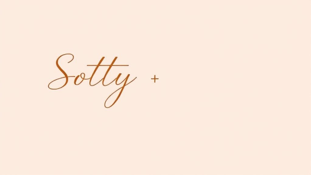

To create calm content, choose paired fonts with smooth curves, minimal embellishments, and subtle contrast. Combine a gentle sans-serif with a soft serif for balanced harmony, ensuring enough difference to guide the eye without disrupting serenity. Use muted, pastel colors to enhance this peaceful vibe, and keep font sizes and weights consistent to maintain visual balance. If you want to discover more about crafting serene typography combinations, keep exploring these helpful insights.
Listen free for 30 days with Audible
Thousands of audiobooks and originals — cancel anytime.
As an affiliate, we earn on qualifying purchases.
Key Takeaways
- Pair soft, rounded sans-serif fonts with gentle serif typefaces to create an inviting, balanced contrast.
- Choose fonts with similar characteristics, such as smooth curves and minimal embellishments, to maintain harmony.
- Use subtle font contrast in weight, style, or size to add interest without disrupting calmness.
- Opt for muted, pastel, or earth-inspired color palettes that complement font choices and evoke serenity.
- Ensure visual hierarchy is clear with appropriate contrast to guide readers effortlessly while preserving a peaceful design.
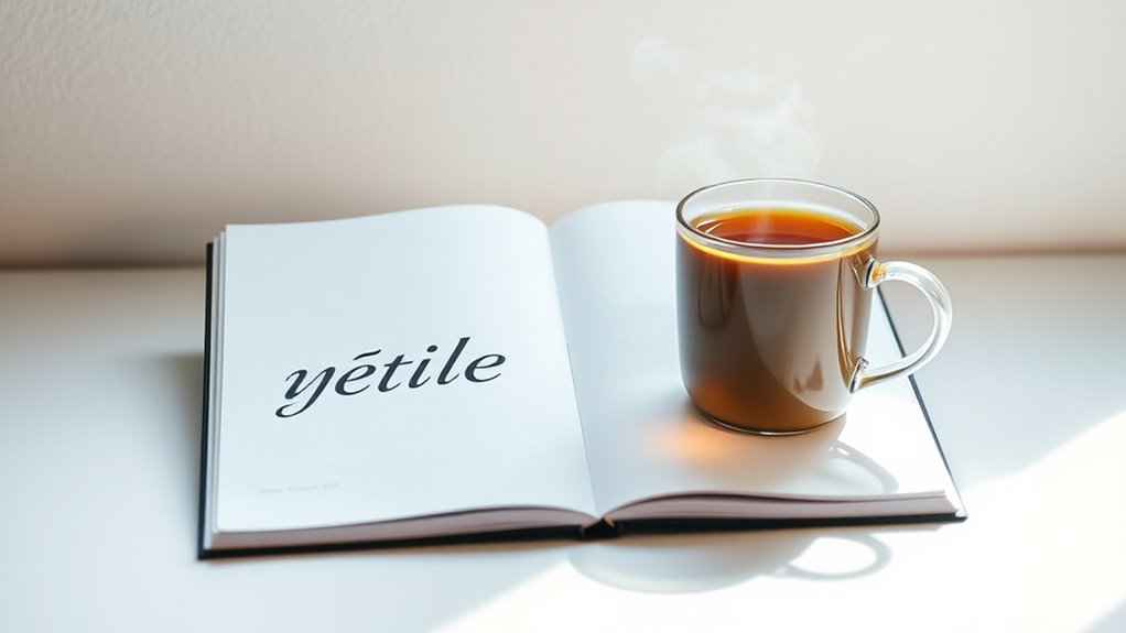
Creating a calm and soothing online or print space hinges on choosing the right typefaces. When you select fonts that work well together, you set the tone for your entire design and influence how your audience perceives your content. One essential aspect to consider is font contrast, which refers to the differences in weight, style, or size between paired fonts. You want enough contrast to create visual interest, but not so much that it disrupts the sense of calm. For instance, combining a soft, rounded sans-serif with a gentle serif creates a subtle contrast that feels inviting rather than jarring. Keep in mind that high contrast can sometimes make your content feel more energetic, so aim for a balanced pairing that maintains serenity.
Choosing fonts with subtle contrast creates inviting, calming designs that feel balanced and serene.
Color harmony also plays a crucial role in establishing a calming atmosphere. When choosing typefaces, consider how their letterforms and colors complement each other and your overall color palette. Stick to harmonious tones—muted, pastel, or earth-inspired hues often evoke tranquility. Your goal is to create a seamless visual flow, where the colors of your fonts don’t clash or draw unnecessary attention. When you pair fonts, think about how their colors interact with your background and other design elements. For example, a soft gray text paired with a gentle blush accent creates a soothing visual rhythm that’s easy on the eyes.
Additionally, selecting fonts with similar characteristics can enhance the sense of unity and calmness. For example, pairing a clean, modern sans-serif with a slightly more decorative serif can add subtle interest without overwhelming your viewers. Avoid overly ornate or aggressive fonts, as they tend to disrupt the peaceful vibe you want to establish. Instead, focus on fonts that have smooth curves and minimal embellishments, which contribute to a relaxed reading experience. Incorporating font contrast thoughtfully helps prevent visual clutter and maintains a calm atmosphere.
When you pay attention to font contrast and color harmony, you craft a visual hierarchy that guides your reader effortlessly through your content. Use contrast to highlight key information without creating clutter, and choose colors that evoke serenity and balance. By thoughtfully pairing your typefaces with these principles in mind, you’ll foster a calm environment that invites your audience to engage comfortably and stay longer with your content. Ultimately, achieving this harmony in your typography helps reinforce the message of calmness and trust you aim to communicate.
Frequently Asked Questions
How Do Font Choices Influence Viewer Emotions?
Your font choices directly influence viewer emotions by creating a sense of harmony and clarity. When you use a clear typography hierarchy, it guides their attention smoothly, making content easier to process and more calming. Consistent font styles reinforce professionalism and trust. If you select fonts that complement each other, you evoke feelings of stability and calmness, helping your audience feel relaxed and engaged with your message.
Can Color Schemes Affect Perception of Calmness?
Imagine your design as a peaceful lake—color schemes are the gentle ripples that set its mood. Yes, color psychology plays a key role: soft blues and greens evoke tranquility, reinforcing visual harmony. When you choose calming colors, you create an environment that feels safe and serene. This perception of calmness helps viewers relax and connect more deeply, making your content not just seen but genuinely felt.
What Are Common Mistakes in Pairing Calming Typefaces?
You might make mistakes like misusing font weights, which can disrupt the calm vibe by making text too bold or too light. Neglecting contrast is another common error; without enough contrast between typefaces or against the background, your content can become hard to read and stressful. To keep things serene, choose font weights thoughtfully and guarantee adequate contrast, creating a harmonious and calming visual experience for your audience.
How Does Font Size Impact Readability and Calmness?
Think of font size as the gentle stream guiding your boat; too small, and it’s hard to see the path, disrupting readability. Too large, and it feels overwhelming, breaking calm. By balancing font size variation, you create a smooth, inviting flow that makes your content easy to read and soothing. This readability balance helps your audience stay engaged without feeling rushed, fostering a peaceful browsing experience.
Are There Specific Typefaces Best for Digital Versus Print?
For digital fonts, choose clean, sans-serif typefaces like Helvetica or Arial that guarantee clarity on screens. For print, opt for classic serif typefaces such as Times New Roman or Garamond, which provide readability and a calming feel. You should consider the medium you’re working with, as digital fonts prioritize simplicity for screen legibility, while print typefaces often favor elegance and tradition for tactile reading experiences.
Conclusion
Now that you’ve seen the perfect pairings for calm content, imagine how your next project could subtly influence your audience’s mood. Will you choose the gentle elegance of serif and sans-serif, or experiment with unexpected combinations? The choice is yours, and the possibilities are endless. But beware—once you unseal this secret, your designs might never feel the same. Are you ready to create something truly soothing? The power is in your hands.
NFL season / tailgating Picks
team gear
As an affiliate, we earn on qualifying purchases.