White space and blank space are terms often used interchangeably, but they serve different purposes in design. White space specifically refers to intentionally left empty areas that improve readability, create visual hierarchy, and enhance aesthetic appeal. Blank space simply denotes any empty area without content, which may be unintentional. Understanding how to use both effectively helps you craft balanced, clear, and engaging layouts—if you continue exploring, you’ll discover how to master these subtle but impactful design elements.
Key Takeaways
- White space is intentionally designed empty area to enhance aesthetics and readability; blank space is unintentional or incidental empty area.
- Proper white space improves content clarity and guides viewer focus, while blank space may cause visual confusion if unplanned.
- White space actively contributes to visual balance and composition; blank space often lacks deliberate purpose.
- White space helps create hierarchy and emphasize key elements; blank space simply provides emptiness without specific intent.
- Effective design leverages white space strategically; excessive blank space can make layouts feel disconnected or sparse.
When designing a layout, understanding the difference between white space and blank space is essential because these terms are often used interchangeably but serve distinct purposes. White space refers to the areas in your design that are intentionally left empty to create visual breathing room, while blank space is simply the absence of any content or visual elements. Recognizing this distinction helps you craft more effective, aesthetically pleasing designs that communicate clearly and engage viewers.
One key aspect to consider is typography differences. When you pay attention to how type interacts with surrounding space, you’ll notice that proper use of white space around text improves readability and emphasizes important information. For example, increasing space between lines or margins can make a block of text easier to scan, preventing it from feeling cluttered. This deliberate use of white space around typography also enhances the overall design balance by guiding the viewer’s eye smoothly across the layout. It emphasizes hierarchy, making headings, subheadings, and body copy distinct and easy to differentiate.
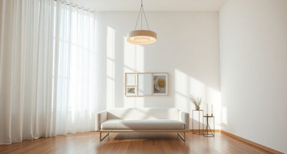
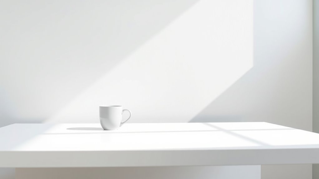
Design balance is another critical factor influenced by your handling of white space versus blank space. Effective use of white space helps you achieve harmony in your composition, preventing it from feeling overcrowded or uneven. When you distribute space thoughtfully, you create focal points that draw attention where you want it most, whether it’s a call-to-action button or an important image. Conversely, too little space can make your design feel cramped, while too much might cause it to look sparse or disconnected. Striking the right balance ensures your message comes across clearly without overwhelming the viewer or leaving them confused.
Blank space, on the other hand, is often seen as a blank canvas that allows your content to breathe. It’s not just an empty void; it’s a strategic tool that can help isolate key elements, add emphasis, and create a sense of sophistication. When you intentionally incorporate blank space into your layout, you’re giving your design room to breathe, which can make your overall aesthetic appear cleaner and more professional. It also offers viewers a moment to rest their eyes, making the entire experience more comfortable and engaging. Additionally, understanding visual hierarchy is crucial for using whitespace effectively to guide viewers through your content seamlessly.
Frequently Asked Questions
How Do Cultural Differences Influence Perceptions of Space?
Cultural differences markedly influence your perceptions of space, affecting how you interpret and use environments. In cross-cultural design, understanding these variations helps you create spaces that feel comfortable. For example, some cultures view close proximity as friendly, while others see it as intrusive. Your awareness of these cultural nuances enhances your ability to design spaces that respect diverse spatial perceptions, fostering better communication and comfort across different cultural contexts.
Can Excessive White Space Harm User Engagement?
Excessive white space can harm user engagement by creating visual clutter and making your design feel empty, which may lead to user distraction. When there’s too much empty space, users might struggle to find important information or feel overwhelmed by the lack of content. To avoid this, balance white space with relevant elements to guide users smoothly through your design without overwhelming or confusing them.
What Are Common Mistakes in Using Blank Space Effectively?
You often make mistakes with blank space when you neglect visual balance and design harmony. Overusing blank space can make your design feel empty, while underusing it creates clutter. You might ignore the importance of proportion, causing your elements to compete rather than complement each other. To improve, guarantee your blank space guides the viewer’s eye, supports your content, and maintains a cohesive, balanced look that enhances overall design harmony.
How Does White Space Impact Website Loading Times?
White space can considerably impact your website’s loading times. When you optimize typography spacing and balance visual elements, you reduce unnecessary code and images, making your site faster. But beware—overusing white space can lead to bloated pages that slow down performance. Striking the right balance ensures your site loads quickly while maintaining a clean, engaging design that keeps visitors hooked from the first click.
Are There Industry Standards for Optimal Space Ratios?
There are no strict industry standards for ideal space ratios, but you should focus on maintaining design consistency and enhancing visual hierarchy. By balancing white space and content, you ensure your website looks clean and organized, guiding visitors naturally through your message. Experiment with different ratios, observe user engagement, and adjust accordingly to create a harmonious layout. Prioritizing these principles helps your site feel professional and user-friendly.
Conclusion
Think of white space and blank space as the breathing room in your design — moments where the eye finds peace and clarity. They symbolize potential, inviting your audience to pause and reflect. Embrace these spaces as silent storytellers that highlight what truly matters. When used wisely, they become the canvas for your message, transforming simple elements into a powerful visual symphony. Remember, sometimes what’s left unsaid speaks the loudest.