

To master minimalist graphic design, focus on essential techniques that emphasize clarity and simplicity. Stick to two or three colors to reduce visual noise and create harmony. Use negative space to draw attention to key elements while maintaining a clean layout. Choose straightforward typography, limiting yourself to two font types for consistency. Incorporate grids to organize your designs effectively. By understanding these principles, you'll enhance your design skills and create impactful visuals. There's more to explore beyond this!
Key Takeaways
- Embrace the "less is more" philosophy by limiting design elements and focusing on essential components for clarity and impact.
- Utilize a restricted color palette of two to three colors to minimize visual noise and enhance brand identity.
- Implement negative space strategically to improve readability and draw attention to key elements within the design.
- Maintain a consistent typography selection with no more than two font types, ensuring readability and visual harmony.
- Use grids to create structured layouts that support visual hierarchy and balance, guiding the viewer's eye through the design.

Minimalist Graphics
As an affiliate, we earn on qualifying purchases.
As an affiliate, we earn on qualifying purchases.
Understanding Minimalist Graphic Design

When you explore minimalist graphic design, you'll quickly realize it embodies the principle of "less is more." This approach emphasizes simplicity and clarity, stripping away unnecessary elements to enhance visual communication.
Originating from the minimalist movement of the 1960s, it focuses on clean lines and functional design over decorative features. You'll often see a limited color palette, usually just two or three colors, which boosts your brand's visual impact.
Negative space is essential, as it creates balance and harmony, directing attention to fundamental components. Simplicity in typography is critical, with sans-serif fonts preferred for their readability. Additionally, just as in sound design techniques, minimalist design emphasizes the importance of reducing distractions to enhance the overall message.

Comic Sans: The Biography of a Typeface (The ABC of Fonts Series)
As an affiliate, we earn on qualifying purchases.
As an affiliate, we earn on qualifying purchases.
Key Principles of Minimalist Graphic Design
Minimalist graphic design revolves around a few key principles that guarantee your visuals communicate effectively. Emphasizing minimalism in graphic design, you focus on important elements while stripping away the unnecessary. Utilize a limited color palette and clean lines to enhance clarity and make a memorable impact.
| Principle | Description |
|---|---|
| Visual Hierarchy | Establish order using size, color, and placement. |
| Negative Space | Enhance focus on key elements for better digestion. |
| Grids to Maintain | Organize design elements systematically for balance. |
| Focal Point | Direct attention to the most significant aspect. |
Additionally, incorporating visual aids can clarify design concepts and ideas, further enhancing the minimalist approach.

2 x Grid Type Lettersize 'Freehand Designer' Sheets.
Enables drawing of horizontal and vertical straight lines freehand
As an affiliate, we earn on qualifying purchases.
As an affiliate, we earn on qualifying purchases.
The Importance of Simplicity

Simplicity stands at the heart of minimalist graphic design, embodying the "less is more" philosophy. By focusing on essential elements, you strip away unnecessary clutter, enhancing clarity and communication.
Minimalist designs often limit font faces to two, ensuring readability and visual harmony. A relaxed color scheme minimizes visual noise, allowing key elements to shine and effectively convey information. This approach not only simplifies brand color selection but also aligns with your brand's core identity.
Emphasizing simplicity creates a faster web page loading experience, which enhances user satisfaction and promotes intuitive navigation. In today's design trend, embracing simplicity is vital, as it draws attention to what truly matters and fosters a more engaging interaction with your audience. Additionally, implementing lighting design can significantly enhance the atmosphere of minimalist spaces, further reinforcing the principles of simplicity and focus.

A Dictionary Of Color Combinations Vol 1 (Japanese Edition)
As an affiliate, we earn on qualifying purchases.
As an affiliate, we earn on qualifying purchases.
Utilizing Negative Space Effectively

Utilizing negative space effectively can transform your design by enhancing focus and clarity. By strategically incorporating negative space, you can:
- Improve readability with ample breathing room around text and images.
- Establish a clear visual hierarchy, guiding viewers towards essential elements.
- Create balance and harmony for a more professional look.
Negative space isn't just empty; it's a powerful tool in minimalist design. It isolates key components, allowing them to stand out and reinforcing the principle of "less is more." Additionally, using sustainable materials in your design can further enhance the minimalist aesthetic by promoting simplicity and functionality.
Negative space serves as a vital element in minimalist design, highlighting essential features and embracing the "less is more" philosophy.
This approach not only simplifies your design but also emphasizes each element's significance. Embrace negative space, and watch how it elevates the clarity and overall effectiveness of your designs.
Selecting Clean and Straightforward Typography

When you select clean and straightforward typography, you set the tone for your entire design. Choosing easy-to-read fonts, like Sans-Serif and Serif typefaces, enhances clarity and suits minimalist designs perfectly.
Limit your font usage to two types—one for headlines and another for body text—to maintain consistency and avoid visual clutter. Opt for bold typefaces for headlines, using ample negative space around them to draw attention. This creates focus and improves readability.
Utilize font pairing guides to guarantee your selected typefaces complement each other in style and size, reinforcing the minimalist aesthetic.
Finally, maintain a consistent typographic hierarchy through size, weight, and placement to guide the viewer's attention and enhance overall communication clarity. Additionally, implementing well-structured content can improve readability and user experience, further supporting your minimalist design approach.
Limiting Your Color Palette
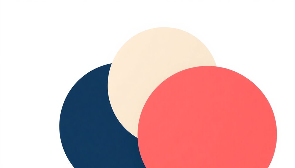
When you limit your color palette, you create a more focused and visually appealing design. Understanding color theory basics helps you choose hues that not only enhance your message but also evoke the right emotions. Additionally, embracing failure as a stepping stone in your design process allows for unique solutions that can emerge from experimenting with your chosen colors.
Color Theory Basics
Limiting your color palette to just two or three colors can dramatically enhance your minimalist design. By doing this, you reduce visual noise and promote clarity, making your message stand out.
Consider these strategies to create a compelling color scheme:
- Use a monochrome palette for a sleek, modern aesthetic.
- Opt for complementary colors to create contrast and highlight key elements.
- Experiment with combinations that reflect your brand identity.
Research shows that designs with a restricted color palette are seen as more professional and trustworthy. Additionally, high topical authority in your content can further enhance the effectiveness of your design by ensuring your message resonates with your audience.
This simplicity aligns with contemporary consumer preferences, ensuring your work maintains visual interest while conveying your message effectively—making your designs not only appealing but also impactful.
Impact of Color Choices
Choosing the right colors can profoundly impact your minimalist design's effectiveness. Limiting your color palette to two or three colors minimizes visual noise and enhances clarity, making your designs more impactful.
Consider using a monochromatic scheme, which employs variations of a single hue to maintain interest without overwhelming viewers. Alternatively, complementary colors can create high contrast, making key elements stand out.
If you prefer a vibrant look, try a triadic color scheme for balance. Starting with neutral tones evokes calmness and sophistication, letting your accent colors shine without distraction.
Ultimately, your choice of colors shapes the viewer's experience and understanding, so make each color count in your minimalistic graphic design. Additionally, understanding the influence of astrological compatibility can help designers create color schemes that resonate emotionally with their audience.
Maintaining Order With Grids

Using grids in your designs helps you organize elements effectively, creating a clean and structured layout.
You'll find that this approach enhances visual consistency and makes your work look more professional.
Plus, it enables you to achieve a balanced layout that guides the viewer's eye seamlessly through your composition. Additionally, implementing automated testing in your design process can improve efficiency and ensure that your layouts meet high-quality standards.
Organizing Design Elements Effectively
While organizing design elements effectively can seem challenging, employing grids in minimalist graphic design offers a straightforward solution.
Grids provide a structured framework that helps you organize the information with precision, ensuring a balanced layout and enhancing visual hierarchy.
Consider these benefits of grid usage:
- Maintain clarity by aligning graphic elements.
- Utilize negative space to separate components and draw attention.
- Reinforce brand identity with consistent design.
- Additionally, using color accuracy in your design elements can significantly enhance the overall visual impact.
Enhancing Visual Consistency
Grids play an essential role in enhancing visual consistency within minimalist graphic design. By defining placements for text and graphics, grids guarantee your designs maintain a cohesive look and feel.
They enhance visual hierarchy, allowing viewers to navigate your work intuitively. Proper alignment through a grid system helps you achieve balance and harmony, preventing overcrowding while improving clarity.
This systematic approach streamlines your design process, making it easier to create variations without sacrificing consistency across different materials.
Additionally, grids reinforce the principle of negative space, effectively separating elements and drawing attention to key components.
Achieving Balanced Layouts
Achieving a balanced layout is essential in minimalist graphic design, and a well-structured grid system can make all the difference.
Grids help you maintain consistent alignment and organize design elements, enhancing clarity and professionalism.
Here's how grids can elevate your design:
- Facilitate effective use of negative space, creating empty areas that highlight key features.
- Guarantee proportionality and balance, making content easier to navigate and improving visual hierarchy.
- Foster a recognizable style across projects, reinforcing your brand's identity.
Creating a Clear Visual Hierarchy

Effective visual hierarchy is essential in minimalist graphic design, as it guides your audience's attention and enhances comprehension. You can achieve this by prioritizing important elements through strategic placement, using varying sizes, and incorporating contrasting colors.
For instance, larger font sizes for headlines naturally draw the viewer's eye, while smaller sizes for body text create a smooth flow of information. Utilize ample negative space around key information to reinforce its importance and aid cognitive processing.
Additionally, using bold typography and distinct shapes consistently throughout your design fosters familiarity, helping users navigate the content intuitively. By implementing these techniques, you'll guarantee a clear understanding of your message and effectively communicate with your audience.
Frequently Asked Questions
What Are the Techniques of Minimalist Art?
When exploring minimalist art, you'll notice a few key techniques that stand out.
You'll often use a limited color palette, focusing on just two or three colors to keep things simple.
Negative space plays a crucial role, drawing attention to essential elements.
You might utilize clean lines and geometric shapes for a modern look.
Finally, favoring easy-to-read sans-serif typefaces guarantees your message remains clear and cohesive throughout your artwork.
What Is Minimalist Style in Graphic Design?
Did you know that designs with a minimalist approach can increase user engagement by up to 50%?
Minimalist style in graphic design revolves around simplicity, using clean lines and ample negative space. You'll often see a limited color palette, usually two or three colors, which reduces visual clutter.
This style prioritizes readability with simple sans-serif fonts, ensuring every element serves a purpose and enhances clarity, making your design more impactful and effective.
What Are the Principles of Minimalist Design?
The principles of minimalist design focus on simplicity and functionality.
You'll find that every element serves a purpose, enhancing clarity and communication.
Prioritize clean lines and a limited color palette to create impactful visuals.
Establish a visual hierarchy to guide attention effectively, and use negative space to balance your designs.
How to Make a Minimalist Graphic?
When you're crafting a minimalist graphic, think of it like creating a sleek, modern smartphone—simplicity is key.
Start by defining your core message and make certain every element serves that purpose. Limit your colors to two or three, and choose clean sans-serif fonts to enhance readability.
Use negative space to create balance, and experiment with grid layouts for a polished look. Less truly is more when it comes to minimalist design!
Conclusion
In minimalist graphic design, less truly is more. By embracing simplicity and focusing on essential elements, you create visuals that resonate like a clear note in a symphony. Remember to utilize negative space, choose straightforward typography, and limit your color palette to maintain clarity. With a well-structured grid and a clear visual hierarchy, your designs will not only be aesthetically pleasing but also effective in communicating your message. Keep it simple, and watch your ideas shine.