
To create custom minimalist icons for your projects, start by identifying core concepts you want to represent. Focus on simplicity using clean lines and geometric shapes. Limit yourself to a 2-4 color palette, ensuring a balance between warm and cool tones. Incorporate negative space for clarity and memorability. Test your designs in various sizes for scalability. By following these principles, you'll strengthen your brand identity. Discover more tips to refine your designs and elevate your work.
Key Takeaways
- Start by identifying core concepts and themes that your icons need to represent for clear communication.
- Utilize simple shapes and a limited color palette to enhance recognizability and maintain minimalism.
- Incorporate negative space effectively to create balance and memorability in your designs.
- Test your icons at various sizes to ensure readability and consistency across different platforms.
- Use design tools like Canva or Stockimg.ai for customizable options and easy export in multiple formats.

Programmer Coffee Mug – Coding Fuel In Progress Design – 11 oz White Ceramic – Modern Minimalist Style
CODING FUEL IN PROGRESS DESIGN: Features a bold, eye-catching graphic with code-themed icons like brackets and circuit lines…
As an affiliate, we earn on qualifying purchases.
As an affiliate, we earn on qualifying purchases.
Understanding Minimalist Icon Design
When it comes to minimalist icon design, simplicity is key. You should focus on clean lines, flat shapes, and a limited color palette to effectively convey meaning without overwhelming detail.
The design process involves utilizing negative space, which enhances recognition and clarity, allowing viewers to quickly grasp the icon's purpose. Geometric shapes often create a modern, timeless aesthetic, aligning perfectly with contemporary design trends.
Consistency is essential in your project; maintaining uniformity in size, color, and shape across all icons strengthens your brand identity. Additionally, incorporating principles from interior design planning can help ensure that your icons are not only visually appealing but also functional within the context of your project.

Inkscape 2026 Guide for Beginners: A Complete Beginner Friendly Guide To Master Vector Design Tools Create Stunning Graphics And Build Creative Confidence With Practical Techniques
As an affiliate, we earn on qualifying purchases.
As an affiliate, we earn on qualifying purchases.
Brainstorming Core Concepts
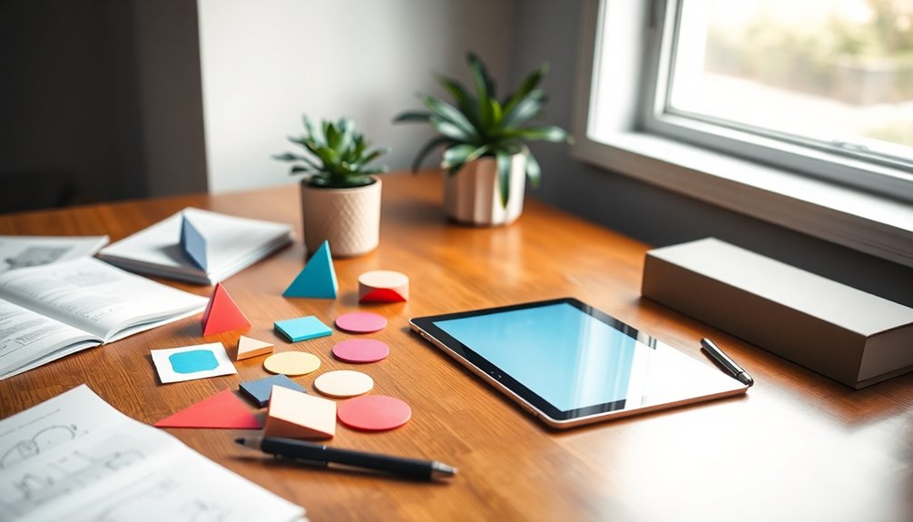
To create effective minimalist icons, start by pinpointing the core concepts that your icons need to represent, ensuring they align with your project's branding and goals.
Identify the themes or messages you want to convey, as this foundation will guide your design choices. Research existing minimalist icon designs for inspiration, noting common traits like simple shapes and limited color palettes.
Create a mood board to visualize your desired aesthetic, gathering elements that resonate with minimalist style.
Next, sketch initial concepts, focusing on simplifying complex ideas into recognizable shapes.
Finally, utilize design tools like Canva or Stockimg.ai to refine your sketches into polished, custom icons, experimenting with color and layout to enhance clarity and visual appeal. Incorporating utilitarian principles can also help ensure your icons serve a practical purpose while maintaining aesthetic value.

Clementoni Idea – Create Your Message Pens Feelings, Creative Kit for Kids Ages 6 and Up, Pens with Emotions Messages and Custom Icons, 18400
Message Feelings pens: original creative kit to assemble and customize three pens with rotating messages and cute characters…
As an affiliate, we earn on qualifying purchases.
As an affiliate, we earn on qualifying purchases.
Choosing Simple Shapes and Clean Lines

When you choose simple shapes and clean lines for your icons, you elevate the power of minimalism in your design. Selecting complementary colors can enhance this effect, making your icons not just recognizable but also visually appealing. Additionally, incorporating educational toys that stimulate cognitive growth can inspire creativity in your design process.
Importance of Minimalism
Simplicity is the cornerstone of effective design, especially in minimalist icons. By prioritizing simple shapes and clean lines, you enhance readability and enable users to grasp information quickly.
Minimalist designs, with their fewer elements, create a cohesive and visually appealing look that seamlessly integrates into various projects. Research shows that these icons greatly improve user experience by reducing cognitive load, allowing for faster recognition and decision-making.
Additionally, utilizing negative space draws attention to the subject while eliminating distractions. Embracing minimalism aligns your work with modern design trends, making it a timeless choice that resonates with a broad audience. Prioritizing self-care in your design process can also enhance your creativity and focus.
Ultimately, choosing a minimalist approach guarantees your icons remain relevant across different platforms and contexts.
Selecting Complementary Colors
Choosing the right complementary colors is crucial for creating minimalist icons that stand out. A well-chosen color palette not only enhances visual harmony but also maintains simplicity.
Here are some tips to help you select the best colors:
- Limit your palette to two or three hues.
- Pair warm colors with cool ones for contrast.
- Test colors against various backgrounds for legibility.
- Use negative space to create balance.
- Guarantee consistent stroke widths for clean lines.
- Consider incorporating artistic elements to further elevate the impact of your icons.

TangleEasy Vintage Icons: Design Templates for Zentangle (R), Coloring, and More (Design Originals) Tangle, Pattern, and Color Retro Designs like a Jukebox, Telephone, Gramophone, Lighthouse, & Camera
As an affiliate, we earn on qualifying purchases.
As an affiliate, we earn on qualifying purchases.
Limiting Your Color Palette
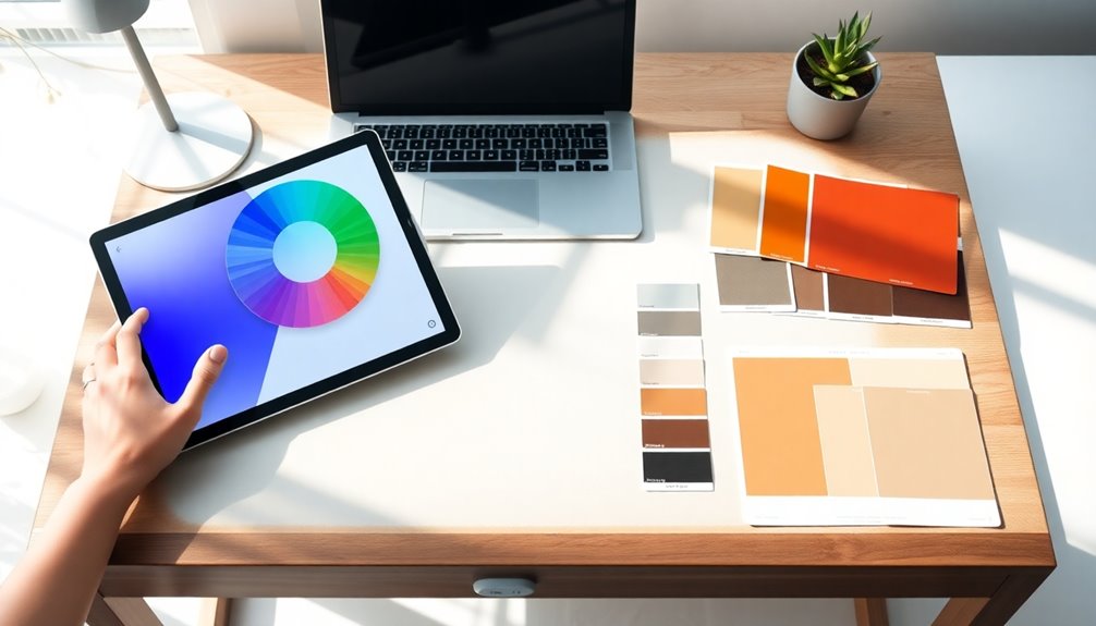
A well-defined color palette can greatly elevate the minimalist aesthetic of your icons. By limiting your palette to just 2-4 colors, you enhance recognizability and ease of integration into various design projects.
A cohesive color scheme guarantees your icons convey a unified brand message, boosting visual harmony across different materials. Stick to neutral tones or monochromatic variations for simplicity and versatility with backgrounds.
Apply the 60-30-10 rule: use 60% of a dominant color, 30% as a secondary color, and 10% for an accent. This approach creates an appealing design without overwhelming the viewer.
Don't hesitate to experiment with shades and tints of your chosen colors to add depth while keeping the minimalist essence intact. Additionally, consider using essential oils for aromatherapy to create a calming atmosphere while you design, enhancing your creative process.
Achieving Balance in Icon Design
With a well-defined color palette setting the stage, achieving balance in icon design becomes paramount.
It guarantees visual harmony and enhances the clarity and recognition of your icons.
Here are key strategies to maintain balance:
- Maintain proportionality between shapes and negative space.
- Use a limited color palette for a cohesive look.
- Simplify details, focusing on essential elements.
- Guarantee consistency in style across all icons.
- Test icons in various sizes and contexts for readability.
Incorporating various brewing methods can inspire unique icon designs that resonate with coffee enthusiasts.
Utilizing Negative Space Effectively
When you think about negative space in your icons, it's all about how you define the areas around your main subject. Balancing elements visually not only enhances recognition but also keeps your design clean and engaging. Additionally, embracing the concept of mindful consumption can help you create icons that are not only aesthetically pleasing but also aligned with sustainable values.
Defining Negative Space
Negative space plays an essential role in minimalist icon design, as it encompasses the area surrounding and between the elements of an image.
By utilizing negative space effectively, you can create icons that aren't only visually appealing but also convey messages succinctly.
Here are some key aspects to reflect on:
- Shape Formation: Use negative space to form recognizable shapes.
- Simplicity: Simplify complex ideas for quick understanding.
- Attention Focus: Draw viewers' attention to the main subject.
- Memorability: Create designs that are memorable and recognizable.
- Storytelling: Enhance the storytelling aspect of your icons.
Additionally, incorporating continuous learning in your design process can help you refine your skills and adapt your style over time.
Balancing Elements Visually
Utilizing negative space effectively can greatly enhance the visual balance of your minimalist icons. By carefully managing the area around and between your icon's elements, you can draw attention to the main features and avoid overcrowding.
This balance guarantees each component has room to "breathe," making your design more impactful. You can also simplify complex shapes, transforming them into recognizable forms vital for clear communication.
Applying the rule of thirds helps position elements harmoniously within the icon, increasing visual interest. Don't forget to test designs with varying levels of negative space; finding the right amount is essential, as too much or too little can detract from your minimalist aesthetic and disrupt the balancing elements. Additionally, understanding the importance of visual aids can clarify design concepts and ideas, which is crucial for effective communication in your projects.
Enhancing Icon Recognition
To enhance icon recognition, it's important to leverage negative space effectively, as it allows the main elements to stand out clearly. By doing this, you can simplify complex designs and improve usability.
Here are some key points to keep in mind:
- Create strong visual impact by using negative space to highlight your main subject.
- Ensure clarity by balancing filled and empty spaces—avoid clutter.
- Make your icons memorable; they'll engage viewers' imaginations.
- Design for versatility; negative space can communicate multiple meanings.
- Optimize for smaller sizes, vital for mobile and web applications.
Refining Your Design
While refining your design, it's crucial to start with a clear concept that emphasizes essential shapes and minimizes unnecessary details. Focus on incorporating a limited color palette to maintain simplicity and enhance clarity. Use negative space effectively to create balance and make your icon memorable. Experiment with line weights and shapes to capture your design's essence.
| Element | Considerations |
|---|---|
| Shapes | Essential, simple forms |
| Color Palette | Two to three colors |
| Negative Space | Balance and memorability |
| Line Weights | Variability for emphasis |
| Design Tools | Canvas, Stockimg.ai |
Ensuring Scalability and Versatility

When designing your minimalist icons, it's essential to prioritize resolution independence, so they look sharp at any size.
Embracing adaptable design principles guarantees your icons work seamlessly across various platforms and backgrounds.
Plus, saving them in multiple formats will make them versatile and easy to use in different projects.
Resolution Independence Importance
Resolution independence is essential for guaranteeing that your icons remain sharp and clear at any size, whether displayed on a mobile device or a large banner.
By using high-resolution icons, you can create designs that are versatile and professional.
Here's why resolution independence matters:
- Scalability: Icons can be resized without losing quality.
- Versatility: Suitable for various applications and devices.
- Editing Ease: Vector formats like SVG or PDF make adjustments simple.
- Consistent Branding: Maintains a polished look across all platforms.
- Future-Proofing: Icons will stay visually appealing as trends change.
Focusing on resolution independence not only enhances your designs but also guarantees they adapt seamlessly to evolving technology.
Adaptable Design Principles
To create truly adaptable designs, you need to focus on simplicity and clarity in your custom minimalist icons.
Begin by utilizing basic shapes and a limited color palette, which enhances versatility across various applications. Opt for scalable vector graphics (SVG) formats to keep your icons clear and high-quality, no matter the size.
Consistency in style and branding elements is vital; confirm your icons fit seamlessly into different contexts while remaining recognizable.
It's important to test your icons across various resolutions and contexts to verify their effectiveness.
Finally, leverage the Brand Kit feature in your design tools to maintain a cohesive look through all your minimalist icons.
Multi-Platform Compatibility
Creating adaptable designs naturally leads you to contemplate multi-platform compatibility. You want your custom minimalist icons to look great on any device, so keep these tips in mind:
- Design in vector format for scalability.
- Use tools like Canva and Stockimg.ai for multiple export options (SVG, PNG, JPEG).
- Test icons in both light and dark modes for clarity.
- Create multiple sizes to fit various devices, from smartphones to desktops.
- Follow industry standards like Apple's and Google's design guidelines.
With these strategies, you'll guarantee your icons maintain their quality and functionality across platforms.
Plus, with drag and drop capabilities in design tools, adapting your icons for different applications becomes a breeze!
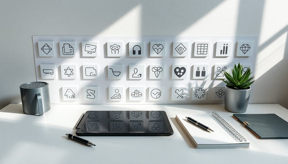
Tools for Creating Minimalist Icons
When you're looking for tools to craft minimalist icons, several options stand out for their ease of use and versatility. Canva is a fantastic choice, offering a free icon maker that lets you customize layouts, colors, and themes to fit your brand. AI generators like Stockimg.ai can quickly produce sleek icons, saving you time and effort. With these tools, you can generate icons that suit your social media needs while adhering to brand guidelines through Canva's Brand Kit feature.
| Tool | Description |
|---|---|
| Canva | Free online icon maker with customizable themes |
| Stockimg.ai | AI icon generator for quick, clean designs |
| Brand Kit | Guarantees consistency across all design elements |
Testing Your Icons Across Different Applications
After selecting the right tools to craft your minimalist icons, the next step involves testing them across various applications and devices. This guarantees your icons maintain clarity and visual impact at different resolutions.
Here are key points to take into account while testing your icons:
- Use mockups to visualize icons in context (web browser, mobile apps).
- Gather user feedback to identify usability issues.
- Check legibility against different backgrounds and color schemes.
- Experiment with styles based on testing results.
- Refine icons for ideal performance and aesthetic appeal.
Frequently Asked Questions
How to Create AI Icons?
To create AI icons, start by choosing a user-friendly tool like Stockimg.ai.
You'll want to define the style you're aiming for, whether it's minimalist or something else.
Next, craft a specific prompt that clearly outlines your vision.
Once the icons are generated, refine them to fit your project's needs.
Finally, download the icons in high resolution to guarantee they look sharp on any device.
You'll have unique icons ready in no time!
What Is the Best Free Icon Maker?
If you're searching for the best free icon maker, stop seeking beyond Canva.
Picture yourself easily crafting sleek, minimalist icons as if you're wielding a digital paintbrush!
With its ready-made templates and customizable features, you can tweak colors and textures to fit your style.
Plus, the Brand Kit guarantees your designs stay consistent.
Download your creations in various formats like PNG, and watch your projects come to life effortlessly!
How to Design an Icon Pack?
To design an icon pack, start by brainstorming themes that align with your project's goals.
Use design tools like Canva or Stockimg.ai to create your icons, focusing on simple shapes and a limited color palette.
Organize your icons into a cohesive pack, ensuring they follow a consistent style.
Finally, download the pack in various formats like PNG or SVG, so you've got compatibility for all your design needs.
How to Create Custom Icons on Iphone?
Creating custom icons on your iPhone can feel intimidating, yet it's surprisingly simple.
Start by downloading the Shortcuts app, where personalization meets ease. You'll tap the "+" to create a new shortcut, selecting "Open App" for the app you want to change.
After tweaking the icon's look with a photo or design, you'll add it to your home screen.
Embrace the transformation and enjoy a cleaner, unique aesthetic that reflects your style!
Conclusion
Creating custom minimalist icons can be like sculpting a masterpiece from a block of marble; it's all about chiseling away the excess to reveal the beauty within. By focusing on simple shapes, a limited color palette, and ensuring balance, you'll craft icons that resonate with clarity and purpose. Remember, just as a well-placed stroke of a brush can transform a canvas, your thoughtful design choices will elevate your projects, making them not just functional but visually striking.