To simplify complex data into minimalist visuals, start by choosing the right chart type, like bar or line charts, depending on your data's needs. Reduce visual clutter by limiting colors and labels for clarity, while using white space effectively. Incorporate clear titles and concise annotations to guide your audience. Break down the data into multiple charts to avoid cognitive overload. With these strategies in place, you'll create visuals that engage and inform. Discover more techniques for enhancing your presentations.
Key Takeaways
- Choose appropriate chart types that clearly communicate the data, such as line charts for trends and bar charts for comparisons.
- Limit colors, fonts, and labels to enhance visibility and reduce visual clutter, ensuring key information stands out.
- Break down complex data into multiple, simpler charts to avoid cognitive overload and facilitate easier understanding.
- Use clear titles, concise labels, and consistent visual cues to emphasize significant data and guide audience attention effectively.
- Gather feedback and conduct usability testing to refine visuals, ensuring they remain simple and engaging for the audience.

SAMSUNG 34" ViewFinity S50GC Series Ultra-WQHD Monitor, 100Hz, 5ms, HDR10, AMD FreeSync, Eye Care, Borderless Design, PIP, PBP, LS34C502GANXZA, 2023, Black
DO MORE ON ONE SCREEN: See every detail on the wider display featuring a 21:9 aspect ratio; Ultra...
As an affiliate, we earn on qualifying purchases.
Choose the Right Chart Type

Choosing the right chart type can make all the difference when presenting complex data. To effectively communicate your message, consider the data type and your audience's familiarity with various charts.
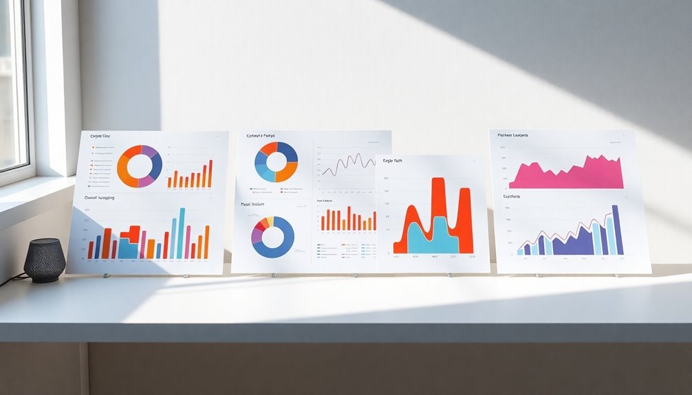
For trends over time, line charts shine, while bar charts excel at comparing quantities across categories. If you want to show proportions, pie charts work well but limit them to a few categories to enhance clarity.
Scatter plots are your go-to for illustrating relationships between variables, helping to identify correlations and outliers. When dealing with multiple datasets, grouped bar charts provide a clear visual representation of differences.
Utilizing data visualization tools can further simplify your visuals, ensuring they're minimalist and easily interpretable for your audience. Additionally, understanding emotional regulation can enhance how you present data to ensure your audience remains engaged and responsive.

INNOCN 49" OLED Ultrawide Curved Monitor 5K2K 5120 x 1440p 144Hz, 0.03ms, Computer Monitor for AI PC, USB Type C 90W, HDMI 2.1, DisplayPort, USB Hub, Speakers, Adaptive-Sync, Adjustable Stand, Black
【49 Inch Curved Monitor with QD-OLED Technology】Premium OLED Panel delivers 5k2k 5120*1440 resolution up to 144hz monitor for...
As an affiliate, we earn on qualifying purchases.
Reduce Visual Clutter

While effective data visualization is essential for clear communication, reducing visual clutter is equally important to confirm your audience grasps the key message.
To reduce visual clutter, select appropriate chart types that clearly communicate complex data, like line charts for trends. Limit excessive colors, fonts, and labels to let key information stand out and enhance clarity.
Utilize white space strategically to create a visual hierarchy, guiding attention to essential elements. Remove non-essential visual elements to streamline understanding and allow focus on relevant data points.
Implement a consistent design with a minimal color palette to further reduce visual clutter, reinforcing brand identity and improving legibility. This approach confirms your visuals effectively communicate the intended message without overwhelming your audience, especially when using free SEO keywords to enhance content relevance.

LG 34WR55QK-B 34-inch UltraWide WQHD (3440 x 1440) Curved Computer Monitor, 100Hz, 5ms, HDR10, Reader Mode, HDMI, DisplayPort, USB Type-C, Tilt/Height Adjustable Stand, Black
21:9 UltraWide - The 21:9 UltraWide WQHD (3440 x 1440) monitor is great for work. The widescreen allows...
As an affiliate, we earn on qualifying purchases.
Use Visual Cues and Annotations

Effective visualization goes beyond mere data presentation; it relies heavily on visual cues and annotations to guide your audience's understanding.
To enhance your minimalist visuals, incorporate clear titles and concise labels that highlight key points. Use intuitive icons and color contrasts to draw attention to significant data points, making it easier for viewers to grasp essential information at a glance.
Keep annotations brief and focused, reinforcing the narrative without adding clutter. Additionally, maintain a consistent style and placement for all visual cues, ensuring a cohesive visual experience. Furthermore, embracing data analytics can help you identify which visuals resonate most with your audience, enhancing their engagement and comprehension.

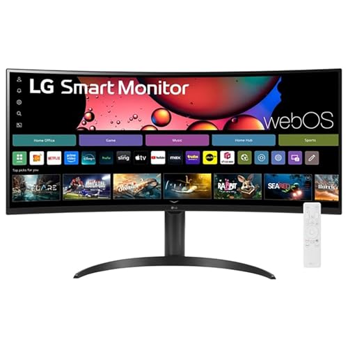
LG 34" Curved UltraWide WQHD(3440x1440) Smart Monitor with HDR10 99% sRGB, 100Hz, Magic Remote, AirPlay 2 & Adjustable Stand, webOS
Work Smart, Play Smart on a 21:9 Smart Screen - LG Smart Monitor is designed for multitasking while...
As an affiliate, we earn on qualifying purchases.
Break Down Complex Data Into Multiple Charts

Breaking down complex data into multiple charts can greatly enhance your audience's understanding. By segmenting data, you're simplifying complex concepts and reducing cognitive overload, allowing viewers to focus effectively. Use varied charts and graphs, like bar graphs for comparisons and line charts for trends, to provide clear and concise data visualization.
Consider creating a dashboard with interactive exploration features that present different facets of the data without overwhelming users. Here's a simple example of how to organize your visuals:
| Chart Type | Purpose | Key Feature |
|---|---|---|
| Bar Graph | Compare categories | Clear comparisons |
| Line Chart | Show trends | Emphasizing changes |
| Pie Chart | Display proportions | Visual aids for parts |
Maintaining consistent design principles enhances understanding and guides attention to key data points. Additionally, leveraging key metrics can help you assess the effectiveness of your visualizations in conveying the intended message.
Test and Refine Your Visualization

Testing and refining your visualizations is essential to ensuring they communicate the intended message effectively.
Start by gathering feedback from stakeholders to pinpoint ambiguities and areas needing improvement. Usability testing reveals how well your audience understands the visualization, guiding necessary adjustments.
Focus on simplicity and engagement during each iteration, minimizing clutter while highlighting key messages. Utilize analytics tools to monitor user interactions, gaining insights into which elements resonate and which require further refining.
Regularly revisit and update your visualizations based on new data or feedback to maintain accuracy and relevance. Incorporating food preservation techniques can illustrate the importance of clarity in visual communication, much like how these methods enhance the longevity of produce.
This iterative process enhances clarity and ultimately elevates the quality of your communication, ensuring your visuals engage and inform your audience effectively.
Frequently Asked Questions
How Do You Simplify Data Visualization?
To simplify data visualization, start by choosing the right chart types that clearly communicate your message.
Limit your color palette and use readable fonts to maintain focus.
Break down complex data into smaller, more manageable visuals.
Use titles and labels to guide viewers, and highlight key points.
Don't hesitate to ask for feedback from your audience to refine your approach, ensuring that your visualizations are both engaging and easy to understand.
How Do You Simplify Complex Information?
To simplify complex information, you should break it down into smaller, digestible parts.
Use visual metaphors to connect new ideas to familiar concepts, making them easier to grasp. A minimalist approach with a limited color palette can enhance clarity, while clear labeling helps key points stand out.
Incorporate infographics like charts and flowcharts to tell a cohesive story, and don't forget to use negative space to reduce clutter and improve understanding.
What Visual Format Combines Text and Graphics to Simplify Complex Data?
You're looking for a visual format that combines text and graphics to simplify complex data. Infographics are your best bet!
They merge concise text with engaging visuals like charts and icons, making intricate information more digestible. By using color-coded sections, you can highlight key points, helping viewers focus on what matters most.
Plus, visual metaphors can connect familiar ideas with new concepts, enhancing understanding and retention. Infographics truly make data come alive!
How to Simplify a Complex Concept?
Imagine untangling a knotted rope; you pull apart each strand to see its path.
To simplify a complex concept, break it down into smaller parts, like unraveling that rope. Use relatable examples or metaphors to create connections.
Highlight key points with visual cues, guiding your audience's focus. Stick to a consistent style to avoid confusion, and present information in a structured way, making it easier for anyone to grasp the essence of your idea.
Conclusion
In the world of data visualization, less is often more. By choosing the right chart type, reducing clutter, and using clear visual cues, you can make complex data accessible and engaging. Remember, "A picture is worth a thousand words." So, break down your data into digestible pieces and don't hesitate to test and refine your visuals. With these strategies, you'll transform overwhelming information into minimalist visuals that speak volumes. Happy visualizing!


