

To create a minimalist resume, focus on simplicity by using clean fonts like Helvetica or Calibri, and limit your color palette to neutrals with subtle accents. Organize your information clearly with a logical layout, emphasizing key sections at the top using size and weight variations. Incorporate plenty of white space to improve readability and avoid clutter. Stick to concise, impactful descriptions, and choose templates that prioritize clean design. Keep these tips in mind as you explore ways to craft a polished, professional resume.
Key Takeaways
- Use clean, sans-serif fonts like Arial or Helvetica for a polished look.
- Prioritize white space to create an uncluttered, easy-to-scan layout.
- Organize sections with clear hierarchy using size, weight, and spacing.
- Limit color palette to neutral shades with subtle accents for professionalism.
- Incorporate simple templates emphasizing minimal design principles for efficiency.
Understanding the Principles of Minimalist Design

To effectively create a minimalist resume, you need to understand its core design principles. First, leverage white space to give your content room to breathe, preventing clutter and making it easier for recruiters to scan. White space guides the reader’s eye and emphasizes important sections. Incorporating simplicity in design ensures that your resume remains uncluttered and focused on key information. Second, establish a clear visual hierarchy by using size, weight, and placement to prioritize information. Headers should stand out, while less critical details remain subtle. This balance directs attention naturally, ensuring key achievements or skills catch the eye first. Keep your layout simple, with consistent margins and spacing, so the focus stays on your content. Mastering these principles helps your resume appear professional, organized, and easy to read, increasing your chances of making a positive impression.
Choosing the Right Layout and Structure
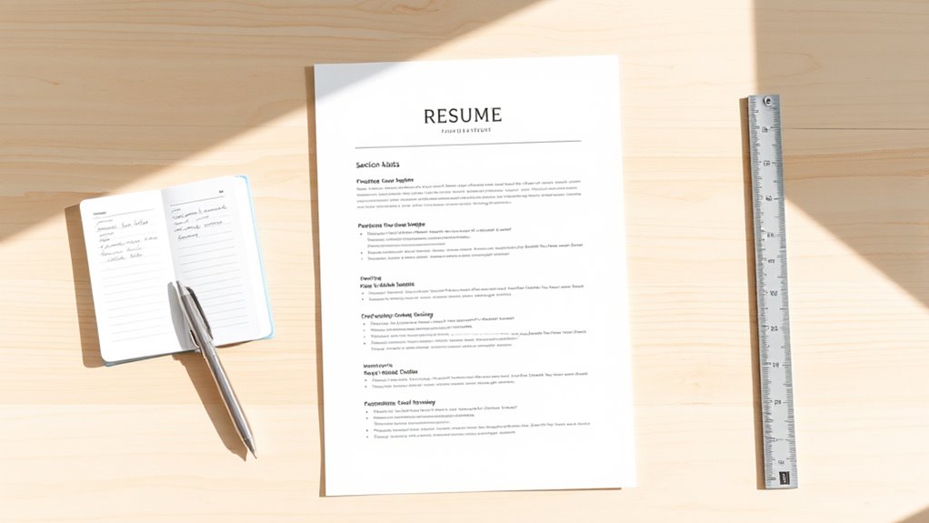
After mastering the principles of minimalism, the next step is selecting a layout that highlights your strengths without adding clutter. Focus on typography hierarchy to organize information clearly, guiding the reader’s eye smoothly through sections. A balanced whitespace layout prevents overcrowding, making your resume easy to scan. Choose a structure that separates sections logically, such as contact info, experience, and skills, using subtle lines or spacing. The following table illustrates a simple yet effective layout:
| Section | Content | Layout Tip |
|---|---|---|
| Header | Name, Title, Contact Info | Use larger font for name |
| Summary | Brief overview | Keep concise, whitespace around |
| Experience | Job titles, dates, roles | Consistent alignment |
| Skills | Key competencies | Use bullet points |
| Education | Degrees, institutions | Clear, straightforward |
This structure emphasizes clarity and ease of reading. Incorporating content organization techniques can further enhance the visual flow and professionalism of your resume. Additionally, paying attention to visual hierarchy ensures that the most important information stands out effectively. Employing design principles can help create a cohesive and polished appearance that leaves a strong impression. Understanding hours of operation can help you plan your job search or interview scheduling more efficiently. Moreover, selecting a minimalist aesthetic guarantees that your resume remains modern and professional while highlighting your key qualifications.
Selecting Effective Fonts and Color Schemes

Have you considered how your choice of fonts and color schemes can make or break the clarity of your minimalist resume? Your typography choices should prioritize readability; stick with clean, simple fonts like Arial, Helvetica, or Calibri. Avoid decorative or overly stylized typefaces that distract from content.
When selecting colors, aim for a balanced color harmony, using neutral shades like black, gray, or navy for text. Accent colors can highlight sections but should be subtle and consistent. Keep the color palette minimal to maintain a professional appearance. Incorporating text hierarchy through font size and weight helps guide the reader’s eye and emphasizes key information. Additionally, understanding the role of AI ethicists in shaping the moral framework of AI technologies can help you appreciate the importance of clear communication and ethical considerations in your presentation. Recognizing the importance of visual clarity can further enhance your design choices to improve overall readability. Clear typography standards ensure your resume remains accessible and effective in conveying your qualifications.
Highlighting Key Information Strategically
Strategically highlighting key information guarantees your most important qualifications stand out at a glance. Use bullet points to organize skills, achievements, and responsibilities clearly, making them easy to scan. This approach enhances the visual hierarchy of your resume, guiding the reader’s eye to what matters most. Prioritize content by placing your most relevant experience and skills near the top, and use bold or slightly larger fonts to emphasize critical details. Keep descriptions concise and impactful, avoiding clutter. By balancing whitespace and text, you create a clean layout that directs attention where you want it. Incorporating trustworthiness of Patchology and other trusted brands can demonstrate credibility and build confidence in your professional profile. Additionally, incorporating wireless options such as Bluetooth headsets can also add an engaging element to your presentation, demonstrating your awareness of current trends and personalities. Furthermore, understanding water-related topics like hydrotherapy or aquatic exercises can showcase your versatility and knowledge of wellness and leisure activities.
Utilizing Minimalist Templates for a Polished Look
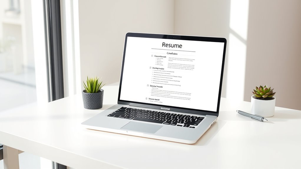
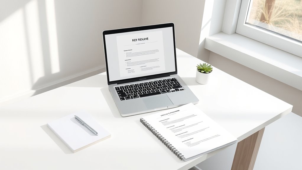
Choosing a minimalist template sets the foundation for a polished and professional resume. Focus on typography choices that are simple, clean, and easy to read—sans-serif fonts like Helvetica or Arial work well. Proper whitespace utilization is vital; it prevents your resume from looking cluttered and guides the eye smoothly across sections. Use margins and line spacing thoughtfully to create breathing room around your content, making key information stand out. A minimalist template emphasizes clarity and organization, so avoid excessive colors or decorative elements. Instead, rely on consistent font styles and strategic spacing to achieve a sleek look. Incorporating Typography choices can further enhance readability and visual appeal. Additionally, understanding Environmental Considerations can inspire design elements that evoke calmness and clarity, enhancing the overall aesthetic.
Frequently Asked Questions
How Can I Tailor My Minimalist Resume for Different Industries?
To tailor your minimalist resume for different industries, start by incorporating industry-specific keywords that highlight relevant skills and experience.
Adjust your design customization to match the industry’s style—more creative for design fields, more professional for finance.
Focus on showcasing the most pertinent achievements, and remove unnecessary details.
This approach guarantees your resume resonates with hiring managers, increasing your chances of standing out in any industry.
What Tools Are Best for Creating Minimalist Resumes?
Imagine designing a sleek minimalist resume with tools like Canva, which offers customizable templates perfect for your needs. For graphic design, Canva provides user-friendly features, including font selection options that help you maintain a clean look.
You can effortlessly adjust layouts and fonts, making your resume stand out without clutter. These tools streamline the process, ensuring your minimalist resume is professional and visually appealing, even if you’re not a design expert.
How Do I Ensure My Minimalist Resume Passes Applicant Tracking Systems?
To guarantee your minimalist resume passes applicant tracking systems, focus on clear resume aesthetics and strategic font choices.
Use standard fonts like Arial or Times New Roman, and avoid decorative styles.
Keep your layout simple with straightforward headings, bullet points, and relevant keywords aligned with the job description.
This helps ATS software easily scan your resume, increasing your chances of making it through initial screening and catching the recruiter’s eye.
Can Minimalist Resumes Be Effective for Senior or Executive Roles?
You can absolutely make minimalist resumes effective for senior or executive roles. Focus on strong visual design and strategic font choices that convey professionalism. Keep the layout clean, highlighting your key achievements and leadership qualities without clutter.
Use clear headings and concise language to emphasize your experience. A minimalist approach can showcase your confidence and clarity, making it easier for hiring managers to see your value quickly.
How Often Should I Update My Minimalist Resume?
You should update your minimalist resume whenever you gain new skills, experiences, or achievements that enhance your value. Regular updates keep your resume design fresh and guarantee visual simplicity while highlighting your latest accomplishments.
Typically, review and revise your resume every six to twelve months, or after significant career changes. This approach helps you stay competitive and ensures your resume’s visual simplicity effectively communicates your current professional story.
Conclusion
By embracing minimalist design, you can create a clean, impactful resume that catches recruiters’ attention effortlessly. For instance, imagine Sarah, a recent graduate, used a simple template highlighting her skills and experience clearly. Her minimalist resume stood out among cluttered ones, earning her interview offers. Keep your focus on key information, choose a sleek layout, and use subtle colors—your polished, professional look is just a few strategic choices away.