Using a monochrome palette helps you create cohesive, impactful designs by exploring various shades, tints, and tones of a single color. You can evoke different emotions and add depth by tweaking saturation and brightness, making your visuals more dynamic and sophisticated. This approach simplifies your choices while enhancing the overall aesthetic. Stay tuned to discover how mastering subtle variations can transform your projects into emotionally resonant works.
Key Takeaways
- Use variations in saturation, tone, and brightness of a single color to create visual depth and interest.
- Incorporate different textures and lighting effects within your monochrome scheme for added dimension.
- Balance lighter and darker shades to evoke specific moods, from calmness to mystery.
- Experiment with the psychological impact of the chosen hue to enhance emotional depth.
- Maintain harmony by carefully selecting shades that complement each other within the monochrome palette.
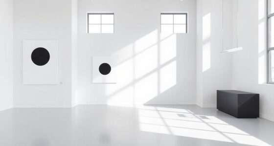
Monochrome palettes use variations of a single color to create striking and cohesive designs. They allow you to explore depth and nuance without the chaos of multiple hues. When you work with a monochrome scheme, you’re harnessing the power of color psychology—understanding how different shades influence mood and perception. Lighter shades can evoke calmness or freshness, while darker tones often suggest sophistication or mystery. This psychological aspect helps you craft environments or visuals that communicate specific feelings, all within a unified color family. Additionally, monochrome palettes have rich historical uses that can inspire your approach. For centuries, artists and designers have employed a limited color range to focus attention or convey mood. For example, in classical paintings, artists used monochromatic schemes like sepia or grisaille to emphasize form and shadow, creating a sense of timelessness and depth. During the Renaissance, master painters often relied on variations of browns and grays to depict realistic textures and light, demonstrating how a single hue could tell complex stories. Even in modern times, monochrome designs are rooted in tradition; they’re often seen in minimalist art and photography, where simplicity enhances impact. Understanding these historical uses informs your choices and helps you appreciate the versatility of monochrome palettes. When you select a single color, you’re not limited—you’re empowered to play with saturation, tone, and brightness to produce a rich tapestry of visual interest. For instance, a deep navy can be paired with softer sky blues to create a sense of depth and tranquility, or a bold red can range from bright scarlet to dark maroon for drama and intensity. This flexibility allows you to evoke a range of emotions and themes without straying from your core color. Monochrome palettes also simplify decision-making, making it easier to maintain consistency across projects, whether you’re designing interiors, branding, or artwork. The key lies in understanding how to balance shades and tints effectively, and to keep the overall composition harmonious. As you experiment with different sizes, textures, and lighting, you’ll discover how a single hue can suggest complexity and depth, transforming a simple color into a compelling visual story. Exploring color variations within a monochrome palette can further enhance the richness and emotional impact of your design. By studying the historical uses of monochrome schemes and applying principles of color psychology, you can create designs that are both visually enthralling and emotionally resonant. In the end, mastering monochrome palettes is about recognizing the strength of unity and the subtle variations that bring a design to life.

Tamaki 2 Pack 11.8 x 7.9 Inch Acrylic Paint Palette with Thumb Hole Clear Paint Pallet, Easy Clean Non-Stick Artist Pallet for Oil Watercolor Craft DIY Art Painting Palette
Value set: 2 pack acrylic transparent palettes include 1 pack 11.8 x 7.9 inch rectangular transparent palette, 1…
As an affiliate, we earn on qualifying purchases.
As an affiliate, we earn on qualifying purchases.
Frequently Asked Questions
How Do I Choose the Right Hue for My Monochrome Palette?
To select the right hue for your monochrome palette, focus on hue selection that complements your project’s mood and purpose. Start with a base color you love, then explore variations by adjusting saturation and brightness. Consider color harmony principles to guarantee your chosen hue blends well across different shades. Trust your intuition and test a few options, choosing the hue that best conveys the emotion or style you want to achieve.
Can Monochrome Palettes Be Effective in Large-Scale Design Projects?
Yes, monochrome palettes can be highly effective in large-scale design projects. They promote strong color harmony and create a cohesive visual experience across expansive areas. By carefully selecting varying shades and tones, you guarantee visual consistency that guides viewers’ attention smoothly. This approach simplifies decision-making and maintains unity, making your design feel intentional and polished, even on a grand scale.
What Are Common Mistakes to Avoid When Using Monochrome Color Schemes?
In the domain of design, avoid common monochrome mistakes like neglecting contrast balance, which can make your work look flat. Think of color harmony to guarantee your shades complement each other and create visual interest. Don’t overuse a single tone, or your project might feel dull—strive for variation in saturation and brightness. Remember, even in monochrome schemes, subtle shifts are essential to keep viewers engaged and your design lively.
How Does Lighting Impact the Perception of a Monochrome Color Palette?
Lighting crucially impacts how you perceive a monochrome color palette. When you adjust light intensity, you create variations in brightness, adding depth and dimension. Shadow play enhances this effect by emphasizing subtle differences in tone, making the single color appear richer and more dynamic. Proper lighting guarantees your monochrome design doesn’t look flat, allowing the nuances to come alive and giving your space or artwork a captivating sense of depth.
Are Monochrome Palettes Suitable for Creating a Calming or Energetic Atmosphere?
Monochrome palettes are perfect for creating a calming atmosphere because they leverage color psychology to promote relaxation and focus. Using soft, muted shades can enhance mood and reduce stress, while vibrant tones can energize a space. You can manipulate saturation and lighting to fine-tune the mood, making these palettes versatile for both soothing environments and lively, energetic settings.

Liquitex Professional Paint Marker Set, 3 Piece, Monochromes
Liquitex paint markers are each made from super-fine artist-grade pigments and give you a huge range of bright,…
As an affiliate, we earn on qualifying purchases.
As an affiliate, we earn on qualifying purchases.
Conclusion
Embracing a monochrome palette transforms your design into an awe-inspiring masterpiece, elevating simplicity to an art form so profound that it could make even the most seasoned artists weep with envy. With just one color, you wield the power to create depths so mesmerizing, they seem to hold entire worlds within a single hue. Trust in this technique, and watch your work transcend ordinary boundaries, leaving viewers utterly captivated by its sublime elegance and unmatched sophistication.

Monochrome Home: Elegant Interiors in Black and White
As an affiliate, we earn on qualifying purchases.
As an affiliate, we earn on qualifying purchases.

NEEWER 52mm Black Diffusion 1/4 Filter Dreamy Soft Cinematic Effect Filter Ultra Slim Water Repellent Scratch Resistant Optical Glass Multiple Nano Coatings for Video/Vlog/Portrait Photography
【Black Diffusion Camera Lens Filter】 NEEWER 52mm black diffusion 1/4 filter with dreamy cinematic effects helps reduce highlights…
As an affiliate, we earn on qualifying purchases.
As an affiliate, we earn on qualifying purchases.