
To choose the right fonts for minimalist design, focus on clarity, simplicity, and how well they reflect your brand’s personality. Opt for clean sans-serif fonts for a modern look or serif fonts for tradition and authority, but always prioritize readability and contrast. Pay attention to font pairing, weight variations, and spacing to create hierarchy and visual harmony. Making thoughtful choices here sets a strong foundation—continue exploring to discover how to perfect your minimalist typography.
Key Takeaways
- Prioritize clean, legible fonts like sans-serif for clarity and modern minimalism.
- Choose font weights and sizes that establish clear hierarchy and guide viewer focus.
- Use high contrast between text and background to enhance readability and visual impact.
- Limit font variety to two or three complementary typefaces for cohesion and simplicity.
- Select fonts that reflect your brand’s personality and emotional tone for consistent messaging.
Understanding the Principles of Minimalist Typography
Have you ever wondered what makes minimalist typography so effective? It’s all about understanding its core principles, rooted in typography psychology. Minimalist fonts emphasize simplicity, clarity, and functionality, allowing messages to stand out without distraction. Acknowledging the role of attention in creative practice highlights how focused design efforts can enhance the effectiveness of minimalist typography. The choice of fonts also carries cultural significance, reflecting societal values, historical context, and brand identity. For example, sans-serif fonts often communicate modernity, while serif fonts evoke tradition and authority. Recognizing these nuances helps you select typefaces that align with your intended message. Additionally, understanding font psychology can help in choosing typefaces that evoke specific emotional responses. Minimalist typography isn’t just about aesthetics; it’s about strategic communication. By focusing on essential elements and understanding how typography influences perception, you can craft designs that are both visually appealing and meaningful. This foundational knowledge guides your approach to creating clean, impactful visuals.
The Impact of Typeface Selection on Design Clarity
Choosing the right typeface can considerably influence how clearly your message is communicated. Your font choice impacts readability, especially in minimalist design, where simplicity is key. Staying updated with typography trends helps you select fonts that resonate with current visual standards, guaranteeing your design feels fresh and relevant. Additionally, understanding font licensing is vital; using properly licensed fonts avoids legal issues and guarantees your project’s integrity. A well-chosen typeface enhances clarity by guiding the viewer’s eye and emphasizing key information. Proper font selection also involves considering typography principles, ensuring your message is both engaging and easy to comprehend. Being aware of design best practices in typography can further refine your font choices to optimize user experience. Consistently applying attention to detail in font selection helps prevent miscommunication and elevates overall design quality. Incorporating font pairing techniques can also help create harmonious and effective typography combinations, further improving the clarity of your message. Utilizing font hierarchy effectively can direct viewer focus and improve overall communication.
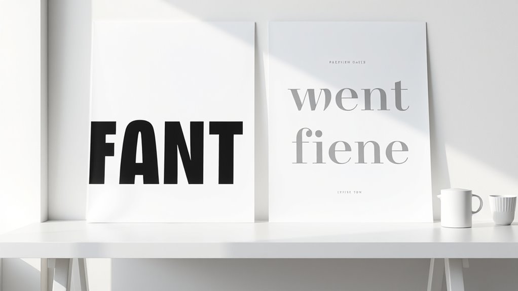
Serif vs. Sans-Serif: Which Works Best in Minimalist Layouts?
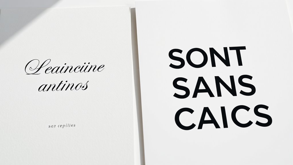
When it comes to minimalist layouts, the choice between serif and sans-serif typefaces can considerably influence the overall aesthetic and clarity of your design. Serif fonts, with their decorative strokes, often evoke tradition and elegance, aligning with current typography trends favoring classic sophistication.
Sans-serif fonts, on the other hand, are clean and modern, promoting readability and a sleek appearance. Font psychology plays a role here: serif typefaces can suggest authority and reliability, while sans-serif fonts communicate simplicity and innovation.
In minimalist design, sans-serif fonts typically better suit the uncluttered style, emphasizing clarity and space. However, if you aim to add a touch of refinement, a well-chosen serif can complement your layout without overwhelming its simplicity.
Understanding the 16PF traits can help in selecting fonts that evoke the desired emotional response and enhance user experience.
Choosing Fonts That Complement Your Brand Identity
When selecting fonts, you need to guarantee they reflect your brand’s tone and personality. Incorporating alternative investments can also influence your overall branding approach in visual communications. Finding the right balance between readability and style helps your message come across clearly without sacrificing visual appeal. Additionally, considering how your typography can facilitate collaborative efforts is crucial for fostering teamwork and innovation. Research indicates that specific sound frequencies can influence brainwave patterns, which can be leveraged to enhance focus during design tasks. Moreover, applying principles of Cultural Intelligence ensures that your typography aligns with diverse audience preferences and cultural nuances, strengthening your brand’s global resonance. Ultimately, your font choices should enhance your brand identity and resonate with your audience. Emphasizing design thinking principles ensures that your typography aligns with user needs and fosters an engaging visual experience.
Aligning Fonts With Brand Tone
Selecting the right fonts is essential for conveying your brand’s personality effectively. Your choice should reflect your brand voice and emotional tone to create a consistent message. For example, a playful brand might opt for rounded, casual fonts, while a sophisticated brand could choose sleek, serif styles. When aligning fonts with your brand tone, consider how different typefaces evoke feelings and reinforce your identity. – Use fonts that match your brand’s personality to foster trust and recognition. – Ensure the font style complements the emotional tone you want to communicate. – Select typefaces that resonate with your target audience’s expectations and preferences. – Practicing mindfulness and stillness can help clarify your brand’s core values and enable more intentional design choices that resonate with your audience. – Recognizing celebrity transformations can inspire your branding to adapt and evolve creatively. Incorporating an understanding of curiosity and its benefits can also encourage exploration of innovative typography solutions that captivate your audience. Additionally, understanding the costs of electric bikes can influence branding decisions for companies in the e-bike industry aiming to communicate affordability and quality through their typography choices. Exploring local community insights can further enhance your understanding of audience preferences and trends in typography.
Balancing Readability and Style
Balancing readability and style is essential to guarantee your design communicates effectively without sacrificing aesthetic appeal. Font psychology plays a key role here, as certain typefaces evoke specific emotions and reinforce your brand message. Incorporating visual techniques can further enhance the harmony between text and overall design. For example, a sleek sans-serif can convey modernity, while a serif might suggest tradition and reliability. Cultural influences also shape font choice, as different regions associate particular styles with their values and history. To strike the right balance, select fonts that align with your brand’s personality while remaining easy to read across various devices and sizes. Avoid overly decorative fonts that hinder legibility, but don’t shy away from subtle stylistic touches that enhance your brand identity. Additionally, considering the context of Water Parks and their vibrant, family-friendly atmosphere can guide you to choose fonts that evoke fun and excitement while maintaining clarity. Understanding typography in minimalism can help you create a clean and effective visual hierarchy. Ultimately, your font choices should harmonize style and function, creating a cohesive, impactful visual experience.
The Role of Readability and Legibility in Font Choice
Choosing the right font means prioritizing clarity so your message isn’t lost.
You need to find the right balance in size and spacing to guarantee everything looks clean and easy to read.
High contrast also makes your text stand out and improves visibility for your audience.
Font Clarity Importance
In minimalist design, the clarity of your fonts directly impacts how easily your message is understood. Prioritizing font clarity ensures your audience quickly grasps your content without distraction.
Clear fonts promote visual simplicity, allowing your design to breathe and focus on essential elements. When choosing fonts, consider how legible they’re at various sizes and distances, as clarity affects overall communication.
Avoid overly decorative or complex typefaces that hinder readability. Remember, the goal is to create a seamless reading experience that conveys professionalism and elegance.
- Clear fonts reduce eye strain and improve user engagement
- Visual simplicity enhances overall aesthetic and focus
- Prioritizing font clarity supports consistent branding and messaging
Size and Spacing Balance
Ensuring the right size and spacing in your typography is essential for maximizing readability and legibility. Choosing an appropriate font size helps your audience easily process the text without strain.
Generally, a larger font size improves clarity, especially on screens or from a distance. Equally important is line spacing, or leading, which prevents lines from feeling cramped or scattered. Proper line spacing creates visual breathing room, making it easier to follow lines smoothly.
Too tight spacing makes text difficult to read, while too much space can disrupt flow. Striking a balance guarantees your minimalist design remains clean yet accessible.
Always test different font sizes and line spacing options to find what works best for your content and layout, keeping readability at the forefront.
Contrast for Visibility
Contrast plays a crucial role in enhancing the visibility of your typography, making it easier for viewers to read and understand your message. Proper contrast between font color and background ensures your text stands out clearly. High contrast improves legibility, especially in minimalist designs where simplicity is key.
When choosing font colors, consider how they interact with the background to create enough separation. Low contrast can cause strain and reduce comprehension, while too much contrast may feel harsh.
To optimize readability, focus on:
- Selecting font colors that sharply contrast with the background
- Using background contrast intentionally to highlight key messages
- Balancing contrast to avoid overwhelming the viewer
Mastering contrast allows your typography to communicate effectively, guiding the audience effortlessly through your content.
Pairing Fonts for a Cohesive Minimalist Aesthetic

Pairing fonts effectively is essential to achieving a cohesive minimalist aesthetic, as it guides the viewer’s eye and creates visual harmony. When selecting font pairing options, focus on balancing contrasting styles—such as a sleek sans-serif with a refined serif—to enhance clarity and interest.
Keep the number of fonts minimal; usually, two or three suffice for a clean look. Consistency is key, so choose fonts that complement each other’s character and maintain visual cohesion across your design.
Pay attention to size and spacing to ensure readability and flow. Avoid overly decorative fonts that can clutter the minimalist feel.
Ultimately, your goal is to create a harmonious combination that supports your message without overwhelming the viewer. Thoughtful font pairing elevates your design’s simplicity and effectiveness.
Utilizing Font Weights and Styles for Visual Hierarchy
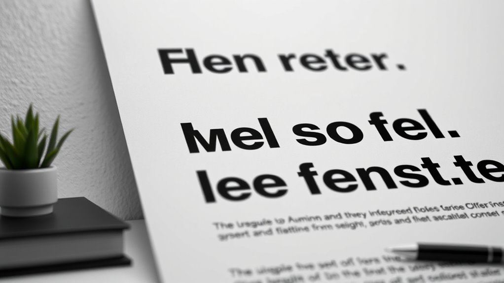
Utilizing font weights and styles effectively allows you to create a clear visual hierarchy that guides viewers through your design. By adjusting font weight, such as using bold for headings and regular for body text, you emphasize importance and structure.
Effective use of font weights and styles guides viewers and emphasizes key information naturally.
Style variations, like italics or uppercase, add emphasis and contrast without cluttering. When choosing font weights, think about balance—too many heavy styles can overwhelm, while too few create dullness. Similarly, style variations should highlight key information subtly.
- Use heavier font weights for main headings to draw attention.
- Apply italics or different styles to differentiate secondary information.
- Maintain consistency to reinforce hierarchy and improve readability.
Avoiding Common Pitfalls When Selecting Minimalist Fonts
Choosing the right minimalist fonts involves more than picking clean, simple typefaces; it requires awareness of common mistakes that can undermine your design. One key pitfall is neglecting proper letter spacing, which can make text hard to read or look cluttered. Too tight or too loose spacing disrupts visual harmony and hampers clarity.
Additionally, overlooking font licensing can cause legal issues or limit your usage options. Always ensure you have the right permissions for your chosen fonts, especially for commercial projects. Avoid using fonts that are overly trendy or too generic, as they can weaken your design’s impact.
Tools and Resources for Finding the Perfect Typeface
Finding the perfect typeface for your minimalist design can be straightforward when you leverage the right tools and resources. These tools help you explore font pairing options, stay updated on typography trends, and identify fonts that complement each other effectively.
Use font libraries like Google Fonts or Adobe Fonts to browse a wide selection of minimalist-compatible typefaces. Typography trend websites can keep you informed about current styles, ensuring your design feels fresh.
Additionally, font pairing tools like Fontjoy or Canva’s font combinations generator can help you discover harmonious matches quickly. Keep in mind that understanding how different fonts interact enhances your overall aesthetic.
Frequently Asked Questions
How Do Font Choices Influence User Experience in Minimalist Design?
When you choose fonts carefully, you directly impact user experience by enhancing readability and setting the tone. Font psychology helps you select typefaces that evoke specific emotions, making your message more compelling.
Good font choices also establish a clear visual hierarchy, guiding users effortlessly through your content. This balance keeps your design clean yet functional, ensuring users stay engaged and easily find what they need without feeling overwhelmed.
What Are the Best Practices for Customizing Minimalist Fonts?
Imagine you’re designing a website with a clean look. To customize minimalist fonts, you should focus on effective font pairing and establishing a clear font size hierarchy.
For example, use a bold sans-serif for headings and a lighter one for body text. Keep font sizes consistent to create visual flow, and avoid excessive styles.
This approach guarantees your design remains simple yet engaging, enhancing readability and user experience.
How Can I Ensure Accessibility With Minimalist Typography?
To guarantee accessibility with minimalist typography, you should focus on effective font pairing and font scalability.
Choose high-contrast fonts that are easy to read, and pair them thoughtfully for clarity.
Prioritize scalable fonts that maintain legibility across various devices and screen sizes.
Avoid overly decorative styles, and test your typography for readability.
This approach helps everyone access your content comfortably while maintaining a clean, minimalist aesthetic.
Are There Specific Fonts Recommended for Mobile Minimalist Interfaces?
Imagine hunting for the perfect font on your tiny mobile screen—like a knight seeking a dragon, but instead, it’s font pairing and scalability.
For minimalist interfaces, opt for clean, sans-serif fonts like Helvetica or Roboto, which stay crisp and readable.
Prioritize scalable fonts that adapt to various screen sizes, ensuring your design remains sleek and accessible without sacrificing style or clarity.
How Does Cultural Context Affect Font Selection in Minimalism?
When selecting fonts for minimalism, you should consider how cultural symbolism influences perception. Regional typography reflects local aesthetics and can evoke specific emotions or associations.
You might choose fonts that resonate with your target audience’s cultural background, ensuring clarity and relevance. Understanding these cultural nuances helps you create designs that feel authentic and respectful, making your minimalistic approach more impactful and engaging across diverse cultural contexts.
Conclusion
By mastering minimalist typography, you reveal the secret weapon to transform your designs into breathtaking works of art. Choose the wrong fonts, and your message risks vanishing into oblivion. But get it right, and you’ll create visuals so clean, striking, and unforgettable, they’ll leave your audience in awe—like a perfectly curated masterpiece that speaks volumes without saying a word. Embrace the power of great typography, and watch your designs soar beyond imagination.