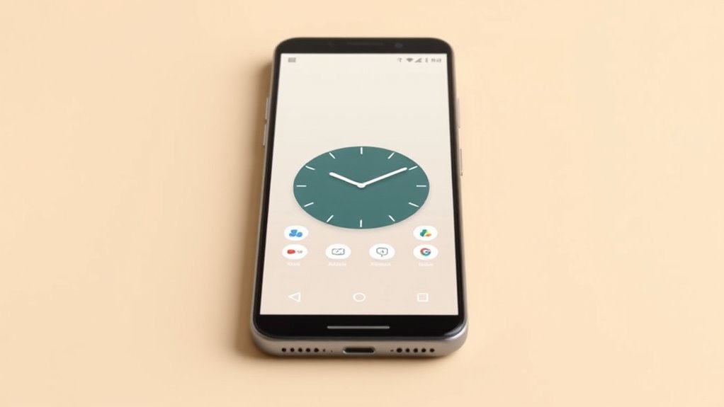
Designing a one-screen home screen means simplifying your device by organizing only essential apps and tools for quick, effortless access. Focus on creating a clean layout with prioritized icons, balanced spacing, and minimal clutter. Use visual cues like color coding and grouping to enhance clarity. Incorporate helpful widgets sparingly, supporting a mindful, distraction-free experience. If you want to learn effective strategies to optimize your layout and boost productivity, keep exploring these simple, impactful ideas.
Key Takeaways
- Prioritize essential apps by placing the most-used ones front and center for quick access.
- Limit the number of icons and widgets to reduce visual clutter and promote focus.
- Organize apps into logical groups or categories for an intuitive, streamlined layout.
- Use consistent spacing and simple visual cues like color coding to enhance clarity.
- Incorporate minimalistic design principles to create a clean, distraction-free interface.

Have you ever wondered how to simplify your smartphone experience? The key lies in designing a one-screen home screen that reduces clutter and enhances ease of use. When you focus on navigation simplicity, you’re creating an interface that feels intuitive and effortless to navigate. A single screen eliminates the need to swipe between multiple pages, so you can access your essential apps and tools quickly without frustration. To achieve this, prioritize a clear visual hierarchy. Organize your icons and shortcuts based on frequency of use and importance. Place the most-used apps front and center, making them instantly accessible. Less frequently used apps can be tucked away in folders or minimized, keeping the main screen clean and focused. By doing so, your visual hierarchy guides your eye naturally to what matters most, minimizing confusion and streamlining your interaction with your device. Incorporating principles of positive thinking can also help foster a mindset that embraces simplicity and clarity in daily routines.
Designing for a one-screen home screen also involves thoughtful layout choices. Use consistent spacing and sizing to create a balanced visual flow that feels natural. Group related apps together, perhaps by function or category, to make scanning easier. Incorporate visual cues—such as color coding or icon shape—to help distinguish different app types at a glance. When your layout is clean and logical, you reduce cognitive overload, making it easier to find and open apps quickly. This thoughtful organization not only enhances navigation simplicity but also encourages a more mindful, less rushed way of using your device.
Group apps by category with consistent spacing for a clean, intuitive layout.
Another aspect to contemplate is the use of minimalism. Aim for a few high-priority apps and features rather than overcrowding your screen with everything. This focus helps you avoid decision fatigue and keeps your attention on what truly matters. Minimalist design isn’t just about aesthetics; it’s about optimizing your interaction by removing distractions and unnecessary elements. As a result, your one-screen home screen becomes a powerful tool to boost productivity and reduce stress, because you’re always just one tap away from your essentials. Embracing positive thinking can further reinforce your commitment to creating an environment that promotes well-being and clarity.
Finally, remember that simplicity doesn’t mean sacrificing functionality. You can incorporate widgets that provide real-time information—like weather or calendar events—without cluttering the screen. These elements support your needs while maintaining a streamlined look. When you combine navigation simplicity with a clear visual hierarchy, your smartphone becomes an extension of your focus, helping you stay organized and efficient. By consciously designing your home screen around these principles, you’ll enjoy a more pleasant, less overwhelming digital experience that fits seamlessly into your daily life.
Frequently Asked Questions
How Does a One-Screen Home Screen Improve User Experience?
A one-screen home screen improves your user experience by offering gesture simplicity, making navigation intuitive and effortless. It reduces clutter, allowing you to focus on essential features. With a clear visual hierarchy, you can easily identify key functions and access them quickly. This streamlined design minimizes confusion, enhances efficiency, and makes your overall interaction smoother, so you spend less time searching and more time enjoying your device.
What Are the Best Practices for Prioritizing App Icons?
You should prioritize app icons by managing icon size to guarantee key apps stand out, creating a clear visual hierarchy. Larger icons draw attention to your most-used apps, while smaller ones recede into the background. Keep spacing consistent for easy navigation, and group related icons together. This approach helps users quickly find what they need, making the home screen more intuitive and efficient.
How Can Minimal Design Enhance App Discoverability?
Minimal design enhances app discoverability by creating a clear visual hierarchy and emphasizing key icons. You’ll find that aesthetic simplicity guides users effortlessly, reducing clutter and confusion. When you simplify your layout, users quickly identify important features and navigate intuitively. This streamlined approach makes your app more inviting, memorable, and easy to explore, ensuring users stay engaged and find what they need without distraction or frustration.
What Challenges Might Developers Face With Single-Screen Layouts?
You might face challenges with single-screen layouts like managing screen clutter and layout constraints. Balancing essential features without overwhelming users requires careful prioritization and design discipline. Limited space can make it hard to include all necessary elements, leading to potential functionality issues. You need to craft a clear, concise layout that highlights key features, ensuring users find what they need quickly without feeling overwhelmed.
How Does a One-Screen Design Impact App Navigation Efficiency?
A one-screen design boosts navigation efficiency by streamlining access through clear visual hierarchy and gesture navigation. You can quickly guide users to key features without overwhelming them with options, making interactions smoother. With thoughtful placement of elements and intuitive gestures, users find what they need faster. This minimalistic approach reduces cognitive load, ensuring a more seamless user experience while maintaining ease of use and aesthetic appeal.
Conclusion
So, you’ve simplified your home screen to just one, thinking less is more. Ironically, in stripping away options, you might’ve actually made your device more complex—forcing yourself to remember fewer shortcuts, yet more. Sometimes, less truly means more effort, and the minimalism you sought might leave you longing for the very clutter you aimed to eliminate. After all, in the quest for simplicity, you might have just crafted a new kind of chaos.


