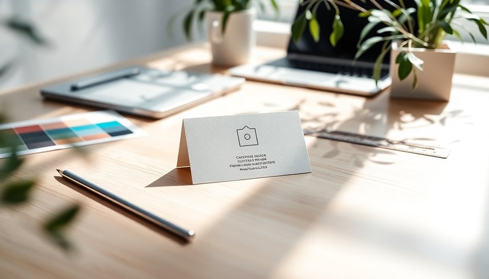
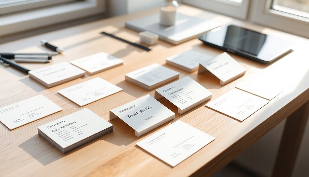
When designing a minimalist business card, start by understanding your client's requirements and branding. Limit your color palette and choose clean, modern fonts for clarity. Utilize white space to highlight key elements and avoid overcrowding. Incorporate minimalist graphics, keeping logos prominent. Guarantee functionality by integrating features like QR codes or appointment fields. Finally, consider eco-friendly materials for added impact. There's so much more to explore about effective minimalist designs that can elevate your brand.
Key Takeaways
- Utilize a limited color palette and clean fonts to enhance readability and create a modern aesthetic.
- Incorporate ample white space to emphasize key elements and avoid overcrowding the design.
- Focus on essential information, ensuring the name and contact details are clearly highlighted and easy to read.
- Use minimalist graphics or logos sparingly to maintain brand recognition without cluttering the card.
- Consider eco-friendly materials and finishes to align with sustainable branding practices while enhancing the design's appeal.
Understand Client Requirements and Design Context

To design a minimalist business card that truly reflects your client's vision, it's vital to gather detailed information about their requirements and design context.
Start by holding face-to-face discussions to understand client requirements clearly. Explore their branding assets, like logos and colors, to guarantee brand consistency within the design.
Engage in direct conversations to grasp client needs and ensure brand consistency through their logos and color schemes.
Ask about specific styles and the target audience to tailor the card effectively. Keep the client's business goals in mind, assuring the design aligns with their overall branding strategy.
Don't forget to take into account practical aspects such as media quality and size, as these elements are essential for a functional and visually appealing business card.
The Role of Color and Typography in Minimalist Design

When designing your minimalist business card, the choice of color and typography plays an essential role in conveying your brand's identity.
Sticking to a limited color palette and selecting clean, modern fonts can enhance simplicity while still making an impact.
Balancing these elements guarantees your card remains visually appealing and effective in communicating your message. Additionally, incorporating a cohesive layout can further enhance the overall aesthetic and functionality of your design.
Color Selection Strategies
Color selection and typography are integral to creating a striking minimalist business card, as they directly influence how your brand is perceived.
Consider using classic black and white for a timeless look, or experiment with two to three complementary colors to enhance visual appeal while keeping it simple. Neutral tones can elevate your design, allowing key elements to pop without cluttering the space.
Choose sans serif fonts for their readability and modern aesthetic, maintaining uniform height for a sleek appearance. If you want to add a creative touch, use handwritten script fonts sparingly to avoid overwhelming the minimalist design. Additionally, understanding color selection strategies can help you create a cohesive and impactful brand identity.
Font Choices Matter
Font choices play an essential role in defining the overall aesthetic and effectiveness of your minimalist business card. To achieve a minimalist look, opt for sans serif fonts, which provide clean lines and enhance readability.
Limit your font palette to two or three complementary styles to maintain cohesion and avoid visual clutter. While handwritten scripts can add a personal touch, choose them carefully to guarantee they align with your design and remain legible.
Color also plays a significant role; use contrasting colors between text and background to improve visibility and highlight important information.
Remember to maintain a minimum font size of 8pt, especially when working with smaller cards, ensuring that all text is easily readable. Additionally, consider how color combinations can further enhance the minimalist design by providing creative inspiration.
Balancing Simplicity and Impact
Achieving a minimalist design requires a careful balance between simplicity and impact, especially when it comes to color and typography.
Here are a few tips to help you create effective minimalist business cards:
- Choose a limited color palette: Stick to two or three complementary colors, including neutrals, to enhance aesthetics without overwhelming the design.
- Select the right font: Opt for sans serif fonts for clean lines and modernity, but consider adding a handwritten script sparingly for creativity.
- Explore unique colors: While black and white are classic, alternatives like gold or orange can add flair while maintaining simplicity.
Maintaining this balance between color and typography is essential for enhancing your card's impact while adhering to minimalist principles. Additionally, user-friendly navigation can help ensure that any information on your card is easily accessible when shared online.
Strategic Use of White Space

When designing your minimalist business card, the strategic use of white space is essential. It creates negative space that draws attention to key elements, making them stand out. Additionally, incorporating design principles can enhance the overall aesthetic and effectiveness of your business card.
Importance of Negative Space
Negative space plays an essential role in minimalist business card design, serving as a foundation for clarity and focus. By strategically using white space, you enhance readability and draw attention to key information.
Here are three ways to effectively utilize negative space:
- Increase white space around text and graphics to create a cleaner, more organized design.
- Avoid overcrowding by ensuring ample negative space, allowing your message to stand out without distractions.
- Facilitate flow by distributing white space evenly, guiding the viewer's eye naturally across the card.
Incorporating sufficient negative space not only emphasizes vital details but also instills a sense of elegance and professionalism, making your business card memorable and effective. Additionally, just as in software development, quality assurance practices can ensure that the design process meets user expectations and enhances overall effectiveness.
Highlighting Key Elements
White space isn't just a backdrop; it's a powerful tool that highlights key elements on your minimalist business card. By strategically using white space, you can draw attention to important information, ensuring it stands out effectively. A clean and uncluttered design enhances readability and fosters visual harmony, making your card appear organized and professional. Additionally, incorporating natural elements into your design can evoke a sense of tranquility that resonates with the recipient.
| Element | Importance | Tips |
|---|---|---|
| Name | Central focus | Increase surrounding white space |
| Title | Establishes identity | Use bold typography |
| Contact Info | Essential for connection | Separate with ample space |
| Personal Touch | Engages recipient | Leave room for notes |
With these strategies, you'll create a minimalist design that captivates and communicates clearly.
Creating Visual Breathing Room
Creating visual breathing room on your minimalist business card is essential for effective communication. By strategically using white space, you enhance the readability of important details and guarantee that your message stands out.
Here are three tips to maximize visual breathing room:
- Utilize Negative Space: Embrace empty areas to create balance, making the design feel uncluttered.
- Maintain Margins: Aim for at least a 5 mm margin from the edges to prevent misalignment and guarantee nothing gets cut off during printing.
- Distribute White Space: Properly placed white space can guide the viewer's eye, emphasizing key information and improving the overall user experience. Additionally, a well-organized design reflects the benefits of decluttering by creating a focused and calm aesthetic.
Incorporating Minimalistic Graphic Elements

When designing a minimalist business card, it's essential to incorporate graphic elements that resonate with your brand identity.
Start by selecting a minimalist logo design that embodies your brand's essence, placing it prominently as a focal point on the card. This not only enhances brand recognition but also creates a strong visual impact.
Selecting a minimalist logo as a focal point enhances brand recognition and creates a powerful visual impact.
Consider dedicating one side exclusively to the logo or a single minimalist graphic, allowing for a clean presentation. Use secondary images sparingly; they should complement your main graphic without cluttering the design.
Make certain all graphic elements align with a simple design philosophy, maintaining a cohesive look through consistent style, color palette, and level of detail. This will reinforce the overall minimalist design you aim to achieve. Additionally, incorporating natural materials like wood can add an organic touch to your design, aligning with the principles of minimalist aesthetics.
Functionality and Versatility of Minimalist Business Cards

When you design a minimalist business card, think about how it can serve multiple purposes.
A clean grid layout not only enhances the card's aesthetic but also makes it easier for recipients to find important information.
Plus, incorporating creative elements can turn your card into a tool for engagement, whether it's for appointments or special offers. Additionally, astrological compatibility can influence how well your card resonates with recipients, enhancing the overall effectiveness of your networking efforts.
Multifunctional Design Elements
While traditional business cards often serve a single purpose, minimalist designs can cleverly incorporate multifunctional elements that enhance their usability.
By prioritizing minimalist aesthetics, you create versatile tools that not only promote your brand but also engage recipients.
Consider these multifunctional features:
- Scheduling Fields: Integrate a clean grid layout for quick appointment types, transforming your card into a practical scheduling tool.
- Loyalty Card Features: Encourage repeat business by adding a loyalty punch system directly on your card.
- QR Codes: Save space and direct clients to additional resources or your online portfolio with a simple scan.
These clever additions not only streamline usability but also foster ongoing interactions, making your minimalist business card an essential networking asset.
Creative Usage Scenarios
How can a minimalist business card elevate your networking game? By embracing a clean design, you can create versatile cards that serve multiple functions.
Think beyond traditional uses—integrate appointment scheduling fields or loyalty card features. With minimalist designs, you can easily modify your cards for promotional offers or event invitations without cluttering the layout.
Including a QR code not only saves space but also connects recipients to additional online content, enhancing functionality.
Plus, experimenting with unique shapes or materials can make your cards stand out, engaging users in creative ways.
Grid Layout Benefits
A well-structured grid layout can transform your minimalist business card into a powerful communication tool.
This approach enhances the organization of information, ensuring easy readability while maintaining a clean look.
Here are three key benefits of using a grid layout:
- Enhanced Readability: A grid system allows for clear separation of elements, making essential details easily accessible.
- Increased Versatility: You can integrate multifunctional features like QR codes or appointment scheduling, maximizing your card's utility.
- Consistent Brand Identity: A grid-based design promotes uniformity across all your branding materials, reinforcing brand recognition.
Experimentation With Unique Designs

When you're designing a minimalist business card, experimenting with unique shapes can set your card apart from the crowd. Instead of the traditional rectangle, try squares or rounded edges to catch attention.
Integrating unique materials like wood, metal, or recycled paper can create a memorable tactile experience that aligns with your brand's identity. Die-cut designs allow you to incorporate cut-out elements or interesting silhouettes while maintaining a minimalist aesthetic.
Additionally, adding eye-catching textures like embossing can provide depth and visual interest without cluttering the design. Just remember to balance these creative design elements with simplicity, ensuring that your card's essential information remains clear and prominent.
This approach will help you create a standout business card that truly reflects your unique style.
Benefits of Minimalist Design in Business Cards

Unique designs can certainly grab attention, but embracing a minimalist approach in business cards offers a range of benefits that elevate your brand.
Here are three key advantages:
- Professionalism: A minimalist design enhances how clients perceive your brand, making it seem more credible and trustworthy.
- Clarity and Efficiency: By focusing on essential elements, your card communicates crucial information clearly, fostering a smooth customer experience.
- Brand Recognition: The clean aesthetic of minimalist cards resonates universally, making it easier for diverse audiences to remember your brand.
Notable Minimalist Card Design Ideas and Materials

Five key design ideas can transform your minimalist business card into a standout piece. First, prioritize essential information while utilizing ample white space to enhance readability. Next, consider unique materials like recycled paper or cotton cardstock to appeal to eco-conscious clients. Incorporating a strong horizontal alignment and clear grid layout will keep your designs organized.
Here's a quick overview of ideas:
| Design Element | Description |
|---|---|
| Prominent Logo | Display your logo clearly for brand recognition. |
| Tactile Finishes | Use Spot Gloss or Letterpress for a premium touch. |
| Eco-Friendly Materials | Choose sustainable materials for a minimalist yet impactful card. |
Essential Information to Include

Creating a minimalist business card means knowing exactly what information to include. Focus on these essential elements:
- Contact Details: Include your name, job title, phone number, and email address to guarantee clarity and professionalism.
- Company Logo: A prominent logo reinforces your brand identity, making your card memorable.
- Website URL: Adding your website gives potential clients a way to explore more about your services.
Prioritize a clean layout, using adequate white space around these key details. This enhances readability and visual appeal, allowing recipients to digest the information quickly.
Quality Finishes and Tactile Enhancements

Elevate your minimalist business card with quality finishes and tactile enhancements that truly make a statement. High-quality finishes like spot UV or foil blocking add sophistication while maintaining simplicity.
Incorporating tactile elements such as embossed text creates a memorable experience, inviting recipients to engage with your card. Opt for thicker card stock—at least 14pt—to convey reliability and quality, distinguishing your card from the ordinary.
Using textured materials like cotton or recycled paper aligns with eco-friendly branding, appealing to environmentally conscious clients.
Additionally, consider contrasting finishes, like matte versus glossy, to enhance the minimalist aesthetic and highlight key design elements, such as your logo or contact details.
These thoughtful enhancements will set your card apart in any networking situation.
Frequently Asked Questions
What Is the Best Way to Layout a Business Card?
When laying out a business card, you should focus on a clean and organized design.
Start by placing your name, job title, and contact details prominently, ideally in the center or upper third. Use a grid system for even distribution and guarantee there's plenty of white space around the elements.
Experiment with horizontal and vertical orientations to find what best represents your brand, while maintaining consistent margins to prevent cutting off important information.
What Are Three Do's and Don'ts for a Business Card?
Less is more when it comes to business cards.
First, you should prioritize essential information—your name, title, and contact details—while avoiding clutter.
Second, skip overly complex fonts; choose simple, sans serif options for clarity.
Finally, don't neglect quality; a well-printed card on high-quality paper makes a lasting impression.
What Are the 8 Steps When Designing a Business Card?
When designing a business card, start by gathering essential information like your name and contact details.
Next, choose a design style that reflects your brand identity.
Create a clear layout with ample white space for readability.
Experiment with materials for a unique touch.
Prioritize feedback from peers to refine your design.
Keep it simple and consistent, focusing on clarity.
Finally, print a few samples to see how your design translates into reality.
How to Make a Business Card More Creative?
To make your business card more creative, try experimenting with unique shapes and materials like wood or metal.
Incorporate 3D effects like raised text to add depth. Use vibrant colors that reflect your brand identity while keeping it minimalist.
Adding QR codes can link to your digital portfolio, enhancing engagement.
Finally, unique finishes like spot gloss or metallic accents can leave a lasting impression, making your card memorable and visually appealing.
Conclusion
Incorporating minimalist design into your business cards can be as invigorating as a cool breeze on a warm day. By focusing on clean lines, strategic white space, and essential information, you create a card that not only stands out but also leaves a lasting impression. Remember, less is often more. Embrace simplicity to convey your brand's essence effectively and watch as your connections grow stronger with each thoughtful exchange.


